I put together a process video for this painting that I created last month! I’m still finding my way with paintings like these, but I think the process is interesting to share because I use a few helpful shortcuts that I’ve been falling back on quite a lot in my art lately. I'll elaborate more on them below!
Some info about this painting process:
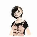
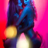
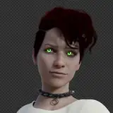
Here’s the reference image I used:

GRID
I start by copy/pasting a grid (got it from google) into the image and transforming it to create a kind of mesh grid version of the space that she’s sitting in. This is something I also did with a previous painting as well, and I found it really helpful to get some sense of the perspective and the space. I did end up having to tweak it later on, but having this in place gives me a good starting point for the sketch and just gives me a lot more confidence. I definitely recommend doing something like this if, like me, you’re not sure where to start when it comes to interior scenes like these!
COLOR MODIFICATION
Lately I’ve been feeling this urge to pull my colors closer together. If I feel the values and colors are not unified enough, I’ll lower the contrast and bring some uniformity to the color and then slowly re-introducing some contrast from there. For this painting, I did this about 20:11 minutes in. I started by lightening the whole image, then using color balance to push it to a warmer hue, and then using selective color to make some final tweaks. The result is a painting with more of a warm ‘wash’ over the whole thing. Then I tone that down a little bit and bring in a darker brush to slowly re-introduce the contrast by drawing outlines and adding more definition to the outer edges of the shapes. This is a technique I’ve used a lot in my art lately, I guess because I’m in a phase where I just really enjoy the effect of a low contrast color scheme.
WALLPAPER
The wallpaper is literally just a copy/pasted texture. I paste it in, set the layer mode to multiply, and then adjust the levels to make it blend in to the background more. I do this about 29:34 minutes in. Then I erase it in some areas and paint over it to blend it in to the painting. This is my general approach when it comes to implementing patterns into my work, especially since they are mostly just a decorative background element - I feel it’s not worth it to literally paint it so this is where I’ll use photoshop to its maximum benefit!
I hope you enjoy this one and let me know if you have any questions or would like me to elaborate further on a specific aspect of the process. Any questions you have are helpful to me in figuring out future tutorial topics or resources, so don’t hesitate to reach out if you have one! Have a great week everyone ❤
yello
2025-01-13 15:32:17 +0000 UTCLoish
2023-05-25 12:48:37 +0000 UTCLoish
2023-05-25 12:47:19 +0000 UTCRob Callicotte
2023-05-25 02:02:59 +0000 UTCAC Moony
2023-05-24 19:51:58 +0000 UTCWill Weston
2023-05-24 19:33:55 +0000 UTCEmberly Erick
2023-05-24 16:36:55 +0000 UTCSandra Elderberry
2023-05-24 13:34:12 +0000 UTCLauren Nicole
2023-05-24 12:25:12 +0000 UTCLoish
2023-05-24 12:23:07 +0000 UTCLauren Nicole
2023-05-24 12:21:23 +0000 UTC


![[M]Alice](https://nokimo.com/istorage/96453.jpg)