NokiMo
lisabrenner
lisabrenner

patreon


[GG | Ch 4] Scene 1 | Color Scheme Test

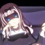
Ohhhhhh I tested the mood for the first scene very quickly earlier and like it so far! In the future, I want to push the colors a bit more to have more atmosphere. This requires some courage to decide on one or two main colors per scene. I'm not used to that! But I love it in other artists' art!
The trick is to choose one main color (pink/orange-y here) and make subtle shifts to get more hues instead of having lots of different colors. Low contrast in hues (eg Piets skin tone + shirt).

Also, this way I can give the right colors to Lew who flats the pages. While I'm lining the next scene, she can flat the finished pages. Efficiency!


[GG | Ch 4] Scene 1 | Color Scheme Test

Comments

Thank you! <3 The final pages will look good *_*

Lisa Brenner

It's so beautyful

Gutokun

That's fine :D I worked on it a bit more and softened the overall contrast. I don't want to have a hard break between the usual coloring and new pages, so you're absolutely right about that. But I still want to shift it a bit. I also thought about golden light at first, but we had that in chapter 3/Levi/library and I wanted something new, but still fall-ish. I feel like my color vision is crooked X_X All my screens have a warm temperature since April and I haven't worked with color in a long time. I feel like I can't judge what I'm doing anymore. Printing out helps a bit though.

Lisa Brenner

Wow, that is very different and very ... pink. It sort of hits you smack in the face. From the previous test panels I had expected something more golden. Like that old picture you did of Piet and Henry walking through the woods? That said, I do think this style of colouration looks very good together with the otherwise soft artstyle in general, and you really manage to capture the feel of that low hanging autumn sun, lighting up rooms at strange angles in the afternoon. Goosebumps. Really the only issue I can see is that the transition from chapter 3 to might be somewhat jarring, if you sort of step back a bit and look at the comic from the perspective of a new reader. Compare the talky scene with Tim and Piet with this one. There the characters stood out much more against the bright white lighting. But here they are sort of swimming in a sea of colour, so my eyes kind of dart around the page more. That's my impression at least. Take it with a grain of salt, as I don't really have clue what I'm talking about.

Anders


Related Creators