Hey my friends!
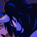
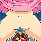
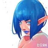
Here's a WIP of Chel. Hope you like the progress so far :)
I wanted to share some tips on how to make your art pop more and create more interesting visuals and better colors. 👇🏼
 First you decide what your base color will be. Chel is an indigenous woman of Colombian origin so her skin is obviosly a little darker. Make sure it isn't too saturated since it's just the base. White characters would be in the lighter area of the color wheel of course and more desaturated.
 Once you've chosen the base color it's time for the shadows. To make skin color more vivid and interesting I always shift the HUE a bit. More shift, more interesting and vivid the skin appears. But change it carefully. If you do too much it can appear unrealistic.
But REMEMBER:
If the environment is very strong in lighting or reflective colors the skin color would change since it affects the skin color. In these cases you can change the HUE in the direction of the surrounding color. For example if Chel would be in a dark forest the shadows would shift towards the green/blue areas. If she'd be in a desert her shaded skin color would be in the red tones area.
You can use this method even with cartoony style if you like. It doesn't have to be a realistic art style since we only talk about the colors.
 For the darker shadows I shift it even more. But, carefully! :) Also I increase the saturation as I go darker.
When it comes to edges you can watch my older tutorial. Just search for "Edge Control" in the searching bar.
 When it comes to Light I stay loyal to this method. The only difference is I shift the HUE in the oppostite direction to create a subtle fuller color palette. I don't know the exact reason but I learned it this way and it works every time :) Guess it just makes the whole appearance more believable and vivid.
 Another thing I'm missing in most people's art is strong shapes through ligh and shadow. Cast shadows in darker tones can really push your art to the next level. It enhances the readability and makes it more believable. It gives that extra visual spice. I also try to follow the forms but at the same time I try to simplify them so I get the forms to be as edgy as possible. This creates contrast in relation to the softer rendered main skin.
If you wondering, you can see this even with the Illustrator /&Plus tier just as a teaser lol. It's only an exception. :)
I hope you like this and can find some value in this :) If you like this type of explanations let me know :) Happy painting and
stay sticky!
DORN
2024-05-27 13:43:33 +0000 UTCIcytoed
2024-05-27 13:25:45 +0000 UTC