NokiMo
Torsten Hewson
Torsten Hewson

patreon


Cover Voting

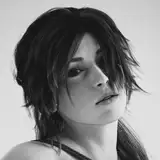
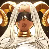
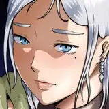
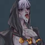
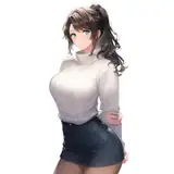
However! while the post may be delayed a bit, I do need your help. going to be dong a revamp of the cover for Volume 1 and I'd like to see which design people like the most! This is just fo the composition, so please let me know!

1: https://i.imgur.com/YTBTNfE.jpg

2: https://i.imgur.com/ImrHlvU.jpg

3: https://i.imgur.com/F4gkwdP.jpg

Cover Voting Cover Voting Cover Voting

Comments

It looks like #1 is winning -- but I love #3 as well. Could we maybe get #3 as an inside page somewhere in the book? Possibly as the whatchamacallit "frontispiece" or something, the illustration facing the title page of the book? #Hopeful

Mickey Phoenix

Cover #1

Covers reflect plot. Picture one seems more like the cover for volume 2 where Jin in a small part of the wider world.

matthew gilley

I’ll go with 2. It has a sense of anticipated movement and optimism for me. The presence of a female character does not demonstrate the nature of that relationship.

JOEL MOSELEY

Hard to choose between 1 and 3, but I think 1 wins it for me

Absolutely not cover 2. The fact that jins wife is in it is a spoiler for the book. Most people wouldn’t expect the Mc to get married and settle down within the course of a couple months, so it represents a minor plot twist. furthermore, it’s super sweet the way it happens, so it’s a NICE plot twist. Don’t spoil.

I was about to suggest this

Alan McBrayer

Number one for me. I love seeing Jin just chillaxing under a tree and staring up at the Sky.

SoulofaGremlin

Oh oh oh. Big D doing his training montages on the fence poles, Jin staring in confusion from a field with the beware sign off to the side. Hahaha

JS

Wow, tough decision. Each looks very good.

ByzFan

I also agree that Bi De should be on Jin's shoulder with the sign on the fence. Jin should be calmer though instead of grinning. The farm with the humble abode and a few rows of rice and his spirit herbs garden should be in the foreground. The entire image should be facing the reader, so that Bi De looks like he is staring everyone down. :-)

Jeanne LInk

I like 1 and 2 (maybe just unfinished but in 2 Big D looks HUGE) so I voted for 1

John Bell

I like the original best of these 3. However, I think of Big D riding on Jin’s shoulder as a potential “iconic” image of the story or as mentioned above, Big D on the fence post with the sign. Potentially move Big D in 1st image to Jin’s shoulder?

WildType

1 gives the feeling that Bi De is an intelligent character while the others only feature him prominently. Volume 1 is mostly a drama centered around Jin and Bi De so it makes sense to me that they are the ones looking at each other as a teaser of the plot.

2 best conveys "chilled out" farmer "way to into it" chicken

David Mansfield

I want a mix between 1 and 2!

Null

Big D on top of the Fa Ram gate with the sign would solicit more curiosity than showing people and other stuff

ericksond

Avoid anime elements on the cover.

6b5zksc9

2 but bi de should have some really strong colours .

Number one, but also include Meimei in there

RainyCats

Of the three choices I like number 1 the most. Number 2 feels like a generic wuxia cover ( all you're missing is for the three in fighting poses) and number 3 has a manga vibe to it (have people jumping towards the MC and a big titty girl glomp him).

I think the cover of Carefree Path of Dreams is pretty good at conveying the vibe and tone of BOC (but not itself) which is why option 1 is the best imo

Howard Yang

Personally, it feels uncomfortable to see images of characters. It creates a schism between my imagination and the image. It can also give impressions and preconceptions of characters we are supposed to be learning about in the story through their thoughts and actions. Why not just feature Big Dee or have Jin wear a straw hat or something? Ofc this is just a personal gripe of mine and would have a negligible impact on my enjoyment of this great story.

the books still going to be called "Beware Of Chicken" right? imo first cover should be all Big D, maybe sitting on a shoulder with only a bit of jins face to the side

STORRM

OK, 2nd is best. First, looks like a generic guy about to go off on an adventure. Which is not what the story is about. Third, A man and his chicken. It's not that simple. Third, gives the proper amount of complexity. the interesting depth of view, or field, whichever, showing that the rooster is important, and yet so is the man. it shows how he prefers to stay back, on his farm. and then the woman, so you know there's a love interest. boom. 2nd is best!

Honestly I don't like any of them. First one is kinda far away and if you don't know the story it does not invite you to take it and explore it. Third one is similar, it is good, feels right but does not invite strangers to take a look. Second one has a perspective problem, if I didn't know about it, I would think it is about a giant chicken. It would be best if you had the entry of the farm with the Beware of the Chicken sign (which also can be used as title) and the chicken on top of that

Umut Numanoglu

Of the three, I like #1 best as it stands. #3 <i>would</i> be best, were it not for the head problem John Koor noted; if that were fixed, I'd vote for #3.

Quentin Long

The story having a litteral picture of only a chicken as cover so didn't seem to hurt it much so far, though?

DocteurNS

2, because I want my Big D up close~

Runaway_Cactuar

It:'s Big D. BIG D! I'll vote for the BIGGEST D to be seen. #2 has my vote.

Slightly Morbid

2, because women on covers sell better.

TheOne320

#1 gives the most accurate depiction of what readers would be reading. #2 along with the story name will mislead the uninformed into thinking the book is about the chicken instead of Jin. #3 bothers me because Jin has a little kid's head. Too small and childish.

John Koor

The issue with the second is that it gives new readers the impression that Bi Debi's the main character while the story is more about Jin. The third one is nice but give too much a feeling of classic Japanese webnovels and with his much low quality of them there are this might give a wrong impression again to potential new readers

Jack Trowell

The rice paddies look wrong to me for some reason in #1. They look... vertical? Like the ones you might see in South America. /shrug. I still love the original one.

The Lost Pages

While I love them all, I am a simple man. I see waifu, I vote waifu.

Dee

I think 1 has the original chill vibe down perfect

Jackson Ragland

Personally, I like the look of 1 best, but I voted for 2. Putting Big Dee up front grabs attention for the concept. This story was the first and only Cultivation story I've tried. I knew the tropes of the genre, and they really didn't appeal to me. But the story was called: "Beware of Chicken". It made me think that maybe, this one story wouldn't be about some self-righteous psychopath, ascending to underserved godhood. Maybe it would be fun? And it was great fun. Big Dee was the reason I gave this story a chance, and maybe it will do the same for others. Additionally, it may sound a bit cynical, but my understanding is that light novels with women on the covers sell better. As long as the cover is accurate to the contents, there's nothing wrong with using established methods to grab the attention of potential readers.

guymcfearsonm

I hope the second volume gets a picture with more characters in it, Tigger and Peppa need to be in it :)

Agree, 1 is the most beautiful but 2 looks more like the name and story. I wouldn't mind a poster of 1 that I could hang on a wall thou.

1 is probably the best composition, but 3 does capture the story tone much better and it's nice that 2 has Meiling(?) on there too.

Anzer'ke

Def #2

paul5555

On RR you can split the series into books and have a different cover for each book. Beneath the dragon eye moon is a good example of this. Maybe consider this option?

Yuanlong Dai

I think these are all fantastic, but as a cover I think I prefer #2.

Empty Shelf

1 for first vol with the beware the chicken from the second image would be the best i think.

Will Iam

Where does book 1 end exactly? Wasn't it at the wedding?

DocteurNS

It's tough, because I feel like the last one is the only one that really captures the spirit of the story, but you need one of the first two in order to snag the attention of new readers

Adam Rosenberg

Voted 1, but I will say 2 might be a good pick for vol.2. After all the book starts with just Jin and Big D. While Meimei comes into the story pretty quickly the first Vol really focuses on those two.

Carl Smith

I pick image 2 because the cover needs a big cock.

Alimaeus

I like 1 the best, but I think 2 works better as a cover that grabs your attention.

Garrett

Number one looks better defined while number 3 is dear to my heart the second one is a nope from me since BI DI looks too menacing. Number one could be improved if you get rid of the Title sign for something that shows the background.

Xodarap4

I like 2 because Meimei is in it, too.

taukid

I agree on it being eye catching with a close up of our boy big D. You would probably get more people picking it up that way

Undead Writer

I feel like 2 is the most attention-grabbing, so I would advocate for it on that front!

Rosenheim

I agree with it being too busy, but I still like it best. Maybe moving Big D back a little bit to add more breathing room might help.

Kamish Bhai

I like 1 because of the depth of the sene. I like 2 because of the close up of our beloved chicken. I like three more as a picture in the book rather than an actual cover piece. But they all look great!

Undead Writer

I mean, the first one is nice and chill. But the story IS called "Beware the Chicken", so I feel the second one is more appropriate. Also more eye-catching, which seems like a better way to attract people who don't know what the book is about.

DocteurNS

I like the idea of the second, but I think it comes across as too busy. Sooo... the original or a revamp of it is preferable. 2 min old 60 some odd votes and 6 replies. Your doing something right!

Kapelteta

I like 1 cause it establishes Jin and Big D as near equals, while also making them a mere part of the larger backdrop of nature

WirelessGrapes

same had to go to my computer to see them

JoshLeeStew

Gotta vote for the most prominent cock

Yeah, the images don’t show and when I tried to hit the link it counted as a vote. (Nm, I see the new links)

David Bean

Hard to copy from mobile

Dan


Related Creators