


psd
clip
Ōåæµ£ĆĶ┐æÕĘ«ÕłåŃéÆŃā¼ŃéżŃāżŃā╝Ńü½ńĄ▒ÕÉłŃüŚŃü”µøĖŃüŹÕć║ŃüŚŃü”ŃéŗŃüøŃüäŃüŗŃāĢŃéĪŃéżŃā½Õ«╣ķćÅŃüīńĢ░µ¦śŃü½Õż¦ŃüŹŃüÅŃü¬ŃüŻŃü”ŃüŚŃüŠŃüŻŃü”Ńéŗ
ŃüōŃéōŃü½ŃüĪŃü»’╝üŃüöÕ┐āķģŹŃéÆŃüŖŃüŗŃüæŃüŚŃü”ŃüŖŃéŖŃüŠŃüÖŃĆüŃéŖŃü«ŃüéŃü¦ŃüÖ
µ£ĆĶ┐æŃü»Ķē▓ŃĆģÕÉ╣ŃüŻÕłćŃéīŃü”ŃüĀŃüäŃüČÕģāµ░ŚŃü½Ńü¬ŃüŻŃü”ŃüŖŃéŖŃüŠŃüÖ’╝ü
’╝ōµ£łŃü»ńĄÉµ¦ŗĶē▓ŃĆģńĄĄŃü«ÕŗēÕ╝ĘŃéÆŃüŚŃü”ŃüŠŃüŚŃü”ŃĆüĶē▓ŃĆģĶ®”ŃüŚµÅÅŃüŹŃüŚŃü”Ńü┐Ńü”ŃĆüŃüŠŃüĀŃüŠŃüĀĶć¬ÕłåŃü«ńĄĄµ¤äŃü½µ£Ćķü®Õī¢ŃüŚŃüŹŃéīŃü”Ńü»ŃüäŃü¬ŃüäŃéōŃü¦ŃüÖŃüæŃü®ŃĆüĶē▓ŃĆģõ╗ŖŃüŠŃü¦Ńü«µÅÅŃüŹµ¢╣Ńü«ńäĪķ¦äŃéÆń£üŃüÅŃüōŃü©ŃüīŃü¦ŃüŹŃü¤ŃüŗŃü¬Ńü©µĆØŃüŻŃü”ŃüäŃüŠŃüÖ
õ╗ŖŃüŠŃü¦Ńü©õĖĆńĢ¬ķüĢŃüåŃü«Ńü»ŃĆüŃüŠŃüüŃāŚŃāŁŃé╗Ńé╣Ńü«ÕĢÅķĪīŃü¬Ńü«Ńü¦ńĄĄŃéÆĶ”ŗŃü”ŃééŃéÅŃüŗŃéēŃü¬ŃüäŃü©Ńü»µĆØŃüåŃéōŃü¦ŃüÖŃüīŃĆüŃüŗŃü¬ŃéŖÕĪŚŃéŖŃüīńĘÜńö╗Ńü½ÕøÜŃéÅŃéīŃü¬ŃüÅŃü¬ŃéŖŃüŠŃüŚŃü¤
ńĘÜńö╗ŃééŃüéŃüŠŃéŖń┤░ŃüŗŃüŵÅÅŃüŗŃü¬ŃüÅŃü¬ŃéŖŃüŠŃüŚŃü¤ŃüŁ
ÕĮ▒Ńü«ķćŹŃüŁµ¢╣Ńü«ńäĪķ¦äŃéÆń£üŃüäŃü¤ŃéŖŃĆüķ½¬Ńü»ńē╣Ńü½ÕÄÜÕĪŚŃéŖŃü«Ķ”üķĀśŃü¦µÅÅŃüŹĶČ│ŃüŚŃü¤ŃéŖŃüŚŃü”ŃüŠŃüÖ
ŃüØŃüŚŃü”µśÄµÜŚŃü«Ńé│Ńā│ŃāłŃā®Ńé╣ŃāłŃéÆŃüżŃüæŃéŗµ¢╣µ│ĢŃééŃüŗŃü¬ŃéŖÕżēŃéÅŃéŖŃüŠŃüŚŃü¤
Õģ©õĮōńÜäŃü½µÖéń¤ŁŃü¦ŃüÖŃüŁŃĆüõĮōµä¤õ╗ŖŃüŠŃü¦Ńü«’╝æ’╝ÉÕłåŃü«’╝æŃüÅŃéēŃüäŃü½Ńü¬ŃüŻŃü¤µ░ŚŃüīŃüÖŃéŗ
ŃüōŃéīńĄÉµ¦ŗŃāóŃāüŃāÖõĖŖŃüīŃéŖŃüŠŃüÖŃüŁŃĆ£
ŃééŃüåÕ░æŃüŚÕĮ®Õ║”Ńü©µśÄÕ║”Ńü«ń«ĪńÉåŃéÆŃüŚŃüŻŃüŗŃéŖŃüŚŃü¤ŃüäŃü©ŃüōŃéŹŃü¦ŃüÖŃüŁ
µČ▓Ńé┐Ńā¢ŃéäPCŃü«ńö╗ķØóŃü»ŃüŗŃü¬ŃéŖŃé│Ńā│ŃāłŃā®Ńé╣ŃāłŃüīŃéłŃüÅĶ”ŗŃüłŃéŗŃéōŃü¦ŃüÖŃüæŃü®ŃĆüŃé╣Ńā×ŃāøŃü©ŃüŗŃüĀŃü©Ńü¬ŃüŗŃü¬ŃüŗõĖŖµēŗŃüÅĶ”ŗŃüłŃüŠŃüøŃéōŃüŁ
ŃüØŃü«ĶŠ║Ńü«ŃéŁŃāŻŃā¬Ńā¢Ńā¼Ńā╝ŃéĘŃā¦Ńā│Ńü«õ╗Ģµ¢╣ŃéäĶē▓Ńü«ķüĖŃü│µ¢╣ŃééµäÅĶŁśŃüŚŃü”ŃüäŃüŹŃü¤ŃüäŃü©ŃüōŃéŹŃü¦ŃüÖŃüŁ
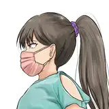
Hello! I'm Rinoa, and I'm sorry for your concern.
Recently, I have been feeling a lot better after having had a lot of things blow over!
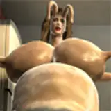
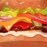
I've been studying a lot in March, and I've been experimenting a lot, and although I haven't fully optimized my drawing style yet, I think I've been able to eliminate a lot of the waste in my previous drawing style.
The biggest difference from the past is that, well, it's a matter of process, so you can't tell by looking at the pictures, but I've become much less confined to line drawings in the painting process.
The line drawing is not so detailed anymore.
I'm not wasting time with layered shadows, and I'm adding hair in a particularly thick way.
I have also changed the way I create contrast between light and dark.
Overall, it's a lot shorter. I feel like it's about 1/10 of what it used to be.
This is quite motivating.
I would like to manage saturation and brightness a little better.
I can see the contrast on liquid tabs and PC screens quite well, but it's not so good on smartphones and other devices.
I'd like to be more conscious of how to calibrate and choose colors.


