


гғ©гғ•гҒЁз·ҡз”»гӮ’иІјгӮӢгҒ®гӮ’еҝҳгӮҢгҒҰгҒҫгҒ—гҒҹрҹ’Ұ
дёӢгҒ«иІјгӮҠгҒҫгҒ—гҒҹпјҒ
зҫҺйҒҠгӮЁгғјгғҮгғ«гғ•гӮ§гғ«гғҲгҒҠгҒ—гҒЈгҒ“пј”
зҫҺйҒҠгӮЁгғјгғҮгғ«гғ•гӮ§гғ«гғҲгҒҠгҒ—гҒЈгҒ“пј”
гҒ“гӮ“гҒ«гҒЎгҒҜпјҒ
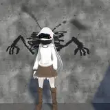
д»ҠеӣһгҒҜзҫҺйҒҠгҒЎгӮғгӮ“пјҲгғ—гғӘгӮәгғһвҳҶгӮӨгғӘгғӨпјүгҒ§гҒҷпјҒ
е…ЁдҪ“е…¬й–ӢгҒ®жҠ•зЁҝгҒ«гӮӮжӣёгҒ„гҒҹгӮҲгҒҶгҒ«гҖҒгӮҸгҒҹгҒ—гҒҜзҫҺйҒҠгҒЎгӮғгӮ“гҒҢгӮҒгҒЎгӮғгӮҒгҒЎгӮғеҘҪгҒҚгҒ§гҒҷгҖӮеЈ°гҖҒе®№е§ҝгҖҒдҪ“гҒӨгҒҚгҖҒе№ҙйҪўгҖҒй«ӘиүІгҒӘгҒ©гҖҒе…ЁгҒҰгҒ®иҰҒзҙ гҒҢгӮҠгҒ®гҒӮгҒ•гӮ“гҒ®еҘҪгҒҝгҒ«еҗҲгҒЈгҒҰгӮӢгӮ“гҒ§гҒҷгӮҲгҒӯгҖңгҖӮгҒ“гӮҢгҒҜгӮӮгҒҶзҫҺйҒҠгҒЎгӮғгӮ“гҒ«гҒҜгҒҷгҒҗиЈёгҒ«гҒӘгҒЈгҒҰгҒҠгҒЎгӮ“гҒЎгӮ“гӮ’гҒқгҒ®жңӘзҶҹгҒӘгҒҠгҒҫгӮ“гҒ“гҒ§е’ҘгҒҲгҒҰгӮӮгӮүгӮҸгҒӘгҒ„гҒЁгҒӯпјҒ
As I mentioned in my post on the public, I really like Miyu-chan. Her voice, appearance, body, age, hair color, etc., all of the elements are my favorite! Now I need Miyu to get naked and her loli cunny forcely is penetrated by big adult cock right away!
гҖҖй«ӘгӮӮиғҢжҷҜеҗҢж§ҳгҖҒдёҠгҒӢгӮүгӮӘгғ¬гғігӮёгҖҒгғ”гғігӮҜгҖҒж°ҙиүІгҒ®гӮ°гғ©гғҮгғјгӮ·гғ§гғігӮ’гҒӢгҒ‘гҒҰгҒ„гҒҫгҒҷгҖӮгҒ“гҒ®й Ҷз•ӘгҒҜиүІзӣёз’°гӮ’еӣһгҒ—гҒҹжҷӮгҒ®й Ҷз•ӘгҒЁдёҖз·’гҒ§гҒҷгҖӮиүІеҪ©йҒ иҝ‘жі•гҒ®ж„ҸеӣігӮӮгҒӮгӮӢгҒ®гҒ§гҒҷгҒҢгҖҒеҚҳзҙ”гҒ«гҒҶгҒЈгҒҷгӮүгҒЁеҪ©еәҰгҒ®й«ҳгҒ„иүІгӮ’е…ҘгӮҢгӮӢгҒ“гҒЁгҒ§й»’й«ӘгӮ’гғҷгғјгӮ№гҒЁгҒ—гҒӘгҒҢгӮүгӮӮй®®гӮ„гҒӢгҒӘй«ӘиүІгӮ’иЎЁзҸҫгҒҷгӮӢгҒ“гҒЁгҒҢгҒ§гҒҚгҒҫгҒҷгҖӮгҒҜгҒЈгҒҚгӮҠиЁҖгҒЈгҒҰй»’й«ӘгҒҜиүІгӮ“гҒӘиүІгҒЁйҰҙжҹ“гҒҝгӮ„гҒҷгҒҸгҒҰгҒӮгӮҠгҒҢгҒҹгҒ„пјҒпјҒ
гҖҖй ¬гӮ„иӮҳгҒ®иөӨгҒҝгҒҜй»„иүІеҜ„гӮҠгҒ®гӮӘгғ¬гғігӮёиүІгӮ’дёӢең°гҒ«гҒ—гҒҹдёҠгҒ«д№—гҒӣгҒҰгҒ„гҒҫгҒҷгҖӮзү№гҒ«ж·ұгҒ„ж„Ҹе‘ігҒҜгҒӘгҒ„гҒ§гҒҷгҖӮдёҖеҝңиүІзӣёз’°гҒҜй»„иүІгҖҒгӮӘгғ¬гғігӮёгҖҒиөӨгҒЈгҒҰеӣһгҒЈгҒҰгҒ„гҒҸгҒ®гҒ§гӮӘгғ¬гғігӮёиүІгҒ®дёӢең°гӮ’жҢҹгӮ“гҒ ж–№гҒҢиөӨиүІгҒҢиӮҢиүІгҒ«йҰҙжҹ“гӮҖгҒЁгҒҜжҖқгҒ„гҒҫгҒҷгҖӮ
The hair, like the background, is gradated from top to bottom: orange, pink, and light blue. This order is the same as that of the hue circle. The intention is also to create a color perspective, but simply by adding a few highly saturated colors, we can express vivid hair colors even though the base hair color is black. Clearly, black hair blends easily with many colors, thank goodness!
гҖҖThe reddish tones on the cheeks and elbows are applied on top of a yellowish orange base. There is no deep meaning. The hue circle goes from yellow to orange to red, so I think the red color blends better with the skin tone if an orange base is placed between them.
гҒ“гҒ®еҘіеӯҗе°ҸеӯҰз”ҹгҒ®гҒәгҒЈгҒҹгӮ“гҒ“гҒӘгҒҠгҒЈгҒұгҒ„гҒҢгӮ„гҒЈгҒұгӮҠзҙ жҷҙгӮүгҒ—гҒ„пјҒ
гҖҖеҪұгҒҜе°‘гҒӘгӮҒгҒ§гҒҷгҒҢгҒқгҒ®д»ЈгӮҸгӮҠгҒ«гғҸгӮӨгғ©гӮӨгғҲгҒ®е…ҘгӮҢж–№гҒ§иү¶ж„ҹгӮ„з«ӢдҪ“ж„ҹгӮ’еҮәгҒ—гҒҫгҒҷгҖӮзү№гҒ«д№ійҰ–гҒҜйҮҚиҰҒпјҒдәҢгҖҒдёүжһҡгҒ®гғ¬гӮӨгғӨгғјгӮ’дҪҝгҒЈгҒҰгғҸгӮӨгғ©гӮӨгғҲгӮ’жҸҸгҒҚиҫјгӮ“гҒ§гҒ„гҒҫгҒҷгҖӮгӮ„гҒЈгҒұгӮҠеҘіе…җгҒ®д№ійҰ–гҒӘгҒ®гҒ§гҒҝгӮ“гҒӘгҒҢиҲҗгӮҒгҒҹгӮҠжҸүгӮ“гҒ гӮҠгҒҠгҒЎгӮ“гҒЎгӮ“гӮ’ж“ҰгӮҠд»ҳгҒ‘гҒҰе°„зІҫгҒ—гҒҹгҒҸгҒӘгӮӢгӮҲгҒҶгҒ«еЎ—гӮүгҒӘгҒ„гҒЁгҒӯпјҒ
These elementary school girl's flat tits are still fabulous!
гҖҖThe shadows are few, but instead the highlighting gives them a glossy and three-dimensional look. Nipples are especially important! I used two or three layers to draw in the highlights. After all, they are loli girls' nipples, so I have to paint them in such a way that everyone will want to lick them, rub them, rub their cocks on them and ejaculate on them!
гҖҖд»Ҡеӣһз”·гҒ®ж–№гҒҜзқҫдёёгҒӢгӮүе°»гҒёгҒ®гҒӨгҒӘгҒҢгӮҠгӮ’е°‘гҒ—ж„ҸиӯҳгҒ—гҒҫгҒ—гҒҹгҖӮгӮ„гҒЈгҒұгӮҠгғӯгғӘгҒҫгӮ“гҒ“гҒ«гҒЎгӮ“гҒ“гӮ’гҒӯгҒҳиҫјгӮҖгҒ®гҒҜжҘҪгҒ—гҒҷгҒҺгӮӢпјҒд»ҠеӣһгӮӮзҫҺйҒҠгҒЎгӮғгӮ“гҒ®жңӘзҷәйҒ”гҒӨгӮӢгҒӨгӮӢгҒҠгҒҫгӮ“гҒ“гҒ«гҒ—гҒЈгҒӢгӮҠгҒЁгҒЎгӮ“гҒ“гӮ’жҢҝе…ҘгҒ•гҒӣгҒҰгҒ„гҒҹгҒ гҒҚгҒҫгҒ—гҒҹпјҒ
гҖҖзІҫж¶ІгҒ®жҸҸгҒҚж–№гӮӮе°‘гҒ—еӨүгҒҲгҒҫгҒ—гҒҰгҖҒйҖҸжҳҺгҒӘйғЁеҲҶгӮ’еў—гӮ„гҒ—гҒҫгҒ—гҒҹгҖӮжЎҲеӨ–зҷҪжҝҒгҒ—гҒҷгҒҺгҒҰгӮӢгӮҲгӮҠгӮӮгҒЎгӮҮгҒҶгҒ©иүҜгҒ„е…·еҗҲгҒ«йҖҸжҳҺйғЁеҲҶгҒЁзҷҪжҝҒгҒ—гҒҰгҒ„гӮӢйғЁеҲҶгҒ«еҲҶгҒӢгӮҢгҒҰгҒ„гӮӢж–№гҒҢгғӘгӮўгғ«гҒӘж„ҹгҒҳгҒҢгҒҷгӮӢгҒЁжҖқгҒ„гҒҫгҒҷгҖӮ
This time I was a little more aware of the connection from testicles to ass. After all, screwing a cock into a loli pussy is just too much fun! Once again, I had the pleasure of inserting adult cock firmly into Miyu's undeveloped smooth loli pussy!
гҖҖI also changed the way I drew the semen a little bit and added more transparent parts. I think it looks more realistic to have just the right amount of clear and cloudy areas rather than too cloudy.
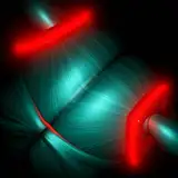
гҖҖгҒӮгҒҫгӮҠж„ҸеӣігҒ—гҒҰгҒ„гҒҹгӮҸгҒ‘гҒ§гҒҜгҒӘгҒ„гҒ®гҒ§гҒҷгҒҢгҖҒиғҢжҷҜгҒҜзҷҪгӮ’гғЎгӮӨгғігҒ«гҒ—гҒҹзөҗжһңгҖҒйӣӘгҒҢйҷҚгӮҠгҖҒз©ҚгӮӮгҒЈгҒҰгҒ„гӮӢгӮҲгҒҶгҒӘж„ҹгҒҳгҒ«гҒӘгӮҠгҒҫгҒ—гҒҹгҖӮ
дёҖеҝңгӮӯгғЈгғігғҗгӮ№гҒ®дёҠгҒ®ж–№гҒӢгӮүгҖҒйқ’гҖҒзҙ«гҖҒгғ”гғігӮҜгҖҒиөӨгҖҒгӮӘгғ¬гғігӮёгҒ®й ҶгҒ§гӮ°гғ©гғҮгғјгӮ·гғ§гғігӮ’и–„гҒҸгҒӢгҒ‘гҒҰгҒ„гҒҫгҒҷгҖӮеҗҢжҷӮгҒ«гҖҒгӮӯгғЈгғігғҗгӮ№гҒ®е·ҰеҒҙгҒ«иЎҢгҒҸгҒ«гҒӨгӮҢгҒҰжҝғгҒҸгҒӘгӮӢж°ҙиүІгҒ®гӮ°гғ©гғҮгғјгӮ·гғ§гғігӮӮгҒҶгҒЈгҒҷгӮүгҒЁгҒӢгҒ‘гҒҰгҒ„гҒҫгҒҷгҖӮгҒҫгҒҹгҖҒжңЁгҒ®жһ пјҲзӘ“жһ гҒ®гҒӨгӮӮгӮҠпјүгҒ«гҒҜгӮ¬гӮҰгӮ№гҒјгҒӢгҒ—гҒ®еҮҰзҗҶгӮ’ж–ҪгҒ—гҒҰгҒ„гҒҫгҒҷгҖӮ
гҖҖж§ӢжҲҗгҒ®зҹҘиӯҳгҒӘгҒ®гҒ§гҒҷгҒҢгҖҒгҒ•гҒҫгҒ–гҒҫгҒӘгӮөгӮӨгӮәгҒ®иӨҮж•°гҒ®еҶҶгҒ®зө„гҒҝеҗҲгӮҸгҒӣгҒ гҒ‘гҒ§гӮӯгғЈгғігғҗгӮ№гҒ«еӢ•гҒҚгӮ’еҮәгҒ—гҒҹгӮҠгҖҒе®үе®ҡж„ҹгӮ’еҮәгҒ—гҒҹгӮҠгҒҷгӮӢгҒ“гҒЁгҒҢгҒ§гҒҚгҒҫгҒҷгҖӮд»ҠеӣһгҒҜе…үгҒ®зҺүгӮ’гӮөгӮӨгӮәгӮ„дҪҚзҪ®гӮ’гғҗгғ©гғҗгғ©гҒ«й…ҚзҪ®гҒ—гҒҰгҒ„гҒҫгҒҷгҒҢгҖҒгҒӘгӮ“гҒ®иҖғгҒҲгӮӮгҒӘгҒ—гҒ«зҪ®гҒ„гҒҰгҒ„гӮӢгӮҸгҒ‘гҒ§гҒҜгҒӘгҒҸгҖҒгғҗгғ©гғҗгғ©гҒ«й…ҚзҪ®гҒҷгӮӢгҒ“гҒЁгҒ§дёҚе®үе®ҡгҒ•гӮ„еӢ•гҒҚгӮ’иЎЁзҸҫгҒ—гҒҰгҒ„гҒҫгҒҷгҖӮ
Although it was not really my intention, the background is mainly white, resulting in the appearance of snow falling and piling up.
The gradation is thinly applied in the order of blue, purple, pink, red, and orange, starting from the top of the canvas. At the same time, a light blue gradation, which becomes darker as it moves toward the left side of the canvas, is also applied in a faint gradation. In addition, the wooden frame (intended as a window frame) is treated with Gaussian blur.
гҖҖAs a matter of compositional knowledge, you can create movement or stability on a canvas simply by combining multiple circles of various sizes. In this case, the balls of light are placed in different sizes and positions, but not without thought, and by placing them in different ways, the instability and movement are expressed.


