Dear patrons,
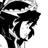
When I was working on Captive of the Orcs, I got lots of critics due to mistakes in the text.
I'd like to get your feedback about dialogues and about font size (if I should make it larger).
Thank you!
Rino99
2019-09-10 03:53:05 +0000 UTCRino99
2019-09-10 03:52:18 +0000 UTCRino99
2019-09-10 03:51:54 +0000 UTCRino99
2019-09-10 03:49:50 +0000 UTCRino99
2019-09-10 03:49:41 +0000 UTCR_Gre
2019-09-09 13:54:11 +0000 UTCGene Cahill
2019-09-08 17:01:33 +0000 UTCleave2gether
2019-09-08 10:34:06 +0000 UTC