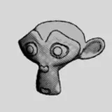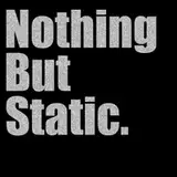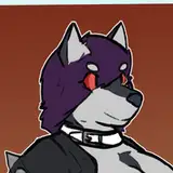
My first pass on a logo for NTO from the wayback. Not greatly worse than the actual current logo but the aspect ratio unfortunately made it better suited to being a bottom shelf bourbon label than a title treatment for a comic bound eventually for print.