Hello patrons and happy summer! I hope you’re doing well and ready to do some mid-year reflecting, because I know I am.
I’ve talked a lot about this before, but I’m in the middle of two big different projects: illustrating my first book client project finals, AND reassessing my art and practice! I think one factor of my recent art block has been a feeling of stagnation and disconnect with my personal art. I’m not liking what I make or have made, which tells me I need to refocus, question, study, experiment, and make some dang art to find what I DO like again.
One key practice in making sure that I’m making the art that I want to make is HONING my INFLUENCES. I believe that all artists are drawing influence from some where, whether they realize it or not.
I once knew an artist who didn’t want to study art because they didn’t want to be influenced, because they thought by not paying attention to other art it would make their art unique. But of course they’d looked at art before in their life and were therefor still influenced, (in my opinion by surrealism and psychedelic art.) And by refusing to acknowledge their own influences, they were conversely even more influenced, even less ‘unique’.
Drawing is a series of visual shorthands, and all artists get those shorthands from other artists or from the world. I VERY OFTEN feel paralyzed by the need to be ~absolutely unique~ as an artist, for fear of copying someone else or seeming derivative. But that’s just the thing, all art is both derivative in some way and unique to you as the artist because YOU are a unique person, with a unique set of influences, interests, preferences, and muscles. The key is to be aware and purposeful with your influences, to draw from a wide array of influences, take a small piece from many, and to put the pieces together into something that is uniquely you.
Instagram has been an accidental huge influence on me, and I think that’s part of what happens on social media. There’s a lot of artists who’s work I love, and a lot of artists that I follow or look at a lot, but just because I like an artists work doesn’t mean I want it to influence my own art. I feel like spending a lot of time on Instagram makes me make art influenced by Instagram Art, if that makes sense. It’s too much art, and too much art that isn’t the kind of art that I want to make. Again, doesn’t mean I don’t like the art of the artists I follow, it just means god damn Instagram becomes the biggest guiding force on my hand and mind. And that I don’t like.
So today, I’m going to do some analysis of a few of my current favorite contemporary artists and illustrators, with the hope of being purposeful with my influences and making art that I like. I’ll break down their stylistic elements that stand out to me, and elements that I’d like to experiment with bringing into my own art. I also plan to do studies from their art, to try to imprint some of these techniques into my muscle memory. And then: a dash of these techniques, a scoop of my past, of my present, a cup of historic and other design influences… and hopefully I’ll be on track to making a tasty new art soup. Metaphors! Let’s go!
. . . . . . . . . . . . . . . . .

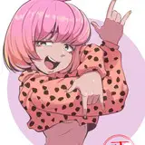
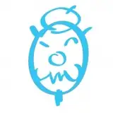
+ Pam Wishbow - Illustrator, screen printer, metal smith, artist who also lives in Seattle! One of my absolute favorites.
Subject matter: Her everyday life/surroundings/herself. Occult symbolism - crows, birds, skulls, keys, candles, fortunes, snakes, chains, locks, knives… People, nature. Animals.
Possibly influenced by: Mid-century modern design and illustration. Screen printing. I get an ancient Egyptian/ancient carvings vibe as well, my terminology fails me here. Mid-century design mixed with occult/ancient symbolism and screen printing? Amazing.
Colors: Black, yellow ochre, sage green, clay red, grey, cream.
Design elements: Screen-print inspired transparent layers of color. Inky, chunky, highly variable linework. Often centered composition. Traditional, Victorian (?) framing techniques- oval, square, circle, window shapes, with ornate framing designs. Fluid, overlapping shapes interacting with each other in unexpected ways- animals fighting or chasing each other, bodies being cut to pieces. Gestural texture and linework to fill a composition. The absolute COOLEST HANDS. Interplay of positive and negative space.
++ Elements I’d like to try: I’ve already started trying the screen-printing inspired transparent layers. Chunkier linework. Highly exaggerated shapes. Making amazing compositions with simple subject matter.

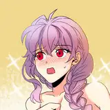
+ Eva Stalinski - Screenprinting, ceramics, illustration.
Subject matter: Furniture, bugs, animals, household items, vegetables and fruit) with whimsical/playful elements- including a technique I call “Faces on things that don’t have faces”. Sometimes forests or parks.
Possibly influenced by: Zines. Graphic Design. Classic cartoons.
Colors: Pastel pink, baby blue, yellow, white and black.
Design elements: Wobbly, hand-drawn linework. Inconsistent line weight adds to the hand-drawn look. Flat colors and flattened perspective. Combines a variety of patterns within linework, solid color and negative space. Chaotic, overlapping patterns. Areas of flat color are scribbled in/ textured.
++ Elements I’d like to try: Design-ifying every day objects. Loose/imperfect linework and design. Being sillier with my art.

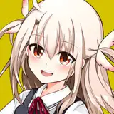
+ Yuk Fun - Design and illustration duo - Lucy Cheung (she/her) & Patrick Gildersleeves (he/him). Apparel, prints, zines, other illustrated products.
Subject Matter: People doing things and animals doing people things. Weird little animal people combos. Expressive characters. Meta elements - like a big pattern of animals, and a little painter animal painting them. Use of big bold funny simple text - “Yes Mate” “Yawn” “Nice One”
Possibly influenced by: Vintage, psychadelic design. Zines. Children's books from the 70s. And maybe the Muppets/Sesame Street?
Colors: Hot pink, light teal blue, neon yellow, red, purple, gold... Quite a variety.
Design elements: Big simple designs with lots of negative space. OR! Playful filled up patterns with imperfect alignment and overlap. Generally clean linework. Graphic shapes with asymmetrical or otherwise imperfect elements.
++ Elements I’d like to try: Expressive characters with fun details. Exaggerated and playful shapes. Being sillier with my art!! Making more apparel/products.

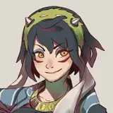
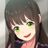
+ Marlowe Dobbe - Illustrator, game artist, animator, ceramicist in Portland.
Subject Matter: People. Character Designs. Game art and fan art.
Possibly influenced by: Games, cartoons, animation. Graphic design. Comics.
Colors: Purple, hot pink, red, teal blue, dark blue, grey.
Design elements: Flat colors interwoven with textural spots and linework. Textures include comic-style Ben Day dots, pencil scribbles, paint brushes, crayon, gradients. Analogous colors for linework, and variety of color palettes.
++ Elements I’d like to try: Expressive characters with fun details. Exaggerated and playful shapes. Being sillier with my art!!
. . . . . . . . . . . . . . . . .
+ Lightning Round! So the above four artists and designers are probably the most common artists that I continually and purposefully return to for inspiration, so I think it makes sense to analyze them more closely. But I’d also like to quickly share a few more artists that I am very inspired by, even if their illustration paths differ quite a bit from what I think I want to do (whether that be more editorial/commercial art, more children’s books, etc. that said I’m not exactly sure the path I’m aiming for with illustration, so…) Still plenty of elements I‘m always inspired by, so I‘d love to share them!


Okay I’m going to stop myself there!
It’s really hard to narrow my favorites at the moment down, but it honestly feels incredibly helpful. Like by looking critically at my favorite artists and seeing commonalities, what elements make them successful or notable, what types of jobs they get with the art they make… and how my art does or doesn’t use similar elements, I can get a much better picture of how I want and don’t want to make art.
There are some artists who I thought where my favorite on a surface level, but when I thought more about it I realized I didn’t really want to make art anything like that. Put another way: I might like how their art looks online or in theory, but when I thought about if I’d actually buy their art or hang it on my wall, I actually didn’t like it that much. It’s just a great exercise in developing your contemporary art *~Personal Taste~*
. . . . . . . . . . . . . . . . .
+ What did I learn? I see some big commonalities in these selected illustrators that can help me direct my own art. It seems like I like art that is:
I can see TONS of ways that I should bring these elements into my own art. I know that the biggest thing that I want to move away from is tightening everything up so much in my art, keep it loose and fun from start to finish! I think it’s my architectural education coming back to bite me, everything doesn’t have to be cleaned up and aligned perfectly in illustration!
. . . . . . . . . . . . . . . . .
+ Now it’s your turn! If you’ve never done an analysis of your influences like this, let me invite you to do it now!
Make a list of your favorite 8 artists, (try to keep it not more or less than 8 for now). Save a few of your favorite pieces of theirs to a word doc or Pinterest board. Next, go through and do a quick analysis of their art, most importantly noting what specific elements you like about their art. Then go back and look for commonalities, and how you might incorporate specific compositional tools, materials, colors, linework styles, subject matter, etc. into your own art!
Now to really seal the deal, do studies from your favorite artists work (just for your own practice, not social media.) And finally, try adding your favorite elements to your own personal art.
In doing this, you might find that you’ve been too directly inspired by one or two very specific artist, and that‘s a great time to improve your own art by diversifying your influences. Don’t just open a can, keep adding ingredients to the pot until you have a Uniquely You Art Soup!

(For a lot more information on this concept, check out the excellent book “Steal Like An Artist” by Austin Kleon.)
Feel free to share in the comments or in the Community Tab if you do any part of this process. I’d love to hear your own analysis of your favorite artists and ways you hope to more purposefully direct your art in the future. It can be as thorough or as quick as you like, or you can also just share your faves!
I hope you find this process as helpful as I did, and that it inspires you to go through it yourself.
Thank you so much for joining me today, bud. See you in two weeks with my June update!

pandorama-art
2021-06-26 10:53:08 +0000 UTC