Daily Update: Something (Perhaps) Unexpected
Added 2018-05-02 02:57:11 +0000 UTCEventful things! Development! Winds of Change! Prophetic Ramblings!
Conceptually, I could have ended the update there. But I owe you more than that.
Today’s task list was an interesting combination of unrelated things. I had to get Felipe an updated Style Guide (see below) send our Reddit guy some new assets (including an updated background and header image), push through as much video outlining as possible, and—hush ye all with proper anticipation—draft a new logo and wordmark for Tale Foundry.
This is something we’ve been trying to figure out for a long time. The Tale Foundry splash image at the beginning of each video is fun to look at, but incredibly unwieldy from a design perspective. If we want to fit it in a small space (read: the spine of a book, or more relevantly, a wax seal on an envelope), do we just scale it down and push the T and the F off-center? Do we just shrink the quill and offset the whole thing? How many of the gears from the splash image should we include? Are the T and the F gonna be visible when the image is scaled down? Are they even attractive, or does it just look like random-font letters haphazardly embedded at the center of some PNGs? These are just some of our gripes. Needless to say, it’s been a bit of a branding nightmare.
I’m fairly capable in Adobe Illustrator, but for time constraints we were thinking we might just have to break down and hire a graphic designer to come up with a decent replacement logo for us. Then, during the note-taking process for this video, I ended up doodling something in the margin that just… clicked. After countless arguments, Chloe and I looked at each other and we were like… yeah. Yeah, that works.
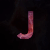
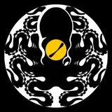
Here’s what I came up with:

The reason we like this one so much is several-fold. First off, it actually has a wordmark. That might not sound like a big deal, but it really is. Sometimes you need to have a recognizable symbol to slap on something that isn’t surrounded by gears and ink and feathers. So far, the closest thing we’ve had to that is a T and an F in a weird font. Not really cutting it, so this thing is a blessing. After that, we have the fact that it’s bloody centered! What a glorious thing to be able to pivot your logo and not have it go haywire, hey? It’ll definitely come in handy. Third (and finally for now), it can scale down nicely to fit in a circle. That becomes relevant in more situations than you’d ever believe.
The best thing about this, though? After this paycheck, we should finally be able to commit to a custom wax seal for our Patreon lifetime letter reward! Thank god. You’ve all waited long enough to have something in Talebot’s chicken scratch arrive in your mailbox, haven’t you?
So that’s the big exciting thing for the brand right now. It won’t change a whole lot in the grand scheme of things, but it does feel really good. You can expect us to attempt rolling this out pretty soon. First I need to change it from a draft to an actual vector graphic, then it begins to appear in our videos, merch, etc., etc..
As for the list, it’s chugging along. We’re only two people (for now) and there’s a lot to do for a show like this. It feels like we’re cresting that developmental slope, though. I’m much of the way through this outline, and Chloe’s been gathering assets like a maniac.
Next order of strictly non-video business? Figuring out our new patreon weekly schedule. These daily posts are a beginning, but just that. Regular think tanks ought to be next.
Love you all. You’re wonderful people. Thanks for reading, thanks for your support, I’ll see you tomorrow at the latest (if I don’t see you on Discord sooner ;b).
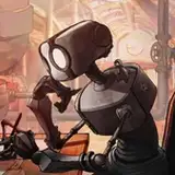
Also, that update Taleoid Style Guide I promised y’all. Enjoy:

—Benji