When it comes to comic book covers, what do you think? What makes a good cover to you?
I've posted here a collection of V chapter covers. The top row are existing comic covers. And i wanted to take a moment to talk about them before i talk about the bottom 3.
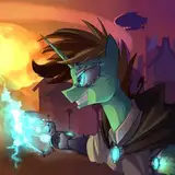
V vs the Kinky Kunoichi Klan: I wanted an image that had V 'in the spotlight', as it was her debut. But also belies her nature as a distress-prone vigilante. She's confident (maybe too much so). But she's also struggling hard (in some cases literally ;)) to make it.
V vs the Generic Thugs: This is by far my favourite of the covers. It just works in a way i don't feel like any of the others posted thus far come close. It shows V, front and centre, helpless and confused. Like she doesn't know how to face this vague enemy. Meanwhile, the titular thugs flank her on either side, smugly smirking over their work. And the ominous face of L watches over all of them from behind - almost symbolic of her role in the story: ominously present, but very much in the background.
V vs IQ: I hate this cover. I feel like it's not what it should be. I mean, i didn't start off hating it (otherwise i would've never drawn it). But what i hoped would be V bound up in an intricate web, as helpless physically as she felt mentally, just looks like a generic "V in a spider web" pic. *sigh*
V vs The Vampire Hunter: This cover feels like it's missing something to me. Maybe V just doesn't feel as prominent in this one...
Athena standing over V and the use of colours (Athena's red and black instead of V's gold and black (and pink)) was meant to show that Athena is the dominant character in this issue.
The plaquards imply the idea of death (even for an immortal like V). It's supposed to be a glimps into the dark tone that's coming. But the comedy of the various names on the other plaquards is there to show it's not going to be completely bleak. It is still a comedy, after all.
But enough of that. Moving on.
The bottom three pictures are linearts of ideas i'm kicking around for the next comic: V vs the Golden Samurai.
Their pictured in the order i drew them.
Vesrion 1
The first one i drew with the idea that V is helpless to this great warrior. Unable to fight her in any meaningful way, all she can do is look up meekly (at her) and hope for the best. The ideas are solid, i think. But it just doesn't feel right. And part of that is because i just don't think V looks cute enough in her bondage. This is still a DID comic, right? I want to have something appealing in that regard too.
Version 2
Much more bondage-y. V is being tied by her opponent and looking back with great helplessness. I like it for this. But it feels too much like a generic picture. Nothing that interesting going on.
Version 3
V bound up in front, looking up forelorn while the spectres of Laura Strad (left) and Golden Samurai (right) hang over her (symbolic of how their actions will/are going to hang over V in the chaters to come).
Little more symbolic... BUT, i don't like the weak bondage element. Nor do i like the strong 'helpless' element. V looks like she's 'resigned' in this one, as opposed to just helplessly tied. I may be channeling something internally for that... or maybe something from the future. But it's just not the right 'look'.
They all have pros and cons. And truthfully, i'm still on the fence about them.
So i ask you, dear reader. What do you think? Which one do you like? Which one should i make the official cover? Or should i trash'em all and start again?