When I make thumbnails for a video, I usually work through 2 or 3 entirely different iterations before I land on a design that really works for me. At that point, I make small tweaks to it all the way until the video releases, sometimes seeking input from close friends, or my MCN (multi-channel network) manager.
In the case of The Mandalorian video, I went through far more iterations than any other thumbnail to date. It speaks volumes to the aesthetic of the show (and it's lead character) that there are *so many* interesting designs, poses, and portraits of the Mandalorian out there; from posters, to T-shirts, to even the tote bags I would see at my local grocery store while working on this video. Evidently, there would be a lot to think about leading up to the final design.

This was my first attempt at a thumbnail for this video. I was curious to see if the landscape approach would make for an appealing thumbnail (kind of like my Cyberpunk thumbnail), but ultimately I concluded it was far too flat looking to experiment any more with.

This was the first thumbnail I kind of liked. It emphasized the "odyssey" aspect of Mando's journey well with its dynamic background, you have the "western" sunset in there, you've got a nice gradient in the background, the art-style paired well with thumbnails like the one I had for the Rebels video, and I could do some fun layering with Mando's blaster and Grogu over the thumbnail border. I think I moved away from it because, again, it seemed too flat, but for different reasons. I wanted to move towards a different color scheme for the background, and the title font just wasn't quite there yet.

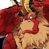
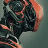
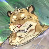
Here's where things got interesting. I follow a website that auctions art and markets fandom-related artwork called Bottleneck Gallery (I highly recommend checking them out, I've gotten so many posters from them in the last few years), and they do sales for Mandalorian-related art pretty regularly, given the popularity of the show. That's where I stumbled upon an amazing poster painting by Pablo Olivera (who you should also follow on Instagram) of the Mandalorian in the action pose you see above. This had far more of the energy I wanted from the thumbnail, and satiated the "Gunslinger" aspect of the title, which was a bit more attention-grabbing than the Odyssey part.

I took this through several small tweaks, but received lukewarm reactions from my friends every time, so I moved away from it. Admittedly, this design leaned a lot more into the big yellow-text clickbait thumbnail that you see a lot on YouTube, which was not a trend I wanted to embrace. So I moved away from this design for a while.

By now, I wondered if I was maybe overthinking my approach to the thumbnail. Maybe it would've been best to settle for something iconic and recognizable. Basically, a more textured, dynamic version of that very first thumbnail design I did. Everyone who's even remotely aware of The Mandalorian has seen this design. It's iconic and attention-grabbing. The yellow-orange background made a striking contrast with solid black letters. This is where I found a font I really liked too, playing around with the size of the first and last letters to give the title an interesting shape. While the thumbnail really worked, I was still dissatisfied on a deeper level. It didn't represent the video well enough.

This was very, very close to becoming the final video thumbnail. I took a popular piece of Mandalorian concept art and, essentially, dumped a rainbow all over it. I like colors; the more the better, and this design had all of them. The Mandalorian's armor particularly had such an interesting and colorful quality to it, like Joseph's coat of many colors in the Christian Bible. The colors, to me, also represented the multitudes of change Mando would experience in his journey, moving behind the monochrome look he's always presented with. However, the greatest strength of this thumbnail is also it's greatest weakness. The color obscures the recognizability of the Mandalorian just a bit too much.
At this point, I presented all my thumbnail designs to my MCN manager, and asked for her feedback. She told me to revisit one of my older designs, and make some crucial tweaks.

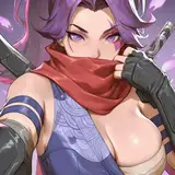
In the end, the action-oriented pose of the Mandalorian made for the best thumbnail. The border was removed, Mando was made brighter and bluer, the background went from yellow to blue (with a very similar texture to the background of the previous design), and I used the font from the previous two designs here, just with a yellow-orange gradient to make a good contrast with the background. I could've easily kept making thumbnails, but this one ultimately captures the video better than any previous design, while also matching the style of my other videos' thumbnails.
There's one last design I will share with you, however.

This thumbnail is dated December 1st, 2020. That was before the end of The Mandalorian's second season, before I made videos on Mass Effect 1 and 2, Bad Batch, Rebels, and Cyberpunk, and before my channel had reached even a thousand subscribers. In fact, I think I had about 250 at the time. I've been trying to make a Mandalorian video for a very long time. It was genuinely going to be my next project after the Fallen Order video in 2020-- until I realized I wasn't ready to make it yet. Though my approach to that video was apparently a bit different, a lot of my original ideas and notes for that video carried over into this one when I got to work on it earlier this year. It's fun looking back, but also, a bit humbling. To see the evolution of an idea overtime, to understand why it's evolved, and to see how much I was able to elevate it from that original concept. In a cosmic sense, it's a reminder that there may just be a right time and place for everything, but in a more general sense-- its a reminder of what you've all empowered me to do with my ideas overtime. I wouldn't have gone to the lengths I did with The Mandalorian video if I didn't have an audience who embraced my content with open arms through every upload since 2021. It's one of the best feelings and greatest blessings any creator can ask for, and it's something I certainly don't take for granted. Thank you.
I hope you've enjoyed this journey through the thumbnails for The Mandalorian video. Stay tuned, I'll be sharing script-related stuff later this week! :)
Nerdverse
2022-10-06 22:36:53 +0000 UTCAllthesenate
2022-08-02 23:11:31 +0000 UTC