OTGW Traditional Commission Process
Added 2020-08-24 19:43:17 +0000 UTCWow, I have to admit I'm a little nervous. I share process work on my instagram story often, but have never outlined it in the detail I will be delving into here. You will quickly realize that a lot of my process--especially with traditional media--is a massive mystery until the last 20% of the piece! Alright, jitters out of the way, let's begin! I will be covering the process on this piece:

For some context: This was a commission from a client who saw my first Over The Garden Wall screencap redraw and said his girlfriend was so fond of it, she wanted one herself. He asked that instead of doing a literal screencap redraw though, I create my own sort of shot using pre-existing characters, elements and environments from the show. In this case, we decided to go with Wirt, Sarah and Greg (and Jason Funderburker the Frog) sitting around a campfire in the graveyard.
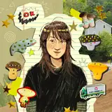
I started with a digital thumbnail done in procreate (lineart: 6B Pencil, value: mercury) to make sure the client was satisfied with the composition:

From there, I moved on to the final. This was done on a piece of Heavyweight Strathmore Bristol (vellum surface) that I cut down to 8 x 10. This has been my paper of choice recently, mostly because I am waiting for some watercolor paper to arrive, which I sometimes prefer for a paper that holds wet media a bit better. Otherwise, I really enjoy the smoothness of the bristol which allows for more detail!
I tape down the edges with masking tape so that when I apply wet media, the paper does not curl up like wild.

I take note of the candles and hot beverage because it is partially on-brand (hehe) and partially necessary to my process! I think of it as a ritualistic approach, or perhaps classical conditioning. Ring the bell, the mouse gets cheese. But in this case, candle + hot drink = work time. It is my motivating trigger, plus it's just generally pleasant. Pavlov's illustrator.
Here are the materials I will be working with today:

- The watercolors were a gift to me from a friend while I was traveling in Japan a few years ago, so I'm not completely sure what specific model it is, but I am almost sure it is a Kuretake set similar to this one.
- The gouache (in tubes) are a combo of Holbein (cadmium red, magenta, cyan, white, black), and M. Graham Co. (yellow). In my opinion, the CMYK set of Holbein is the best deal you can get + a larger tube of white. BUT you just cannot achieve that striking red that a straight cad. red achieves, so that's why I decided to splurge and purchase that. I prefer to mix my gouache rather than getting pre-mixed. I also believe it gives you a better concept of how color works if you mix your own! (I say this as I bite my nails and eye a few gorgeous pre-mixed earth tones on Blick's website...)
- The colored pencils are prismacolor. Not much else to say on that. They get the job done.
- the brushes I use for the initial blocking in of color and shadow are usually bamboo brushes, and for gouache shapes and details I have been using a cheap set of brushes I got from Joann's that are Royal & Langnickel. For watercolor and gouache I could paint with a dry stick and be satisfied--I am by no means a brush snob.
Okay let's begin painting, yeah? With every piece I birth from my brain I like to start with a wash to give the whole thing and overarching tone/theme. The graveyard from OTGW has a sickly mint green hue, so that's the base I chose, even if the fire light itself will end up being warmer.

Yup. Not much to look at. I watered down a mixture of a minty blue and leaf green from my watercolor set and applied it with a large bamboo brush.
After this wash dried, I put down the sketch with a 2H pencil which will inevitably get absolutely obliterated, so I'm not too careful or precise with it.

Here's a closeup on our pals Greg and Jason Funderburker:

Now that I have some shapes to work with, I blocked in some shadow shapes with that same minty grey (just added a touch of black to the original mixture), and though this doesn't do much for the actual piece, it gives my brain some sense of progression.

And then I take some deep breaths and (try to) gain more confidence as I place a couple more dark values where I know for a fact I will have my darkest values happening in the end.

In this case, I am trying to frame our friends around the fire. I create this "frame" by adding shadowed foreground elements such as the gravestones and tree branches. Framing devices are what I use when I feel my composition is lacking depth.
Now, I want to take note of something that you might notice and I certainly noticed and that is the fact that this is messy as hell in certain areas. In fact, certain parts just look straight ugly. Some edges don't make sense. This is normal. My work is usually "ugly" up until the 80% completion mark, and I think most artists experience this (right?) I am still learning to have faith in myself and my process, but I am getting better at it. Below is an example of the thing I am talking about.

Why don't I just further prove my point above by showing you this photo that I took at a severe angle to try and hide the fact that I was thinking fuckfuckfuck at this point.
I went in and added some red watercolor to the few points in the piece that I knew would be my hotspots of red. Putting a little bit of reddish pink even in areas where they might not normally belong (such as Sarah's pants) can create unity in the final, even if it is just added in the underpainting stage and eventually covered up. You'll see this later, but I often use a red colored pencil near the end and place little hits of red all over the place to tie everything together.

Next, I dipped into the gouache to start carving into the background. I mix my gouache with a bit of water, but not much. I want it to keep the thickness and chalkiness but be able to move it around on the surface with ease. In this particular case, I moved quickly so that the gradient would mix well on the bushes.
I don't mind too much if the gouache overlaps foreground elements such as the characters at this point, because I know I will be using gouache on them closer to the end which will cover up any overlap. I actually prefer to "break" the edges instead of pushing the paint only up to the edge of the sketch because--coming back to this word--it creates more unity (perhaps I should say integration?)

Now I want to establish my sketch by bringing it back a little, using a dark blue colored pencil. Sometimes it is scary to let go of your sketch completely because you might go
oh shit Wirt sure is armless now huh
and for me, doing this bit of refinement with a colored pencil puts my mind at ease if I begin to worry that I will lose important elements and not remember where they should be places. You can also see I started adding the black shape of Sarah's hair with gouache.

Let's continue with Sarah! I begin to shape her into a real human by blocking in her shapes with gouache. I use a larger brush than you might think, and prefer to save the small brushes for the details and refinement. Right now I am still thinking with large shapes.

Sarah then received a little bit of colored pencil action. My process is a lot of back and forth between media, never 1,2,3... but more like 1,2,1,3,2 etc.

And I continued on with that back and forth media approach, bringing Sarah to 90% completion (minus some details, lighting and appendages). I blocked in some of Wirt and Greg with gouache. You'll notice the background also got some colored pencil treatment, in the trees, gravestones, and hills.

I realized i should probably start blocking in the logs they are seated on at this point, and used exactly the same approach as the characters: gouache blocking, colored pencil details, textures and lighting. So long as your gouache isn't too thick, the combo between them and colored pencil can be magical to work with.

Now to begin any sort of semblance of a light source, I wanted to bring in some colored pencil details so I began with a warm glow on Sarah, and some structural refinement to Greg's teapot hat. I also took this time to intensify some of the darkness in the background hills, the trees, the log shadows, and the gravestones.

Now, it is a graveyard after all. So that usually means the presence of headstones, some spooky dead trees, maybe a sexy little iron fence. I added the base shapes of the headstones with gouache in the same color as the hills, and blocked in rough shadows with black colored pencil, as well as adding a very faint iron fence as to not distract from anything happening in the middle/foreground.

Some zoom-out action for you on that:

For me, Over The Garden Wall isn't complete without a branch of some autumn leaves, and it is a popular motif I use in my work (genuinely I think there is nothing sexier than a dark branch and sparce red leaves), so I painted in a smattering of gouache leaves. I kept this gouache mixture fairly thick so that it was opaque enough. Adding even just a little bit of white helps to achieve this!
You can also begin to see those red colored pencil hits beginning to appear as I had mentioned earlier. I did not want Wirt's hat to be the only red thing in the composition, because I did not want it to distract from the rest of what was going on.

Finally, it's time to carve out our favorite half-brothers' faces! I went in with gouache (a mixture of mostly white, some yellow, and a touch of cadmium red) fairly thick so that this could be a one-and-done coat. The effect at this stage ends up looking a little...spooky.

I have to admit, there appears to be quite a large gap between the previous photo and the next one. I think I got really in the zone and had what I like to call an art blackout. This is also my first time documenting my process so in depth, so please don't throw any tomatoes (or pumpkins) yet--next month you can certainly do so if I goof up again.
Basically, it was a lot of colored pencil refinement on faces, as well as some gouache lighting adjustments on Wirt's face. Sarah gained appendages (yay) and our fire was born. Fire has always been hard to draw for me--how do you stylize it without making it look like the fire 🔥emoji? Or avoid making it look too realistic in an otherwise stylized illustration? I started with a very light yellow gouache shape, then worked outwards with gouache and colored pencils, leaving the hot center of the fire almost white.
Additionally, I finely splattered the illustration with white paint using my thumb against a stiff, worn brush. This gives the piece a noise/grain and brings me much satisfaction to do.

Texture is a friend, if you couldn't tell.

The final addition was Jason Funderburker the Frog, created using the same techniques as mentioned above.

I have learned something after many, many previous mistakes. Before slamming the brush down and saying "boy howdy, I am done with that" and ripping off your pants,
Maaaaybe check to see if you are actually done. Stand up, look at the piece from a distance. Double check to see if any fingers are missing, squint at it to check values, etc.
For example, Wirt is missing the gold buttons on his shawl, and Sarah's American flag patch is, well, just a white surrender flag right now.

And it was a quick fix:

....Then I could slam my brush down and rip off my pants.

And that's that on that!
I really do hope you enjoyed this. These tutorials will be a little different every time, and sometimes digital rather than traditional. Procreate timelapses aren't out of the question either! I'd really love to hear from you if you have any questions on this specific piece, or if you have a request for some particular tutorial. Since you are a patron, my email inbox is open for you to scream in my general direction--if you loved this or hated this--regardless, let me know!
I had a blast documenting this and giving you a little more insight into how I make my work. Have a magical September wherever you are, stay safe, and much love.

Comments
I recently became a Patreon and so I wanted to follow you on your journey from the beginning. Best choice. Can’t wait to go forward from here.
Aditi Kakade Beaufrand
2021-04-04 22:57:48 +0000 UTCHey Camila!! This is so good to hear. Sometimes after working on digital art for too long I realize how bloodshot my eyes are...and that's when I know it's time to get up and go back to traditional for a little bit. Your body just needs it sometimes, and I think gouache is such an awesome (albeit difficult to navigate) media.
Jamie Green
2020-09-18 12:49:11 +0000 UTCThis was super insightful and thoroughly enjoyable to read!! Thanks Jamie ^_^
Dora de Norie
2020-09-16 09:34:51 +0000 UTCwow i loved reading this jamie thank you so much! I've been getting into gouache as well and i love it, i think it's been better for me to not stay all day in my computer even if that meant making digital art... i was craving change and this step by step gives me a lot of ideas! Love!!
Cam Estela
2020-09-13 02:51:18 +0000 UTCThis is so interesting to me! I like to get the idea of how the art is created. :)
Cassidy
2020-09-07 21:44:28 +0000 UTCHanna my love! Yes, it's a bit of a "panic process" in my eyes. Me going in with the gouache and then saying "aw shit" and quickly fixing it with colored pencils, and so on. There's no rules when it comes to the order though! Mixed media with no limits!!
Jamie Green
2020-09-03 20:52:25 +0000 UTCThis is a really great in depth process post!! I've always enjoyed your little process stories on insta, but reading along as you go adds so much more! Traditional art has always been very final to me, like every mark I make is how it will stay forever, and I'm trying to get passed that! Its also very hard for me to diverge from my initial sketch, but I like the mindset of being okay with it getting "absolutely obliterated" lol. Seeing stuff like this is definitely helpful for getting out of that mindset! I'm very excited to see the new process posts to come!!
Ambie
2020-09-03 20:12:49 +0000 UTCThis was great! I think the thing missing most from process videos is the explanation of why the artist is making certain choices. They are always lovely to watch and relaxing but its not exactly informative to just watch someone be brilliant with no idea why they're doing things. You really took your time and explained each step which I really appreciate!
Jameela Wahlgren
2020-09-03 13:10:37 +0000 UTCI'm so keen to start getting more use out of multiple mediums at a time (i love inks, watercolours, gouache and colour pencils, but I rarely combine them!), this process is making me incredibly inspired to give more of a mix a go (I was incredibly pleased to hear you do a lot of back and forth between media (i.e. "never 1,2,3... but more like 1,2,1,3,2") which makes it feel way less intimidating! Thanks for this detailed insight into your process!
Hanna Mancini
2020-09-03 02:43:21 +0000 UTCBack when I lived at an apartment with a balcony, I used crystal clear spray fix! Unfortunately I don't have a proper place to do that as easily now.
Jamie Green
2020-09-02 23:45:54 +0000 UTCdo you do anything to your pieces to seal them? :o absolutely lovely! <3
Hannah S
2020-09-02 23:24:41 +0000 UTCGOD i really thoroughly enjoyed this :’))) been mega curious about your process and im EATIN IT UP. Thank you for the meal!! 🙏
spiceman2000
2020-09-02 19:04:51 +0000 UTCIt's so comforting to understand the "ugly" stage of painting is part of the process. Illustrating with opaque paints stresses me out for that reason. Now I have a bit of a clearer understanding and will give gouache another chance down the road. Thank you Jamie! <3
Kassidy Daussin
2020-09-02 06:28:56 +0000 UTC