Behind the Scenes: STP Lighting Preset Room (part.1)
Added 2023-01-18 06:43:53 +0000 UTCIt's been more than 2 years after STP and its first lighting preset room came out. I didn't make up my mind, and also didn't have enough time to write down its whole story, until now.
Most of you may not be interested in it; still I want to record all the things behind the scenes. This could be a long story, and thank you so much for having enough patience if you finish reading it. Hope it's not so boring at least.
Sorry if there's any wrong with my English.

There is 15 published lighting preset rooms now. But there's more behind the scene.
At first, I didn't plan to make and publish STP lighting preset rooms. I just built some rooms to take screenshots of STP lighting, and saved some of them in game, in case I need to take more photos of the same lighting effect in the future.
But after STP and the tutorial came out (domestically), I was asked many times about 'how to use it', 'when to use PL-soft, when to use PL-hard', 'is there any recommended position for light', 'is there any lighting preset', and so on. It would be quite hard for me to find out the exact reasons why people couldn't figure it out with the tutorial. I guess maybe it's not easy for the beginners to understand, or maybe it's too long for people to finish reading it. I failed to optimize the tutorial, so I tried to make some lighting preset rooms, which hopefully bring convenience and help STP beginners better understand the usage of STP.
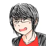
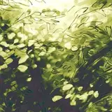
No.19 「Pearl」

I don't know if there is any person who are curious about the serial number of STP lighting preset rooms. Among all the published rooms, it seems that the earliest is No.21 'Aquarium'. But before that, there is a No.19 called 'Pearl'. The serial number represents the order of the related posters. And the poster above is the 19th posters of STP collection.
After finishing building this room, I forgot to add the sim position (or location?) mark when taking screenshots, so it's hard to get the similar lighting effect through this room. I only sent it to one of my friends.
The lighting effect of No.19 is shown in this poster, and it's quite simple. It's just white light outlining part of the face. But it shows how small could the lighting area of STP be. People can use it to add a tiny small light on sim's nose, which is quite different from a reflection of light brought by the skin or makeup.
This poster is also the poster of STP eyelens cc 'Glitter'. I wanted the feeling of ‘softly shining’ or 'soft luster', so I named No.19 'Pearl'.
No.21 「Aquarium」

The lighting effect of No.21 is quite simple too. Mainly consist of cold white light and blue light. I set Koi's hair as white, so that people can easily feel the purity and intensity of the color of STP lighting -- part of Koi's hair is like dyed blue.

I put the sim position mark this time. But it didn't strictly follow the floor grid in game, so it's hard to get the specific position of sim again. I haven't noticed it for a long time. This problem occurs in all the lighting preset rooms of STP Standard. When using them, people may get part of the lighting effect most of the time, but it's hard to get a very similar lighting effect as shown on the poster, unless the position, bodyheight, pose of sim are all very similar to mine.

The area of overexposion is a little bit too large on the above poster. I was getting used to STP at that time, so the lighting skill may be not that good. Still I love the vibes of this lighting. Slightly cold, quiet, tender. I planned to name it 'Underwater'. But on the poster, Koi was like a creature behind the glass which reminded me of aquarium. So I named it 'Aquarium' at last.
No.23「Memory」


This is the first (domestically) published STP lighting preset room, as the quick start for STP beginners. It shows the basic mix of Light Intensifier and Shadow Intensifier. There are only 3 intensifiers (lamp) in this room. I guess it will be quite easy for people to figure out how to use them through this room.
Both light and shadow is soft in the poster. It's like memory of good old days, a little bit blurry, but still brings us warmth. So I named it 'Memory'.
No.24「Neon」


I know some people get to know STP because of this poster. Among all the lighting preset rooms of STP Standard, it's the most complicated. I designed this lighting to show the advanced mix of Light Intensifier and Shadow Intensifier, and stress the choice of shadow color. Most importantly, it needed to be enough attractive for people. Given that both shadow color and light color need to be catchy on this poster, I made the lighting effect neonlight-like at last, and named this lighting preset room 'Neon'.
It's funny that I did take some photos of neonlight before I created STP. I didn't have other photography-lighting cc. With just Maxis lighting, I did all my best and it's like:

So, in spite of the differences of lighting effect between STP and Maxis normal light, I guess the huge differences between these two pictures above is due to the progress of my lighting skill. STP pushes me to practice taking photos more. My lighting skill is better now than before.
No.25「Dawn」

This time, I wanted the poster stress the biggest feature of PL-hard lighting -- the gradient-color light boundry. I chose a sim with light-color hair and big eyes as model, so that the gradient boundary could be clearly seen by people, and that this screenshot could be the poster of STP eyelens 'Control' too.

(Sorry that I actually photoshopped the clothes and necklace of the picture above for some upload-restrict reasons of some platforms)
I set the PL-hard light color as orange, which brought an orange-to-golden gradient color boundary like sunshine on people's faces. And I set the shadow color as purple, so as to bring a little contrast of color temperature. This brought me the feeling of dawn somehow, so I named it 'Dawn'.
No.26「Blast」

I took the screenshot and made the poster (motion blur and my mark added), but gave it up at last. There was just the red soft light on the left as main light, and green hard light on the right which outlined sim's face. I didn't see the point of publishing a lighting preset room of simple lighting effect like this. So I gave it up.
Still I love the contrast of catchy red and green, like blast of magic power. That's why behind placed the Hexagram lamp of LMC.
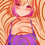
No.27「Rainbow」

Another complicated lighting preset room of STP Standard. I wanted the poster show that 'STP can bring various color of light within a small area'. So I made a rainbow lighting effect. The rainbow color can be clearly seen from the sweater. Yellow from the left, and then orange, pink, purple, blue, and light cyan on the right. Without the light, the sweater itself was light-brown (coffee) actually.
The lighting on Koi's face is quite similar to Rembrandt lighting. I like this poster, but I guess it would be better if Koi were in a more relaxed mood such as smiling. (He would do it in No.36 ^ ^)

I uploaded some gifs to bring further explanation of 'why the actual lighting effect may differ from the poster'. Sim's position, pose (angle), body height and shape, all these factors affect the final lighting effect. Hope it will be easier to understand for people.
No.28 (Untitled)

I like the hair outlined by golden light in this poster. But the color is quite similar to No.25 'Dawn'. So I didn't save this room as lighting preset room.
No.29 (Untitled)

I set this room just to stress how soft can the light and shadow be when using PL-soft. Though the catchy boundary of PL-hard is cool, I think PL-soft is suitable for more scenes when taking photos. I was trying my best to prevent it from being underestimated 😂😂😂

But the lighting effect would be too simple as an STP lighting preset room. So I didn't save and publish this room, either.
No.30「Koi & Lotus」


It's kind of a little gift to my household sim Koi. The word 'Koi' of his English name is a kind of fish which is a symbol of good luck in Chinese. And lotus leaf is always shown together to convey wishes to people. So this time, I made the lighting as orange and green, just like the koi fish and lotus leaf. (But I'd like to point out that Koi's English name comes from the sound of his Chinese name instead of the meaning 'koi fish' at the very beginning😂)
At first I was quite satisfied with this lighting on the poster. But after several weeks I realize that this may be quite far from good. The light didn't shape Koi's face to a better look. It just made it worse😂. The lighting effect may be better if slightly adjusting the position of light or just taking photos from another angle.
(To be continued)