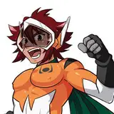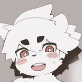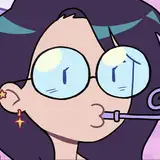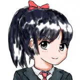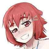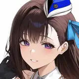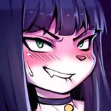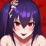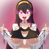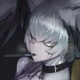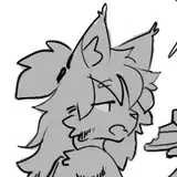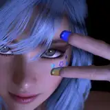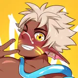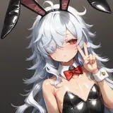
Right now, I’m testing out adding dialogue and sound effects to the illustrations I’ve made.
If anything stands out—like the font being hard to read or too small—please let me know.
I’m still learning about panel layout, so for this work, I’m only adding dialogue and sound effects.
現在作ったイラストにテストがてらセリフと擬音をいれています
何か気になるような点があれば教えてほしいです
フォントが見にくいとか小さいとか大きいとかなんでも
コマ割りに関してはまだ勉強途中なのでこの作品ではセリフと擬音入れのみです
初めての試みなのですべてが初心者だから何が良いか悪いかあまりわからない・・・
dene1129
2025-04-11 12:02:41 +0000 UTCDinders
2025-04-11 01:22:20 +0000 UTC