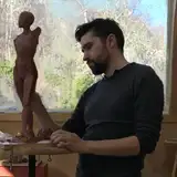
Saturday Study
Added 2025-05-10 21:50:58 +0000 UTC
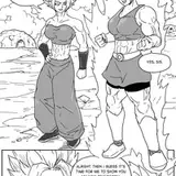
A fun little figure study for today.

I'm not sure what the limit is. Make sure to right-click and open in a new window for full resolution. I will play around with uploading larger ones.
Lane.Draws
2025-05-14 03:07:47 +0000 UTC
Is this the max file size that Patreon will let you upload?
Arthur James Louis Philip
2025-05-13 18:12:53 +0000 UTC
Thanks Justin!
I love the comparison of lines to to electrical tape, lol. I can certainly relate to that experience. There are times when I feel like I'm being too heavy-handed with the shadow lines. Then there's times when I don't take enough advantage of them. Sometimes it's perhaps influenced by the quality of the lighting in the reference. High contrast lighting makes for more vivid shadow lines, while with softer light they may not even be visible. I wouldn't say that one is necessarily better than the other, but the former does give you more to work with. (I just posted a video talking more about lighting.)
Make sure to carefully identify the character of the edges. Broad soft forms tend to have softer, more gradual, transitions. Boney forms, like an ribcage or elbow will often show much sharper edges. Cast shadows are usually sharper than form shadows. Contours can almost always be drawn sharply. This creates a natural variety/balance of edge types.
Apart from that, it's really a matter of making a conscious choice of what look your after in the drawing. This can take me a while to decide. I'll often play around the focal point for a bit, then reach a level of rendering which I like, then apply that to the rest of the drawing. In general, I aim for a look that appears fairly spontaneous / effortless. (Whether the process actually was or not!) So, if I can describe the core shadows with just a few simple strokes, that is ideal.
Lane.Draws
2025-05-11 19:46:32 +0000 UTC
This is so beautiful, and it perfectly exemplifies one of the challenges I face, when rendering the core shadows, you have such a lovely balance of
Firmness in the lines. I seem to fall on one side of the other depending on the day. Either too solid and it looks more like electrical tape running around the form, or too soft and loose the impact, definition, and muddies the drawing. Any Advice?
Justin Land
2025-05-11 05:57:29 +0000 UTC