Project Herald UI - Patron Input
Added 2022-01-25 11:12:00 +0000 UTCHerald UI - Patron Input
Hey, I wanted to tease a bit more about Project Herald, a land filled with decadence, indulgence, satin sheets and sheer curtains. A land where you can always expect a dagger in the shadows, or worse, a ruler with a hidden agenda.
Now that we've set the scene, I need your help deciding on the UI direction. We have several options for the screen layout, and I wanted to get some input from all of you on which direction to explore further. Here they are!

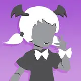
^ The first option is going the same route as Infinite Stars, where the characters appear on the screen.

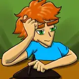
^ The second option is to go a more "focused on the speaker" route, where we just show the primary speaker on screen.

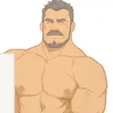
^ The third option is a mix between the first and the second option, showing larger, close-up characters.
Each option has pros and cons.
Option One will allow more real estate for the gorgeous backgrounds to be shown, but players might miss the facial expressions. (a workaround for Infinite Stars was to place the character faces on the bottom left, duplicating the sprite on the screen, we can explore this for Draegan: Herald.) At the same time, the smaller character sprites make the characters appear more detailed.
Option Two will allow for a bigger theatre of the mind experience (and also require less budget since we won't need full-body character art) It will allow a bit more freedom for the writing, but players might "forget" who else is also present in the scene since their sprites won't be shown unless they speak.
Option three tries to be the best of the two, but it does so at the cost of covering most of the backgrounds. Also, having three characters on screen would probably be the maximum, and it might feel crowded.
Let me know what your thoughts are. In the meantime I'm finishing up some Infinite Stars scenes. If all goes well, we should have something for you to play by end of this week.
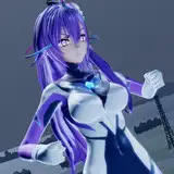
As a side note, I know we've only shown female characters for the men (and some of you ladies) thus far, but I promise we'll share some men (and more) soon. My hope is that if the desert doesn't kill your character from thirst, these men will. <3
Comments
Voted for one; personally, I think it's the most flexible option, especially if you have access to their faces for if they're not on screen for some reason. This lets you have scenes where the focus is on the character you're speaking to as well as scenes where you're talking to somebody but the focus is on something else, or someone else; one example from Infinite Stars is whenever we see the crew communicating with other ships via holo display. We have the other person in focus, and then the faces of other characters speaking when appropriate, which not only makes it clear what's going on and allows you to have any number of speakers in any situation, but additionally can give a contextual sense of space, like when we're in those communication scenes you feel like everyone is focused on who is being talked to but the other characters are by your side watching with you. The other thing worth noting that you can play with is the size and positioning of the sprites. Different scenes might call for different sprite placement, and can also emphasize the depth of your backgrounds. So if you have a background that's a long hallway or alley, you can have sprites further back, or pull sprites closer if a character is in your face and you want to emphasize proximity. This can be a bit of a style thing so you might want to be thoughtful if you move sprites around, how you go about it in terms of speed; I think a few inches and a second or two can make the difference between a dramatically fitting sprite movement or a comedic one that punctuates a joke, and of course both have their place. In the end though I think transforming sprites is a bit of a style thing, so I think it's something worth considering but sometimes just having them like they are in the first screenshot is the best thing for a scene, it just depends on the tone and context and stuff too. I don't personally think Option Two's theatre of mind gain is substantial enough to offset the loss of clarity, and Option Three to me is just like Option One but repositioned for context; that is to say, it would make sense if the norm was Option One, but to have people up closer or shifted around whenever the scene would call for it, so I think if you wanted people closer, Option One lets you do that without framing things that way ALL the time, which like you said obfuscates the backgrounds too which is no fun, since backgrounds are every bit as critical as character sprites in establishing context and immersing the reader and what not. So to recap, I vote one because I think it will let you get away with pretty much whatever you want or need, and has the most clarity and character space in terms of its neutral/"default" state.
Toastywafflz
2022-01-26 13:35:37 +0000 UTC