NokiMo
americanmcgee
americanmcgee

patreon


Twisted Perspectives

Dear Insane Children, 

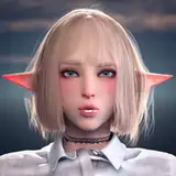
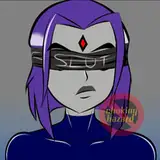
Thought I'd share with you an illustration from Joey that she says is final... but I think might still use a few adjustments. What do you think?

She sent along a series of sketches illustrating the origin of the visuals leading to the final image (above). 

I responded to all this by asking if she might consider including a couple more "creepy" elements hiding in the scene. Being a huge fan of those "how many things can you find wrong with this picture" challenges... this illustration feels like the perfect playground for a similar exploration. 

In addition, I suggested that she rotate the image like so... 

Doing so makes it feel even more uncomfortable and surreal for Alice... at least I think it does.

(To be clear: Rotating is the first step - to complete this, Joey would also need to fill out the white space with a continuation of the illustration). 

What do you think? 

Let us know in the Comments below. I'll pass your notes along to Joey and we can discuss the topic on this week's Live Stream (Wednesday at the usual PDT time of 7PM). 


From Shanghai with Twisted Tea, 

-American

Twisted Perspectives

Comments

definitely rotate the image, I think there is something missing on that mirror, getting caught off guard with creepy shadows and images on mirrors that you dont see at first glance is one of my favorite things! just add a little creep to it and it will be perfect!

Rotate! ❤

Absolutely adore this image. So much going on, but it's not over crowded. All the elements are there, and every time you see it, there's something new you notice.

She appears to be missing her boots and the bottom half of her pinafore. Perhaps the mirror could reflect the ash dress? I do love Joey's style though! I was also going to suggest "make the paintings show creepy stuff, like cutaways of the brain or maybe Dr. Bumby..." and then I noticed the latter was there already.

I like it u tilted but like the idea of subtle creepy things in the background!

Sarah McKeegan

It's a lovely illustration, but it isn't quite dark/twisted enough to be AMA. I think turning it would be a good start! Maybe add the tentacles back in from version A?

Anna Lepper

It's nice.

Saleh Abu-Rashid

I love it. Love to see the A version as well, though

darth raven

As usual I'm utterly in love with Joey's work!

I liked it the way it was. Without tilting it and without creepy elements.

It's a pretty image, but Alice looks too comfortable to me. I like sketch A better with a tilt.

Hmmm what if she was wearing the denial dress and you see the burnt part reflected in the mirror? I know that’s a lot of work and Joey did a great job, I do think it needs more darkness, figuratively but also literally. The colors of her dress and hair as well as the scene feel a bit to vibrant, I think making it more “grungy” (darker pallette, textures, dim lighting) as well as creepier objects is a good way to go. Wish I had more suggestions for those objects besides a sinister mirror reflection and “add tentacles!” Though. Unrelated: confused on the stockings/ shoes situation. Maybe I’m just looking at it incorrectly but it looks off to me.

I'm absolutely in love with this image! Hidden creepiness and some rotation sounds like a lovely idea, and I hope Joey will not mind! She did an outstanding job with this,

I used to like those I spy games and books too (even if I was bad at them). So a throwback to that'd be cool too.

RedBreloom

I felt the same way, she looks kinda disconnected from the scene. I do think it looks nice, it just doesn't read as American McGee's Alice as much as it reads as an archetypical Alice In Wonderland with Our Alice in it.

RedBreloom

I agree about hidden things. How about an impression of the door mouse from Madness set below the mirror on side of the bureau?

I think it definitely needs a little more chaos, and as Francesca DuChene stated, the bottom of her apron is missing!

Wendy Jaa

I love the “hidden creepiness” idea!

Therese

I noticed that the bottom part of her apron is missing. It's a wonderful image, though!

Or what about like the Tenniel illustration when she is stuck in the hall of doors and she is growing and her neck is elongated but keep her in the seated position but with the long neck?

My weird mind would go to something like, if it was to remain neat and orderly within the picture, I would bring in maybe certain features or body parts being disproportionate to the other body parts. Maybe like a really large head on the rest of the body being the same size as shown here. Or maybe make the hands bigger too like the head. Idk.

Is she supposed to be staring at something? I’m a bit late to the party so I don’t know if this piece is in relation to something or if it’s just a concept, but I would expect her to interact with the room a bit more. When I look at the image, I don’t really get anything from her body language or face that indicates how she’s feeling or why she’s there. I agree that the Sketch A has a lot more of the dynamic and chaos unique to the world you’ve constructed, so I’m curious to the reason for going with Sketch B?

bread baby

I like the idea of rotating and extending the contents, I also agree with Lucky Dragon that there should be some destruction within the image.

I'm loving the image, wouldn't mind seeing some of the more classic Alice scenes in the game under a new twisted view.

V--R

Ok final comment, rather than rotating the image, add a little destruction to it. Mess some stuff up. Break the table. Knock over some furniture. Maybe add some tentacles. Make it chaotic.

Lucky Dragon ‘She.They’

I agree with Lucky Dragon, the first sketch depicted a believable situation, there is too much order in the image. Rotating it will improve it, in my opinion

it's a bit "neat" - if she grew in there, more things would be disturbed by that I like the rotation...could work some chaos in below...and some moon up above? I agree to hiding a few more things in there...but I like the other prints on the wall

Definitely feeling the rotated version more, things feel too structured otherwise. Amazing work though!

I LOVE this piece!, yes I know its not creepy, but does it hurt to have a little normality in there? Bravo

I also think you probably should have gone with the A sketch, where there could have been more destruction. That would have been more visually interesting. Probably too late for that now.

Lucky Dragon ‘She.They’

I think that this particular scene has been done in every rendition of Alice. I wouldn't expect the expected to be associated with the darker (better in my opinion) Alice. I think that incorporating things from the Asylum into this, or burned items or images from her home would take an over used image and make it a "never done before" piece.

She should be mad with the rabbit at this point. Choking it or be in "serious discussion"!

I like the idea of it being off center, it makes the viewer feel her awkward and cramped situation. I would also love to get this or something like it as an art print.

I think Joey should change Alice’s face to the current models face. Shouldn’t going forward that be the Alice that’s depicted in concept art?

Lucky Dragon ‘She.They’

I agree with the implementing of a bit more “creepy” but, I was also caught up in looking at all the small pictures myself. I love small details like that and taking the time to enjoy them. Even seeing a small bit of her reflection is a nice detail.

This looks sick honestly. Could even make a good print

Abelwyn Connelly

I think it's a little too well-lit? The lighting is a bit flat. Other than that I really like this piece.

I don’t know if rotating the image would improve it. Personally I find dutch angles a bit over used and a bit of a lazy way to make something seem surreal without actually being surreal

Lucky Dragon ‘She.They’

rotating is good. reminds me of visual novels

I think it looks really good, but it doesn’t really feel as creepy” as this series is known to be. It’s a beautiful piece, but adding some more creepy and surreal imagery might give it more of that “Alice” feel!

Ah this is gorgeous! I love the subtle Arthur Rackham influence. It looks like a modernized, more creepy version of a Victorian etching. Love it!


Related Creators