Teapots and Three Pins
Added 2019-11-21 04:16:03 +0000 UTC
Dear Insane Children,
As our art/design team turn their attention to Hatter's Domain we'll start to explore elements of the story, visuals, and design you'll find there.
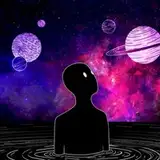
Joey sends over an illustration of Hatter's Domain *before* the explosion which blew it to bits. This provides a foundation for the area around his domain and his workshop - a mixture of Classic English Countryside with a strong dose of Hieronymus Bosch.
Also on the list of areas to explore in Hatter's Domain: The interior of Hatter's laboratory and observatory, a giant tea table, interior of Hatter's cottage/home, the interior of Hatter's workshop, and some of the surrounding "countryside" - all blown to bits, of course.
Look forward to seeing lots of beautiful new art!
Enamel Pins - Progress and Possibilities
Jen continues her efforts on pin designs...

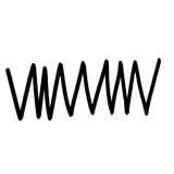
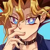
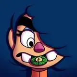
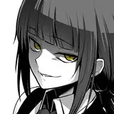
We've generated a selection of designs based on The Jabberwock. Jen initially submitted Design 'C' and I suggested that we add the alchemy symbol for Fire (upright triangle). We also played around with spreading the triangle around the edge to create a hint of a Chaos symbol. And there's one which just plops a Chaos symbol right into the background...
Which do you prefer? Let us know in the comments below! (I quite like D and E).
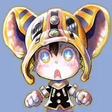
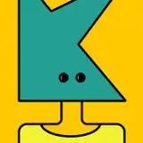
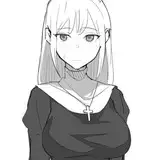
She also sent over The Carpenter from AMR:

This started with the design you see on the left. I suggested we take the ship's wheel out of his ear. And then thought it would be nice to have the V turned into the alchemy symbol for water (upside-down triangle) which resulted in the final image you see on the right.
What do you think? Let us know in the comments below!
And last but not least...

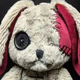
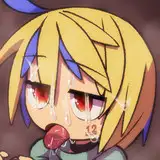
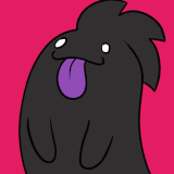
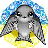
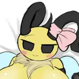
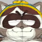
Some of you may remember this Mock Turtle design from our previous exploration of pin/patch designs.
I still think he's cute but I don't know that he fits in with the overall dark/magic theme we're building towards with this set.
What do you think? Tu Turtle or Not Tu Turtle?
Still one more big post I'm working on for this week. It's making my brain hurt - in a good way - so I don't know if I can have it done before the weekend... but I am trying!
From Shanghai with Turtles,
-American
and E on Jabber !!!!!
2019-11-25 20:12:40 +0000 UTC
I like the turtle - so Tu Turtle !!!!
2019-11-25 20:11:03 +0000 UTC
Jabberwocky E or B, The wheel eared carpenter, no on the mock turtle :/
Clyde Raccoon
2019-11-24 04:14:35 +0000 UTC
Since I'd rather blow the mock turtle up, I'm gonna give you a hard no on that one. Bastard kept drowning me. The test of the pins are gorgeous though
2019-11-23 15:04:31 +0000 UTC
Keep mister mock turtle
2019-11-23 02:48:21 +0000 UTC
SUGGESTION: Why don't we do the style of the Mock Turtle pin for set #2?
2019-11-23 01:15:44 +0000 UTC
The hatters domain image is amazing!! absolutely love it. Design B or E look nice. I think the turtle would be cute in a different collection.
2019-11-22 04:07:09 +0000 UTC
Pin B or Pin E. No turtle or a different version of the turtle. The version shown really doesn't seem to fit in with the collection style.
2019-11-22 02:38:58 +0000 UTC
E for Jabberwock. Third design for Carpenter but add the wheel back. No turtle.
2019-11-22 01:34:55 +0000 UTC
Pins B or E. Beautiful painting💙
Tal'Ki
2019-11-21 21:10:22 +0000 UTC
I say tu turtle. I get we are all dark and crazy here but we are more than that for sure. Also I like E best for the pin.
2019-11-21 18:56:10 +0000 UTC
Love the new hatter domain artwork, love all 3 pins mock turtle included, I'd say pins B and E for the jabberwocky design. Looking forward to all the new artwork coming!
2019-11-21 16:24:26 +0000 UTC
Oh and I like the Mock Turtle :)
2019-11-21 15:58:03 +0000 UTC
Jabberwock: E, The Carpenter: The farthest to the right!
2019-11-21 15:57:41 +0000 UTC
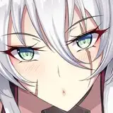
Pin B of the Jabberwock looks great! Not so sure about the Carpenter pin and Mock Turtle pin though... The painting loooks great, gives me a feel of the original books' of Alice in Wonderland artwork that I have in my bookshelf!
Definitely not Adam Driver
2019-11-21 14:06:41 +0000 UTC
Pin No. B
BadRandolph
2019-11-21 13:30:26 +0000 UTC
I really love the painting for the Hatter’s Domain! This feels very Alice-y to me. I would love to see more of this kind picture.
Chaussette
2019-11-21 12:55:45 +0000 UTC
Personally, I think C. Adding a background makes the image seem too busy. But if I had to pick a background I would say E. Also, the mock turtle is cute, but too cute
No turtle. Lol
2019-11-21 12:21:58 +0000 UTC
B. And Not Tu Turtle.
Erin Flower
2019-11-21 10:53:43 +0000 UTC
My preference is E for The Jabberwock
Martin Towell
2019-11-21 10:46:42 +0000 UTC
Im drawn to B for the Jabberwock pin. Mock turtle doesn't seem to fit in with the chaos
2019-11-21 10:31:18 +0000 UTC
Jabberwock pins B or E preferable.
Aside from perhaps tweaking his colors (As one of previous members said), is there a way his expression can truly look sad?
Now he seems rather tired, than sad.
2019-11-21 07:36:07 +0000 UTC
I love the hatters domain image but I'm not feeling the pins. I don't know if I missed a discussion about them but I feel they should be more main character focused or recognisable e.g Alice, vorpal blade, Cheshire cat, teapot cannon, hatter and his iconic hat etc. I dont know if it's just me but I feel having really minor characters on pins isn't the way to go and I'm a huge collector of pins.
2019-11-21 07:28:45 +0000 UTC
1. The shape of the pin itself could be the triangle, rather than incorporating the triangles into another shape.
2. I'm really not liking the look of this Mock Turtle design.
Wendy Jaa
2019-11-21 05:56:41 +0000 UTC
I'm so excited to see a pin for the Mock Turtle! I love him. His color pallete doesn't feel quite right though? He seemed much paler and kind of ghostly in the game? Also I feel like there should be some bubbles around him, since they were his main mechanic in AMA. Maybe change the color pallete and give him a black circle background with some bubbles floating around? I like B and E for the Jabberwocky.
2019-11-21 05:47:34 +0000 UTC
Jabber pin B is my choice
2019-11-21 05:38:54 +0000 UTC
love the hatter domain image! like E for Jabberwock pin which hints at fire and chaos both. I think Mock Turtle needs some work to fit in better
2019-11-21 04:53:52 +0000 UTC
Ooooo I like. But also, I'd love to see a vorpal pin, if there isn't one available already. I've been a bit outta the loop here lately
2019-11-21 04:38:15 +0000 UTC
I prefer B or E for the Jabberwock as well, the middle of last image for the Carpenter and I'm not feeling the Mock Turtle for this collection but it needs to be at least a three piece collection still
2019-11-21 04:34:59 +0000 UTC
I am also rather partial to Design E for the Jaberwock and the 3rd design for the Carpenter. But I think the mock turtle may be too cute. If you planned on doing more of that style of merch for this game I feel it could be worked in but so far everything has been much more serious or classy.
2019-11-21 04:26:18 +0000 UTC
I like B and E for the Jabberwocky!
2019-11-21 04:25:48 +0000 UTC