Marvelous Missteps
Added 2019-11-05 07:50:49 +0000 UTC
Dear Insane Children,
One of the themes I discussed while at the recent Patreon Assembly in Los Angeles was the idea of Missteps as Content. And how this is a radical notion in a world of glitzy product launches, review embargos, and Rotten Tomato's faked freshness.
My premise is one you've heard before: Embrace your failures. Also known as "if you aren't failing regularly, you aren't trying hard enough."
A lot of creators I spoke with shared a feeling I know very well... that we shouldn't go public with a thing until it's 110% final. We don't want the world to see our ideas before they're fully formed - because we fear ridicule and rejection. But that fear excludes our audience from the creation process.
Sharing is scary. Sharing our mistakes? Yikes!
What Are Patrons?
When I think of "patrons" of ye olde times, I imagine them peering over the shoulder of the musicians, painters, sculptors, and sailors they financed. They witnessed as plans were made, ideas sketched, and marble chiseled. They heard and saw the mistakes - and that made their appreciation of the final product that much richer.
Part of the benefit of being a Patron is a behind-the-scenes view of a work in progress and a chance for creative involvement - something the general public will never see.
Well... maybe the general public never should see...

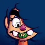
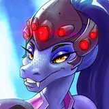
This is a Cheshire Cat "cake" I was reminded of when Jen sent over the Cheshire Face Enamel Pin concept image (main image, above). This is actually the second-worst thing I've ever seen done with the Cheshire's face.
(If you want to see the first-worst thing (you don't) then there's a pr0n tattoo (NSFW) someone did (why?!) which you can see HERE. I'm telling you NOT to click on that link. If you do, it's your own fault if you can never see Cheshire the same again.)
Ahem...

Where Were We?
So I am not a fan of the first-round version of the Cheshire Cat Head enamel pin. But that's OK. It gives us a starting place for heading towards the final destination. And in this revival of the Patron-Artist-Relationship, it gives us The Creation Process as Content.
Here's the note I wrote to Jen with my thoughts on her original version (top image) vs. the sinister version I shared with her as an example (image above).
Where I prefer this (sinister) version:
1) removes the pupils so that you don't get the "eyes rolled up into the head" look
2) flattens the proportions and moves the center of the face down - looks more sinister, less goofy
3) reduces the amount of teeth shown - again, less goofy, more sinister
4) brings the ears down a bit so he looks more angry, ready to pounce
5) slants the eyes down - same effect as #4
Maybe I should just state this style direction from the start...
Let's make this set of pins to be like the Specter Ring from the Bond films. Dark, sinister, belonging to a secret group of mysterious Insane Children. When viewed by people outside the group (cult) raises questions about relationship to magic, the occult, and S&M sex dungeons. Keep them simple... black, silver, and a touch of (single) color when/if needed. The cat? Black, silver, and a single color (yellow looks nice above) for the eyes.
Our Final Destination(?)
Now it's your turn. Jen's turned in a new variation...

Let us know in the comments below what YOU think! Join the process! Give us your feedback!
From Shanghai with I Told You So,
-American
https://www.patreon.com/posts/31517521
2019-11-12 19:24:23 +0000 UTC
That gives A whole new meaning to "Here Kitty kitty"... As got the pin. Sinister Cheshire kitty is best kitty. Would look awesome in bronze💚
Tal'Ki
2019-11-09 08:38:59 +0000 UTC
HAAA, that tattoo... oof
Christ Why
2019-11-07 17:07:06 +0000 UTC
The new version is looking better. Since it is a pin what are the chances of glow in the dark paint for the eyes and teeth?
2019-11-07 01:14:33 +0000 UTC
I love it and I want it!
2019-11-06 15:49:21 +0000 UTC
Well that is one phat boi... I like the new version Jen did, but I feel like it needs pupils... maybe not looking up?
Chaussette
2019-11-06 13:18:00 +0000 UTC
Not your art. The cake!
American McGee
2019-11-06 08:55:03 +0000 UTC
I clicked on the link. Why don't I ever listen?
2019-11-06 08:31:55 +0000 UTC
I once saw The Cheshire Cat used to show the difference between a $150 tattoo and a $350 tattoo. It's Amazing the difference $200 makes. American, I should have followed your advice and not clicked on that tattoo. To borrow From H.P. Lovecraft: "it is a thing that should not be". The pin is a good place to start. it will be exciting to see how it changes as it develops.
2019-11-06 06:15:35 +0000 UTC
Second worst! A new personal best! ;)
2019-11-06 04:38:57 +0000 UTC
Yeah I love Tattoos and I have 2 of the Cheshire Cat on my Body (one on my Knee and one on the back of my leg) but this one is making me bad dreams I think. So I like the Second Idea of the Pin a lot more than the first, but I like it when the Cat is in some Grey Tones and some Lilac and perhaps Yellow for the eyes. But I'm a colorful person :)
2019-11-05 21:41:56 +0000 UTC
I have a Cheshire tattoo, wonder if it's not liked
2019-11-05 19:42:09 +0000 UTC
Well that cake is just scary in itself! I really want to click the link but don't want to have strange images of Chesh so for once I'm resisting. SUGGESTION: The first pin does look way too friendly, second version is a lot better but I would love his eyes slightly bigger and maybe mouth a bit less curved. But that's just being picky, I would love it as if is now
2019-11-05 18:07:00 +0000 UTC
I had no idea what I was expecting to see on that link, but that was definitely not it. Lol I love the new version! I really the above idea about glow eyes and teeth, possibly a bit of a bigger smile, but those are very minor, overall it looks great!
2019-11-05 16:54:26 +0000 UTC
Love the updated version!
2019-11-05 16:51:20 +0000 UTC
The new design of the pin is 1000% better. More sinister, more catlike (the style I use when I draw the Cheshire actually).
I saw that tattoo years ago, and I hate it a lot :D My Cheshire cat's were requested as tattoos several times but none of them were used like this, thank god :D
Also the image of the Cheshire cat in the middle... it's a fanart, I know it, but couldn't recall the name of the artist...
2019-11-05 16:47:55 +0000 UTC
SUGGESTION: So it's much easier to get a glow effect with pins than bags. Maybe glow teeth and eyes? Also it'd be super sick if at least one of the designs got an anodized metal on the line work.
Sarah Heist
2019-11-05 15:13:08 +0000 UTC
I actually have that example art as a necklace! 😮 I love the new design!
Wendy Jaa
2019-11-05 15:06:33 +0000 UTC
I liked the new variation best!
Definitely not Adam Driver
2019-11-05 15:03:37 +0000 UTC
Same here!
Definitely not Adam Driver
2019-11-05 15:03:01 +0000 UTC
Also........American......we're all Alice fans.........you couldn't realistically expect to put that link in front of us and not expect us to be a bit.........curious......(translation: thanks, I hate it😱).
2019-11-05 14:08:01 +0000 UTC
I love the new version except I feel like the grin could be...bigger? Like, when I think Chesh, I think Joker smile - just a little too wide, just a little unsettling. The grin here seems constrained, almost? I hope this made at least a little bit of sense.
2019-11-05 14:05:11 +0000 UTC
Wowww!! I didn't realize how goofy the first draft looked until seeing the second. 🙌👏 definitely asylum worthy now!!
2019-11-05 13:24:22 +0000 UTC
Now THAT is a dangerous kitty to not be messed with!
2019-11-05 12:51:41 +0000 UTC
Also... I couldn't NOT click it.. scarred...
2019-11-05 12:45:37 +0000 UTC
I approve!
2019-11-05 12:44:48 +0000 UTC
He needs to look sinister not cute as that was the plushie's job. Also argh and I am glad my Cheshire cat is on my shoulder blade with the Alice quote 😂
2019-11-05 11:31:41 +0000 UTC
I'm liking it. Way better then the first though I will have to agree that some color in the right spots on the image will add to the sinister affect.
2019-11-05 11:06:17 +0000 UTC
I TOLD YOU.
American McGee
2019-11-05 08:08:54 +0000 UTC
Love the new more sinister design! Also yikes on the tattoo.. I regret pressing that linkxD
2019-11-05 08:04:25 +0000 UTC
I like it but maybe make it darker for that sinister effect
James Allvord
2019-11-05 08:02:18 +0000 UTC
Muuuuuch more sinister looking than the first! I look forward to this being made into existence 💜💀💚
2019-11-05 07:58:09 +0000 UTC
Oh, im loving this new cheshire design a lot better than the one before
MaddieTheHatter
2019-11-05 07:55:02 +0000 UTC