Psu: Brellom, do you got 20 minutes?
Brellom: Bold of you to assume I could limit my monologue to a mere 20 minutes.
Psu: Well if you can keep going for 30 minutes while I go do something about this headache I got, then you'll be a big help. Again. Like when you flatted and rendered this page.
Brellom: Shouldn't we wait for you though?
Gunwild: Maybe you should explain what those terms mean for the audience (and by the way, I only generally know myself).
Brellom: Flatting is the act of placing the basic colours of any given part of the image. For instance, brown for Peia's hair. Orange for Penny's shirt, etc. And rendering is when we try to depict those items more realistically. Sometimes that can be done in a wide variety of ways, but it usually consists of shading & lighting an object. I can definitely see signs of my rendering on this page, with the highlights on the hair, and the hard edges in the shadows. But I think I took a back seat to Psu's vision for some of it, as you can really see me embracing the soft edges quite a lot on this page.
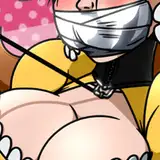
Psu: I might've gone over your shadows with some additional softening. I know we discussed it after the finished work on the previous page. I know I definitely went in to add more lighting to the backgrounds. In terms of layout, I'm pretty happy with this page. Something I like to do, especially in action scenes is to create frames within frames. Lemme explain a bit of what I mean. Everyone should be aware of comic book panel borders right. But on a page like this, there's a LOT of things going on within each panel. One way to make that easier for the reader is to design your panels in a way to have their own divided sections. So with the background, I looked for opportunities to include natural "borders." Whether that's the corner of a hallway, or the way I'll split a scene with light and shadow. Panel 2 is the most clear example of this. You can see the enemy rounding the corner. BUT I needed readers to clearly see the holo emitter turning on. The holo emitter is a bright dot in the middle of a dark space on the page, it's also separated from everything else by straight lines cutting across the panel. There are more examples of that sorta, panel within panels, in the rest of the shots. Panel 3, even has Cassiopeia and Minx in the distance, being framed by the brightly lit holographic Cassiopeias.
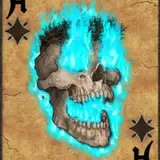
Gunwild: I like that we got the spooky skull face back, I'm simple like that.
Psu: It was definitely fun to get a lot of callbacks. This whole chapter got to reuse so much good stuff.
Gunwild: I think the shape of Cassiopeia's hologram remote is based on a real-world device?
Psu: It's roughly based on VR controllers, at the time the HTC Vive had a controller like that.
Brellom: Interesting how, even in the space future times of Cassiopeia Quinn, VR still looks fake and hologrammy.
Psu: It's an important part of storytelling!
Gunwild: Maybe they're set to the mode that makes them harder to see by electronic observation, rather than the human eye. Y'know, because robots.
Brellom: I get the impression you're making that up only just now... Writers, am I right? *looks at the comment section, badumtish*
Psu: Well... at the risk of exacerbating my headache. Lemme get into some theory/story craft about making an illusion or a sci fi illustration look real. The thing about technology and the way things are going today, things will get simplified and you'll get further and further away from seeing how things work. You look at a modern cellphone and if you handed it to someone whose never seen one 20 years ago, they'll just see a blank slate. When you have to describe or show a science fiction device using only images, you need to telegraph things in ways that aren't necessarily realistic. All holograms in Star Wars have a blueish tinge to them and have static distortion. The viewer needs some information that tells them, this isn't just someone else in the room. And thankfully for our heroes, the drones aren't as smart as our readers.
Brellom: Kind of a design oversight... No wonder this criminal organization loses at the end of the story.
Psu: They also hire rabid fan girls to work for them. That last panel is a favorite moment for me in this entire comic.
Brellom: We should be getting to my favourite parts soon, which happened to be the parts I did the most work on! Honestly, Dr. Botz is probably just my favourite character in the comic to work on, so I'm glad there was A LOT of her in this chapter. Every panel featuring her is a good one.
Gunwild: I know she's not supposed to be the evil one, but Penny's super good at shoving an entire broken-down human-sized pile of limbs into a body bag.
Psu: It's a valuable talent!
Brellom: Or maybe we're all evil sometimes...
Psu: Oh hey, before we leave this page forever. Can I point out my ONE complaint on the art? That red tomato.
Brellom: I also dislike that red tomato.
Psu: That slice of tomato is too red.
Brellom: Agreed.
Psu: IT'S TOO RED. It sticks out like a sore thumb!
Gunwild: Shoulda been kinda purple-y?
Brellom: Maybe.
Psu: I could've just toned it down in saturation. But ah well. Tomato, tomorrow.
Brellom: I was thinking about it earlier; it really stands out and looks out of place because it's colour & lighting feels foreign to the current environment where everything is super de-saturated blue. I was wondering if you did it because you only had so much space to communicate that it was a tomato with a giant burrito, since so much of that is being cut out of frame... But it could've just been oversight too. These things happen a lot sometimes... Or maybe I was the one who did it.
Psu: It was probably an oversight. I manually toned down your original colors EXCEPT the tomato. Because I was thinking... tomatoes are red, right? So I probably left it like that while I worked on the rest of the page, and only remembered it now some... what is it 3 years later?
Gunwild: Almost precisely.
Brellom: Alas. These things happen. Sometimes we make decisions in the moment that seem like a good idea, but in retrospect, don't.
Psu: Speaking of decisions in the moment, is this commentary too long?
Brellom: Probably not long enough. My Patrons love reading my novel-length design notes.
Gunwild: Yeah it's long, but I mean it's not like they tell us we can only use so much space. Okay, I might have to spend some extra time formatting more text, but that's not so bad.
Brellom: It's more value.
Psu: Unlike tomatoes in your hamburger. Just get ketchup.
Brellom: Tomatoes offer a really nice texture and temperature difference though...
Psu: You're a nice texture and temperature difference.
Brellom: =D
WA Jones
2021-04-30 22:53:03 +0000 UTCRob Lyman
2021-04-26 00:13:12 +0000 UTC