AHA! You thought I would go a day without a post, huh? Well you were wrong. Granted, it's almost midnight my time but as long as I type fast there won't be a problem. It took a while to get this post ready for a number of reasons:
1. My inability to commit to a choice.
2. My pen tablet consistently being inconsistent with when it decides to work.
3. Final paper/other school stuff.
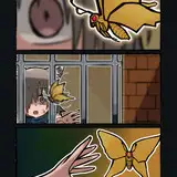
Either way, these are the main styles I experimented with, a basic cell shading on the left, like you'd see in most anime today. A sort of soft cell shading, with several layers of shades/highlights. And lastly, soft shading with hue adjustments for the shades (warmer colors used for highlights, and cooler colors used for shadows). Colors aside, since I know I made some versions darker/brighter than others or more red/more pale. Think of the contrast most of all when you make your decision.
I personally like soft shading the most, and I think it has the best potential, but I want to hear your opinions. Each of the styles take roughly the same amount of time with me, so don't consider that a factor. Since Patreon hasn't figured out how to integrate polls and images in the same post, here's a strawpoll:
http://www.strawpoll.me/14929557
Song of the day: https://www.youtube.com/watch?v=ckZlj2p8W9M