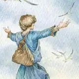
I'd made two mistakes with the last version - the worst of which was letting the paper soak in water for too long before stretching, which destroyed the surface structure. This only became apparent in the detail work, which turned out extremely frustrating, cakey and too dark. This gave me the chance to go back and use some more fitting background greys - I thoroughly disliked the hints of purple and green in the first try, and they didn't get better with more layers.
I realised that I didn't know my palette as well as I thought I did. For years, I'd believed that I could mix any two paints on it, and would know exactly what I'd get, so I'd never made a mixing chart in my life. Since I'd got a few new paints, I decided to do a Grey Chart - earth tones on one side, blues on the other.
The results surprised me. Which made it clear how dearly I'd needed to do a mixing chart. I'd never thought Horizon Blue would yield such consistently green results even with Burnt Sienna, and what beautiful, calm greys my new favourite, Indanthrone Blue, was good for producing.

So, back to the figure work - now armed with a colour chart! One day, I'll make a real, full one...
Jenny Dolfen
2019-01-19 12:54:45 +0000 UTCAnna R Dunster
2019-01-19 12:24:36 +0000 UTCJenny Dolfen
2019-01-18 14:46:15 +0000 UTCTanya
2019-01-18 13:29:38 +0000 UTCLitsen
2019-01-18 11:30:57 +0000 UTC