In the last three years of working on Oh Joy, my ability to draw has improved immensely. Which is great! I'm super proud of myself!
But (there's always a 'but') I feel like there's only so much I can figure out on my own. I've tried reading books on learning how to do art stuff, and I just don't get very far with them. There's something about having An Instructor in A Class that really wakes me up and lights a fire under me to LEARN HOW TO DO THINGS. I had already resolved to sign up for a few art classes at the beginning of the year, so when Danielle Corsetto offered her online illustration course to her patrons, it felt like fate. (Danielle being one of my favorite cartoonists responsible for Girls With Slingshots, one of my most favorite comics)
Our homework for last week was to pick three distinctly different illustrations we would emulate when drawing from a photograph of an object. I chose one of the reference photos I'd taken of a beet from my garden last month and my artistic inspirations were the artists Klimt and William Morris, and the general Shunga style (ancient Japanese porn).
Now, I know I just made that whole shpiel about how much I looooove being in a class because it really makes me get to work. With that in mind, I did not complete my homework. I got the Klimt and Shunga pieces done, but the William Morris piece is still in its pencil stage. My intention is to finish it, but only if that doesn't interfere with me completing our next homework assignment.
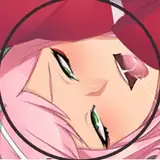
The Shunga-style illustration came out pretty well, I think! My lines aren't as wispy and elegant, but I think I got close enough in capturing the intimate feel of being close up to a soft, round, inviting, warm shape.
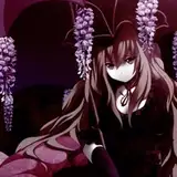
Feeling proud of my Shunga-style drawing, I started the Klimt-style one thinking 'Aw yeh, I'm a Real Good art student! If this class gave grades, I'd be getting hella As.' Oh, hubris. My intention was to show the beet as if it were the portrait of a person, which is why it's upside-down, so the bulb is kinda head-shaped. I thought I could render the beet to have some dimension to it, while it popped out against a more stark and geometric background. My color choices and technical skill with the brush kept everything very flat and indistinct. Unfortunately, the patterny-shapes I tried to paint onto the background just... faded into the overall blue/brown paint? Like, it looks like one solid color. The more I worked on it, the worse it got. At some point I smeared gold paint splatches on it, hoping that would give it the POP that the original painting has. That was a mistake. Then I was like I HAVE GOLD LEAF, I CAN GIVE IT GOLD LEAF BORDERS LIKE KLIMT'S PIECE HAS. That was also a mistake. The gold is so shiny that it only further flattens out the rest of the dark illustration.
As fun and basically effortless as making the Shunga interpretation was, it's this Klimt-inspired one from which I learned the most. Not that I'm entirely sure how to articulate what I learned, but if I were to try it again I have some gut feelings about how I would do things differently. I would start with picking colors that aren't so similarly... uh... saturated as each other? Not sure of the right terms to use. If this image were made gray scale, there wouldn't be much tonal difference between the red and the blue/brown. So I would pick a background color that would have a greater contrast in the event that I gray-scaled the finished picture.
So yeah! Here I am! Livin' n' learnin'!
Sam Orchard
2016-01-22 20:43:36 +0000 UTCThe Queer Art Pagan
2016-01-21 22:10:13 +0000 UTC