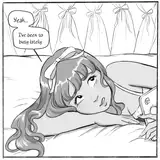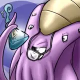
Alright, the middle panel's structure is a bit counter-intuitive, but I want to hear you opinion. If people don't like it, I can probably restructure the text to make it match better. I just really wanted to draw that angle, and text is easier to change than art :P
Edit: Moved some stuff around.
Laura milne
2017-10-14 10:13:25 +0000 UTCPerniciousducks
2017-10-14 03:03:47 +0000 UTCThe Trojan Hawk
2017-10-14 03:00:06 +0000 UTCArgenten
2017-10-14 02:58:23 +0000 UTCArdenW
2017-10-14 02:57:50 +0000 UTC