NokiMo
Daniel Schinhofen
Daniel Schinhofen

patreon


Cover art... LV1

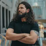
Luck's Voice 1: Suited for Luck.


This is a slight departure as it's not an exact scene from the book, but I think it captures the heart of the story.

The cover was tweaked just a bit.

https://www.amazon.com/dp/B0897XYCJW

Cover art... LV1

Comments

I just need 2 words for this book. MORE!!!! Please.

Dennis Bigelow

i want the next luck voice book already

Fynnius Szubart

Damn that’s book was amazing keep up the good work my man

KATL-Chief

That took some doing XD but the watch needed its angle adjusting too which i couldn't see after working on it for a few weeks, its a ton better now.

Grimmhelm

Yea, looks much cleaner and easy to read now to me also. Awesome. Can't wait to read the final book 😁

Matthew Malkin

Much better version IMHO. The watch doesn't look like it's floating any more.

Phil Haddock

if you have been reading the latest chapters on here then its for that story :)

Grimmhelm

THe elven queen of hearts does that, though it is hard to notice with a casual glance.

Dwinald Lint III

Maybe add a touch of magic to the cover, like engraving on the weapon. Let’s people know it’s no a straight western.

Artman

I do my best to keep the covers close to the story and not just cheesecake

Daniel Schinhofen

I like it!

George Ueland Jr

Important. The name and the cover are all that the author has immediate control over when someone's browsing. The blurb is the next level, and having a good social media presence can help with getting enough ratings to matter. . .

J B

Looks kind of like an old time Western, which is I guess what you were after, not really my cup of tea but regardless of the cover enjoying the story!

Mike Durie

So... how important is cover art to e-books? I know the cover can have a significant effect on sales in the physical book world, but I wouldn't think it would be as big on Amazon. That SubVersion piece of the three ladies would have been a killer cover.

Dennis Erwin

It looks very cool. Only thing I wonder is should the text be black? The rest seems to be quite dark colours so the black isn't the clearest. Particularly around your surname as it overlaps the card

Matthew Malkin


Related Creators