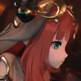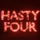
Astral Ascension - Logo (Vote Your Favourite!)
Added 2021-08-04 18:54:44 +0000 UTCHello Patrons,
Hope everyone is having a fantastic Wednesday!! We got some phat news, the logo design for Astral Ascension is in progress and we have narrowed it down to the look and feel that captures the VN.
Now we need your help in picking which design element works best, so please take a look at the below options and vote your favourite below!:


We basically have an italicized and formal font version and the third one is a different styling altogether.
As always, please feel free to share your thoughts below and if you have any feedback on the logo (beyond the font!). Thanks again for your continued support. :^)
Comments
Loving the look! Can’t wait to play the game and see all this beautiful and wonderful art in action! The world needs to see this! Such a shame only we can. :D. #3FTW!
The Gentleman
2021-08-07 14:01:37 +0000 UTCWhile the font 1 and 2 looks like from an old heavy metal band, 3 has the most sci fi vibes. Definitly go with three!
Lucas Slavik
2021-08-05 02:36:01 +0000 UTC1. Best typeface and font, as well as character outline coloring. Too many sharp angles, a bit asymmetric. 2. Very standard centered text formatting. Not bad but not particularly interesting. 3. Cleanest bordering, most well defined gradients. The typeface used for Astral is a bit generic, and the text stands a bit too far out of the ring in the background.
Tansetsu Fuyuka - 鍛雪冬花
2021-08-04 20:07:27 +0000 UTCThe clear lines of 3 are simply so much more pleasing in my opinion. Perhaps because straight lines appear utilitarian it also gives me more sci fi feelings. Can't think of why but it brings to mind Star Wars and Gundam for me. Great work either way.
Yuzuku-雪月
2021-08-04 19:17:26 +0000 UTC