One more post from the theater. This was by far the largest hand-lettering job I've ever done!
Our master carpenter Paul let me pick out a few fonts for signage in the set. Here's a sheet with all the fonts I considered for the late-1940s train station and "The Club."

(The candy on my desk is from Roger, who turned a can of Almond Roca into a vintage can of coffee.)

While I was agonizing over font choice, Paul cut out the signs and stenciled the spacing for the letters. Then I drew the letters in pencil.

It was kind of hard to see the pencil marks, and hard to tell Paul's stencil lines from my guidelines. I got all the way through drawing an "I" in the completely wrong place.

When I was happy(ish) with the result, I outlined the letters in Sharpie, and we both filled them in with paint.


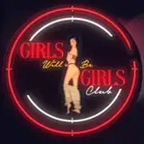
Naomi thinks The Club looks like the classic Nintendo logo, but TOO LATE! 😆
I’m out of town for 10 days and then working on the box office the next weekend, so SuperButch will resume updates in June, and in the meantime I hope to have some VERY relaxed sketches and watercolors for you!
-Becky