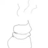
I have been working on the color tone of this painting for a long time, creating a feeling of scattered light and chaotic rooms. However, I still haven't received satisfactory results, as my abilities are not enough and I need more practice.😅
This should have been updated a few days ago, but my home had a power outage and it was very hot, so today's update has been postponed. During the power outage, because the computer couldn't draw, I was very anxious and couldn't do many things. There is a sense of urgency that it's almost too late, but the road is full of red lights.🤣
Whatever I want to know~ which color tone do you absolutely prefer? Or if there are any other painting suggestions~
KUMAICE CREAM
2024-08-17 11:05:28 +0000 UTCKUMAICE CREAM
2024-08-17 11:04:27 +0000 UTCKUMAICE CREAM
2024-08-17 11:04:23 +0000 UTCKUMAICE CREAM
2024-08-17 11:03:14 +0000 UTCKUMAICE CREAM
2024-08-17 11:03:03 +0000 UTCKUMAICE CREAM
2024-08-17 11:02:35 +0000 UTCKUMAICE CREAM
2024-08-17 11:01:13 +0000 UTCKUMAICE CREAM
2024-08-17 10:59:49 +0000 UTCAnthony Melnyk
2024-08-17 00:34:55 +0000 UTCBaby Sweet
2024-08-17 00:05:04 +0000 UTCYangmao
2024-08-16 23:38:14 +0000 UTCRaleyDrew
2024-08-16 23:00:44 +0000 UTCDeusAxeMachina
2024-08-16 20:23:03 +0000 UTCZhana
2024-08-16 20:20:48 +0000 UTCBryanna Stander
2024-08-16 20:20:38 +0000 UTCdiaz adventures
2024-08-16 19:35:20 +0000 UTC