![【限定差分あり】褐色ケモミミ君、3点責め!! [Limited difference] Brown chemomimi-kun, 3 points blame! !!](https://img5.nokimo.com/storage/6/rv/ni/fb3178-019e833d-7f5d-7727-91f4-a67649534e90.jpg)
![【限定差分あり】褐色ケモミミ君、3点責め!! [Limited difference] Brown chemomimi-kun, 3 points blame! !!](https://img5.nokimo.com/storage/2/pq/lc/fb3178-019e833d-7f5d-7aa5-bd98-85d5238d2c2c.jpg)
![【限定差分あり】褐色ケモミミ君、3点責め!! [Limited difference] Brown chemomimi-kun, 3 points blame! !!](https://img5.nokimo.com/storage/10/xt/cq/fb3178-019e833d-7f5f-706e-ae8b-bf92e0ab5f83.jpg)
![【限定差分あり】褐色ケモミミ君、3点責め!! [Limited difference] Brown chemomimi-kun, 3 points blame! !!](https://img5.nokimo.com/storage/5/py/gk/fb3178-019e833d-7f5f-79cc-9134-d1e29f82d6c9.jpg)
![【限定差分あり】褐色ケモミミ君、3点責め!! [Limited difference] Brown chemomimi-kun, 3 points blame! !!](https://img5.nokimo.com/storage/12/ux/qi/fb3178-019e833d-7f60-72b6-b1ee-c794aa8d583f.jpg)

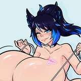
というわけで、完成しました!!今回はセリフとか効果音なしの、絵の力だけのガチンコ勝負です。人気が出るといいなぁ。 こだわったのは、いろいろなところにある対比です。 受けと攻めの肌の対比、視線の対比、髪の毛の色の対比、体系の対比。 それと受けの子と背景の暖色寒色の対比、エアコンとか升目があることによるワイルドとクールの対比、シャープとぼかしの対比などなどです。 それぞれがお互いの意味や存在を引き立たせあうことにより、主役に目が行きつつも全体を見回さなければならないような錯覚に陥るような視覚効果を狙ってみました! すべってなければいいな!!(笑) あと、ピクシブへの作品公開当日におまけ差分(しょっちズわーく以上の方限定公開です。本当に申し訳ありません…)もアップしますので、ピクシブへアップする日…今のところ7月1日予定ですが、その日はFANBOX2回投稿します!全体公開と、限定公開です。 あともし色違いみたいなの欲しいと思ってくれましたら遠慮なくお申し付けください。 色を直すだけならそんなに手間がかからないので、色白差分とか金髪差分とかも、やろうと思えばできます。 よろしくお願いします! 以上、しょっちでした!! So, it's done!! This time, there are no lines or sound effects, just the power of the picture. I hope it becomes popular. What I was particular about was the contrast in various places. The contrast between the receiving and aggressive skin, the contrast of the gaze, the contrast of the color of the hair, the contrast of the system. And the contrast between the receiver and the warm and cold colors in the background, the contrast between wild and cool due to the presence of air conditioning and squares, the contrast between sharp and blur, etc. By bringing out each other's meaning and existence, I aimed for a visual effect that makes you feel like you have to look around the whole while looking at the protagonist! I hope it's not slipping!! (laughs) Also, on the day of the release of the work on pixiv, the bonus difference (it is limited to those who are often more than sizzy. I'm really sorry...) will also be up, so the day to upload to pixiv ... FOR NOW, IT'S SCHEDULED FOR JULY 1ST, BUT I'LL POST TWICE ON FANBOX THAT DAY! It is open to the public and to the public for a limited time. Also, if you want something like a different color, please don't hesitate to let us know. If you just fix the color, it doesn't take much time, so you can do the fair skin difference or the blonde difference if you want to. Thank you in advance! That's it! !!
しょっち@気ままにやってきます
2023-06-26 09:45:22 +0000 UTC藤原妹紅
2023-06-26 09:19:01 +0000 UTC