NokiMo
CandRsenal
CandRsenal

patreon


A New Site

The old C&Rsenal site just isn't cutting it.  Too ad-hoc and confusing.  But there are a number of articles people still reference so I can't just take it down.

Well, I have an old domain handy; so for now I'm building up the new C&Rsenal site, with gallery and print shop, contact forms, etc... on the spare.  Once ready I'll swap the domains, so the old article site can still be referenced at Surplused.com.

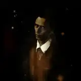
As part of this I'll also release a new print, to encourage people to come see the changes. 

I figured I'd let you, our patrons, have the first crawl before it is finalized. 


A New Site A New Site

Comments

I used your old site to do a bit of background work on the Yugo M24 I purchased last year. I'm glad the old articles and photos are still available.

Christopher Dooley

Every startup needs an elevator pitch, and a statement of what they intend to accomplish. I see C&Rsenal as primarily a historic firearms education organization, with Primer giving an introduction the history and historic value of various firearms, and Anvil, demonstrates restoration of historic firearms. The descriptions don't need to be lengthy, just enough to give the someone an idea what the site is about.

Oh man it's hard enough describing the team members. I get insecure trying to describe the whole project. The sign in is buried somewhere I've yet to unearth but I'm concerned about how logins work in general so I'm oging to leave it a while

C&Rsenal

I like the new clean layout. I would add a description of what C&Rsenal is for those that are not familiar, what is C&Rsenal, Primer, Anvil, etc. The ampersands in the main text font look different than the logo. The mobile page looks good, and country names in the Gallery work extremely well on mobile, as mentioned before, on desktop its not as clean. The menu on mobile has a sign in link, the desktop site does not. The Updates page only has the last 4 videos, this might be due to being a mockup.

I don’t like change

Looks great and is easy to navigate. Good work

Not bad.Substantially easier to find the articles and primers now (perhaps add the videos to the gallery list). The country "sort" could use a different format I think, I thought the buttons would filter out everything that wasn't that country. I presume this is still in progress, as Your EXCELLENT arisaka page isn't on this new one yet. I routinely used the series/rough dates graphics instead of flipping to the book.

Atamis

Unfortunately that is a simple idea that would require a LOT of backend work. It would also have to be adjusted every time we uploaded a new image.

C&Rsenal

True but the new CSS will create havoc and the new site is not setup for articles at all. We have not done any in years

C&Rsenal

The new site looks much cleaner, very nice.

litgeek

They're both WordPress, you can import the old content into the blog on the new site.

Bill Smithem

Neat. One suggestion: In the gallery, it would be nice if the national badges that delineate each group of photos lined up on the left edge instead of merging all together. It would be easier to tell where each nation began and ended. Or you can ignore me and do your thing. ;)

Click on the Surplused.com link

OK, I guess I'm just stupid !

Nicely cleaned up.

We are changing the format of the website. That is all.

C&Rsenal

Sorry, but I'm totally confused!!!! WTF?


Related Creators