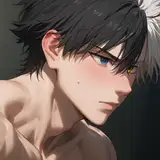
今年もやってきます、競パンの季節! 冬の間は封印して…ないけど、当分の間は心置きなく描けますwww pixivに投稿したイラストのキャプションに書いた通りなのですが 肌色に近い競パンは、パっと見何も穿いてないように見えてスケベなのでは!?と思って描き始めた今回のイラスト。 ベージュな上で更にうっすら透けてるバージョンの他に デザインのせいで穿いてないように見えるのも描いてみたものの これは巨根の貴英が穿いてもあまりスケベにならず失敗💦 競パンに筋肉を合わせたくて貴英にしたけど 非巨根キャラでリベンジしたい…! 他に完全全裸と日焼け跡バージョン。 最後の2枚は前半のパターンより先に描いたのですが 一番描きたかった肝心の競パンが見えなくて ダメだこりゃ、ってなったヤツ。 それでも立派なチンチンは描くwww 肌の色に近い競パンはエロく見えると思ったけど 全く同じ色だとマネキンみたいに見えてまるでエロくならなかったため 描き直し時には色味を少し調整した、なんて学びもありました。 It's the season of the bikini wear again! I'm not going to seal it off for the winter, but for the time being, I can draw without worrying about it! As I wrote in the caption of the illustration I posted on pixiv, I thought that the beige bikini wear looked lewd because it looked like I wasn't wearing anything at first glance! I started drawing this illustration with this in mind. I also tried to draw one that looks like he is not wearing any bikini because of the design,but this one failed because it didn't look too lewd even if Takahide, who has a huge dick, was wearing them💦. I wanted to match the muscles with the bikini wear, so I made Takahide wear them,and I want to try again with a character who doesn't have a big dick...! There are also completely naked and tanning scar versions. I drew the last two before the first half of the pattern. But I couldn't see the bikini wear, which I wanted to draw the most. I was like, "What the heck.... Still, I drew a great cock. I thought that the bikini wear close to the beige would look erotic, but if the color was exactly the same, it looked like a mannequin and did not look erotic. So I had to adjust the color a little when I redrew the illustration.