PRELIMINARY NOTE
First of all, I want to clarify that the "corrected" version of the illustration is not an end in itself. My goal is not to present a simple "before/after" without depth or to create sensationalism.
In fact, doing the work for someone else, in my opinion, has no educational value. If I spent 10 hours redoing this image to match my vision and intentions, it would no longer truly be Luca's image. What would he gain from it, other than the feeling of having been dispossessed of his work?
I fully respect his involvement and what he intended to express. I also applaud his humility, as it's always difficult to see one’s work analyzed publicly.
My intervention is therefore aimed at highlighting areas of improvement, illustrating them as clearly and simply as possible, without delving into purely technical aspects, like the details of the armor for instance.
That being said, let's start with a small detail that immediately caught my eye and which, from an anatomical perspective, is quite significant.
The devil is in the details.
The eye is first drawn to the faces, and then to the hands, and since there is no real face here, and the only visible hand seems to have six fingers, something immediately feels off.

An accidental sixth finger, probably due to a lapse in attention, or perhaps it’s an element that got lost during the creative process, an ill-timed brushstroke? It doesn't matter; some things are so obvious that they end up being overlooked, especially when you’ve spent 15 hours on an image and lack the perspective. I’ve learned this the hard way. So, double-check the anatomical "evidences" before publishing your image on social media, or you might… regret it ^^'

With a few brushstrokes or a subtle gradient, I prevent the hair from overlapping the character's shoulder lines. This helps avoid mixing the planes and adds more depth.
before :

after : 
Here’s a very simple correction, but one that changes the scene's dynamic enormously. If you have elements like hair, loose clothing, or floating fabrics in an action scene, try to give them some movement to add dynamism to the scene, and avoid straight lines unless it's a very strong, graphic, aesthetic choice.
Here’s an example where straight lines work very well: (Art by Dominik Mayer, "Fall of the Emperor").
The image is highly graphic, with an inclination towards symbolism more than realism.

Focal Points and the Rule of Thirds
Composition is the backbone of your artwork. It's essential to focus on it as much as necessary before anything else because it forms the foundation of your illustration.
In the base image below, the knight's head is correctly placed. It’s not crucial to strictly adhere to the rule of thirds down to the millimeter, but it's still important to consider it to ensure the relevance of the rest.
Here, the monster’s head is almost at the center of the image, which could have significance in itself if it were the main character to highlight. But in reality, it’s the victim of the assault, a functional element meant to emphasize the knight, not the other way around.
Additionally, the monster is almost at the same level as the knight, which suggests an equality between them in the conflict. However, this idea is contradicted by the monster's unfortunate position (receiving a sword to the stomach is rarely a good start to the week).
before :

after : 
That’s why I chose to change its position in the composition to reinforce its vulnerability. By lowering it, I give it the symbolic role of the defeated, which further amplifies the power of the knight. The storytelling becomes more impactful, the image more readable and striking.
Indeed, the human eye naturally tends to read an image from left to right and top to bottom (likely a reflex tied to reading).
I also slightly altered the knight's head angle so that his gaze – though nonexistent, but implied – is clearly directed towards the monster's face.
The Movement of Drapes
We've seen how to make the hair more dynamic, and here, we will try to do the same with fabrics. They should complement the movement, not break the "flow." They must not compete with other important lines in the image. Here, I’ve given the fabric a spiral effect. While my retouching might not be perfect, you can still grasp the concept.
Before:

After :

Simple is Often Better, Not Always, But Still, Well, It Depends... But Still.
The monster illustrated by Lucas is interesting, but its overall anatomy is unclear—too complex because we don't really know how to look at it.
I have made a simple monster shape to show you what i want to explain here :

Without wanting to stifle boldness and ambition in general, or Lucas’s in this case (since, of course, he is free to design what he likes), I think it's always necessary to adjust our ambitions according to what is technically achievable. The goal is not to diminish ourselves or underestimate our abilities, but to balance what we want to do and what we can do. This balance refines itself as we practice.
For example: Below, the artist imagined an extremely complex and detailed design, but nothing gets lost in the image. Everything is legible; the creature is understandable, though totally nightmarish. Its anatomy is monstrous, dreamlike, yet remains coherent with itself, and it's this coherence that gives it weight, power, and thus makes it tangible in terms of threat. Nothing gets lost, nothing is confusing, because everything is controlled with perfect mastery of the knowledge the artist has accumulated throughout his artistic journey.
"Alien vs Bloodborne" by RJ Palmer

Two examples here, with two less detailed monsters, but with well-defined and readable silhouettes, which can seem just as threatening as an ultra-detailed monster down to its most putrid and gangrenous details. Again, it’s a matter of artistic choice and storytelling. Sometimes, suggesting can be more interesting than showing everything outright. Everyone is free to choose their approach.
"Wendigo" by Kyle Enochs

"Werewolf" by Alexandrov

It’s up to the artist to know where they stand on this point. In this small example, I illustrated a very simple creature shape, allowing for quick understanding of the scene and the morphology of the two characters, while adding a foreground with the monster’s hand, which adds depth to the composition, and is further emphasized by the other arm disappearing into the third plane.
Yes, I am fully aware that Luca wanted to illustrate the monster "Manus," a creature from the lore of Dark Souls 1, and it makes perfect sense that these two characters are facing each other, as they belong to the same universe. But with this framing, the details get lost, and I admit I had trouble recognizing it at first glance. There are several solutions Luca can explore to address this issue: either simplify the silhouette, change the overall composition to give it more clarity, or find a monster with a simpler design that fits more easily into such a confined space
Lights and Colors
This confrontation scene has a simple goal: to highlight the knight's triumph, because that’s what this is about. However, the situation in Lucas’s version remains ambiguous and deserves to be emphasized through the composition, as previously discussed, with the distribution of the two subjects in space, the details, the lighting, and the colors—because colors have meaning and should also tell a story.
So, in this example, I distributed the light in a way that the viewer's eye is first drawn to the knight’s side, accentuated by the details of the armor, and then moves over to the monster, who serves as the pretext. It’s the receptacle of the action, but not the vector of it; it endures the action. Its function is essential, but it shouldn’t take up as much space for the viewer's eye, especially in such a narrow and intimate frame.

Colors are our allies, and they serve to evoke emotions and the relationships between characters in the context they exist in.
Here, I chose to emphasize the cold colors on the knight’s side and warm colors on the monster’s side. It’s simple, basic, but effective.

This highlights the famous duality, providing an immediate understanding of the situation. I simplified it to the extreme to make the example more comprehensible with simple warm and cool gradients.
The “hero” executes his enemy, and his colors are cold because he expresses no emotion but shows firm resolve. The monster is bathed in red because it symbolizes animality and ferocity; it’s from him that blood and pain emanate. This emphasizes its bestiality.
Once again, it’s simple, basic, but everyone understands. I could have also added some greenish hues in the backlight to contrast with the red, but that should be done discreetly so as not to divert the viewer’s gaze to a dead zone.
Dead zones, often at the edges of the image, aren’t really worth detailing unless they truly make sense in the image. But in this case, the viewer’s eye would stray to the right, toward unnecessary elements that distract from the action. It’s better to minimize them, not detail them, especially if they’re in shadowed areas. Lack of light = lack of detail.
Pushing and Pulling
In Lucas’s version, we can infer that the monster has just been pierced, but it’s unclear whether the knight is pushing the sword further in or pulling it out to finish him off.
I’ve made the decision for Lucas, based on the position of the left arm, which is fully extended, that it’s better to emphasize the fact that the knight is pulling the sword out. This is first suggested by the monster’s posture, as it reacts to the thrust, as if it had just run full speed into a signpost. The arms are thrust forward because they’re still part of the motion, but the rest of the body is abruptly stopped, gripped by the knight’s hand, allowing him to pull the sword out without bringing the monster closer.
before : after :

I also made sure that the blood pouring from its mouth and chest follows the same logic, to emphasize the shock and violence of the scene.
FIND THE FLOW, DON'T BREAK THE FLOW
This is probably one of the most challenging points to address, but also one of the most important. Flow is the way elements move and interact with each other in the space they occupy. This applies to objects, characters, natural elements like water or fire, and even particle effects or abstract paintings.
This involves the phenomenon of tangents. To illustrate this concept, here’s a very simple demonstration, and you can already grasp where I’m heading:

The brain likes to connect the dots, it likes straight lines, it likes symmetry, and it loves parallel lines. It loves to create them for its comfort, but it hates to encounter them randomly when they aren’t tied to a logical context. A tangent in a math exercise or a marketing graph is fine, but in an action scene, it immediately becomes incoherent. The brain feels discomfort, a blockage, without necessarily identifying the source if it lacks the skills to detect it. The same goes for parallel lines and symmetry, which must be handled with utmost care.
In the original version, I’ve highlighted in red many of these issues that make the image feel extremely stiff and frozen.

In this version, I’ve traced the path of the “Flow.” It’s not perfect (that would have taken too much time), but it allows the image to circulate energy more smoothly, without the eye hitting tangents, crossing lines, or encountering parallel lines that have no place in a chaotic context where every movement is organic.

CONCLUSION
All artists are subject to the same biases. These biases must be analyzed, dissected, and deconstructed in order to grasp the appropriate solutions. For this image, the main flaw, in my opinion, is the desire to add too many details at the expense of what needs to be highlighted: namely, the storytelling, the readability of the action in a very tight frame, which must therefore focus on the essentials. Details should come after all these considerations, once the fundamental elements are locked in place to ensure a solid composition.
Luca’s image has many qualities: Artorias is instantly recognizable, the composition, the balance of colors, and the lighting are all demonstrations of a highly developed skill set, just waiting to be optimized.
In 10 years, this is the first time I’ve done this kind of exercise, and it’s precisely because Luca’s image struck me at first glance. So I Apologies for the poor quality of my syntax and the somewhat chaotic structure of this analysis ^^
I also want to clarify that my words are not gospel, that nothing in this article should be taken literally, and there are always multiple ways to solve a problem. I’ve presented some of them, but this is not meant to be exhaustive. Every illustration is like a different riddle to solve each time; you must be observant and patient to know how to tackle it.
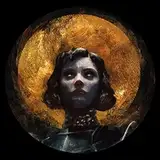
Once again, I thank Luca for allowing me to carry out this small analysis, and I wish him the best in his art, whose current qualities suggest an extremely interesting potential for the years ahead. An artist to watch, and you can follow him here: https://www.artstation.com/finotto_luca
Luca Finotto
2025-03-10 17:29:19 +0000 UTCmarcos
2025-03-05 18:00:26 +0000 UTCStLOrca (pronounced Ess Tee Ell Orca)
2025-03-05 04:17:35 +0000 UTCAnato Finnstark
2025-03-04 18:41:12 +0000 UTCAnato Finnstark
2025-03-04 18:40:48 +0000 UTCNoctis Lucis
2025-03-04 17:48:30 +0000 UTCAstreyoth
2025-03-04 17:34:28 +0000 UTC