![BEHIND THE SCENES #6 - [S1E8.38] and [S1E8.39]](https://img5.nokimo.com/storage/10/ds/em/fb3178-019e8365-320a-7f65-87ef-b91295961b6f.jpg)

special deal TODAY ONLY.... two behind the scenes posts for the price of one.... get it while its hot!!!!! actually though, these two updates are just very connected in my brain, so i wanted to talk about them together ehehe
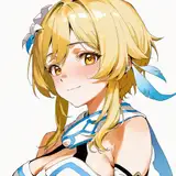
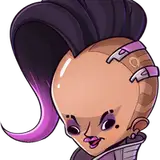
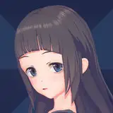
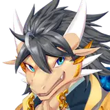
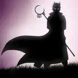
so, let's start with the most obvious thing... these characters are back!! and they even have names now!! woah!!
their return seemed to be very well received overall, which i'm quite happy for!! >:)c i was honestly a little worried that people would be annoyed about having to retread some ground, but everyone seemed pretty happy with these updates in the comments, so i'm feeling relieved, ahaha ^v^''
any time i plan to show something new in this comic, i always go back and forth on it a lot, cause i want it to feel like it belongs in the story, and isn't taking away from what was there already--it's a really hard balance to get right!! i'm sure that as things go on there'll be more instances like The Lore Dump where i try something that doesn't work and have to go back and fix it, but i think overall, experimenting with new ideas has been a really good thing!! of course though, at the end of the day, this story is first and foremost about penny and her lesbian adventures--so there will always be lots more of that to see!! >:]c
-----

-----
so, onto some more technical stuff about these updates!!
the first thing i think is interesting is the backgrounds in these two--it's a good show of the different types of backgrounds i do for this story, spanning the full range from color gradients, to blurry pictures, to fully drawn pictures!!
-----

[a color gradient one... btw, i think this is my favorite drawing from this update--i just really like how it came out for some reason!! :3]
-----

[and a blurry picture background.....]
-----

[aaand the fully hand-drawn one!! these always take a while...]
-----
i like how all three look, but hand drawn ones are always the most fun for me to make--i used to hate drawing backgrounds (a sentiment i've heard from many artists LMAO,) but these days, i actually really enjoy it!! i've never been able to make one as detailed as what i dream of in my head, but i think i'm getting better with time!! >:]c i would love to do all the backgrounds in the story as fully hand-drawn ones, but it would take wAAAY too long--even ONE of these takes me like, one to two hours--which is troublesome when i have to make like, 12 panels lol
my favorite artist, velinxi, does these SUPER detailed backgrounds that i could just stare at all day--so i always look to them for inspiration when i'm working on a background!! i think having strong inspirations is one of the best ways to improve at something quickly--if you know what you want your art to look like, it's a lot easier to get there!! so, i always try to keep a goal in mind while drawing!!
we don't really get to see the full un-covered thing in this update, since rem's big fat head takes up a lot of real estate in the panels it does show up in, but here's the background i drew as an establishing shot for adrian's house!! it was actually purple and green originally, but then i realised i was just drawing a homestuck troll house, and was like. wait a minute. and shifted the hues DNJDNJFGNHJ--i think it works way better as a blue house anyway though, cuz blue is his theme color!! B)
-----

[da blue version....]
-----

[...and the original purple!!]
-----
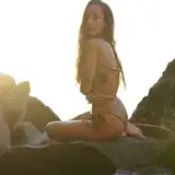
these are nice, but they also take forever--so, if i don't have time to draw a background, or it's not terribly important to the look/situation of the panel, then usually i'll go with the blurry picture option!! it's cheap and quick, but it does the job of setting the mood well, so i think it's pretty useful!
as for the process, i usually start with a royalty free picture from unsplash or some similar website, then change hues, contrast, etc, until i like the look of it, and feel it fits the scene well--and then, i blur it a lot, and put it behind the characters!! usually with a little white outline around them to help them stand out more--the specifics of this process have varied a bit over the course of the story, but the general idea has stayed the same!! B)
here's a closeup look at the background seen in most of the panels from this update...
-----

[this is the picture i started with...]
-----

[...and this is how it ended up!]
-----
the color gradient backgrounds are pretty self explanatory i think LMAO, but one thing i think is fun about them is that they are actually color coded based on the emotion most prominent in the panel--a fact that was mentioned way back in the QNA i did nearly a year ago!! back then i showed off a little library of colors i've used previously, that has since grown in size.... it now includes such epic and powerful emotions as 'Lying Badly' and 'Night Time'... my creative genius is truly an untameable beast.....
-----

-----
ps please don't laugh at my handwriting, she is doing her best u_u i know it looks like a six year old wrote it but that is just because i am stupid. thank you <3
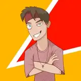
OKAY, moving on from the backgrounds to the last thing in this post!! and that is: facial proportions!!
these updates took me an extra long time for multiple reasons, but the MAIN one was that i spent a lot of time nailing down rem and adrian's facial structures for all future updates--i'm still not COMPLETELY confident while drawing them, but they're more or less where i want them to be looks-wise now, so overall, i'm happy with the results!!
i'm not really sure if it works, since my style tends to drift a lot, but i try to make every character in this story have a distinct look to their face, so that they can be easily told apart in a face shot, or even just by their eyes--the proportions for these exist mainly in my head, but you can see traces of the lines i use to measure them in the sketches for the story!! if i don't do this, they sort of start to look different after a while, so i have to make sure i remember the proportions........ vewy important!!! >:3c
-----

[an example with ava from a past update--the lines i'm talking about are outlined in red!!]
-----
i also frequently cross-reference newer drawings with older ones i liked a lot, to try and keep it consistently nice looking--i can't really tell if this WORKS cause i stare at these guys so much it's all just Images to me at some point, but i try to make sure they always look the same, at the very least!!
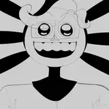
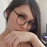
to be honest, it's kind of hard to show the process of actually MAKING the proportions, cause it mostly happens dynamically as i draw, BUT i can show you one thing.... rem with no glasses... scary!!!!!! o_o
-----

-----
she confounds me.... that little <:3 face... Haunting.....
okay, that's all from me for now--as always, thanks for reading, and thank you so much for the support!! love you guys!!! <3<3<3