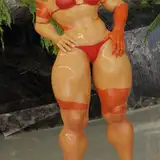
Frank sent another photo for Critic's Corner, so, lets' talk about it. How to improve it?
1. Background texture looks bright and sharp. I think you have to blur it more. The idea is to create background behind the model, not at the same distance. Now it's distracting a bit.
2. The texture was erased from model's body quite nice, but you still see some halo effect around her. Use burn tool carefully to hide it.
3. Some kind of blue spot. Not the same skin color as nearby areas.
4. Composition! She looks to the left, and there's more space on the right. I guess it would be better to move model to the right a bit.
PS Maybe, her bra is a little bit too bright, what do you think?
Frank Martin
2022-07-26 14:38:09 +0000 UTCSean Archer
2022-07-26 14:16:26 +0000 UTCFrank Martin
2022-07-26 14:15:08 +0000 UTCFrank Martin
2022-07-26 14:13:58 +0000 UTCSean Archer
2022-07-26 14:08:46 +0000 UTCFrank Martin
2022-07-26 13:57:22 +0000 UTCSean Archer
2022-07-26 13:55:58 +0000 UTCFrank Martin
2022-07-26 13:16:12 +0000 UTC