NokiMo
dcorsetto
dcorsetto

patreon


Step aside Legs Day it's HANDS DAY

Hey class! Let's draw some hands! 

Between what I know about drawing hands and what I learned from other artists' tutorials (I happen to like this one a good bit), these were the most important bits, IMO. Let's go!


Basic Shapes

The basic shapes I see in a hand are a softened square (palm), a softened triangle (thumb meat), circles (knuckles) and lines (fingers). I've seen some artists who use nothing but circles, some who skip the lines and go straight to cylinders... maybe you see something different. Go with your gut, but if your gut isn't telling you anything, just try my method and see how it feels.  :)


This is how I lay out practically ALL hands  that I draw. I've included all of the knuckles in the green drawings above, but I generally just use lines for the fingers (like in the very first three examples) when I sketch out hands, to make sure the gesture feels appropriate before I flesh it out.


So, start out drawing a plain old open hand. Once you've got your softened square palm, look at your hand reference (use hand reference!!) and figure out where all the meat of that thumb is. It takes up a lot of the palm! Soft-triangle that thing.


From there, indicate where your first knuckles will fall. The most important element of drawing hands, in my opinion, is keeping in mind that ARCH. The knuckles arch, and the tips of the fingers arch the same way. The pointer finger and ring finger start at nearly the same place; the middle finger's knuckle is a smidge higher than those two; and the pinkie finger is WAY THE F DOWN, way farther than you probably think! Use reference, look at your own hand, and draw what you see, not what you think you see.


The fingers are about the same length as the palm. On some hands they're longer, some they're shorter (so I guess that "not quite" was unnecessary - they may be exactly the same after all! Depends on the hand). 


The next set of knuckles will be about halfway up the fingers, mirroring the arch of the first knuckles. The final set of knuckles are between that and the fingertips, again arching the same way. Your pinkie may end before it even reaches the other three fingers' last knuckles, so pay attention to that!


The thumb's first knuckle starts OUTSIDE of the palm, quite low. Unless someone's got MAD LONG thumbs, the final knuckle (it only has two visible knuckles) will land somewhere around the same level as the first pinkie knuckle. 


As you may recall from your days in middle school fingering the letter L on your forehead, your thumb rotates from the base of the palm and can move perpendicular to the rest of your fingers (or, if you're a weirdo like me, ANYWHERE).


When you're drawing a hand from the side, keep in mind that the palm is thicker near the bottom (wrist) than the top, although there's still a good meaty section up  near the first knuckles on the inside. 


Finger Wang

This will probably be old hat to many of you, BUT! ...


Your pointer finger generally leads the rest of the fingers, but it sometimes enjoys venturing out on its own and leaving the gang behind a bit. You'll often see it at the bar, somewhat near the middle, ring and pinkie fingers, but still far enough away to look like, hey, maybe it came in alone.


Your middle and ring fingers often stick together. In fact, if you try to bend your middle or ring fingers, it may be difficult to keep the other one straight.


And if you try to bend your pinkie finger, forget it, that ring finger is coming along for the ride. The pinkie generally tries to follow the middle and ring fingers, but often gets left behind like a little kid who was sort of an oops-baby and was born several years after all of its siblings.


The thumb has already moved out of the house and lives in its own apartment with a cat and a futon and a part-time job.


JUST DON'T

Here are some don'ts that I highly recommend not doing!!


Hand Exercise

Here's what I had my college students do in class!


Open this folder: https://www.dropbox.com/sh/lxdtl1jgfljqghs/AADh8xmqoknbIHzVDLYUNuANa?dl=0


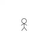
The first image should be hand exercise example.jpg, which is the same image at the top of this post. Okay, I drew those in a hurry before class using my laptop's trackpad, so they're terrible, but you get the idea. Really simple basic shapes.


From there, you've got a bunch of photos of hands. Copyright Gods forgive me, for I nabbed them from an image search, I confess.


Time yourself. Give yourself a minute for one or two of these hands, then do them in 30 seconds or fewer. Draw the hands using JUST the basic shapes. If you'd like to include all of the knuckles, go for it. Or just use lines if you feel more comfortable doing that.


Once you've done that, move on to drawing in the full hand after laying it out with the same sketching method. Pay attention to the way the skin shifts and bunches up to compensate for the hands' movements. Recall what you learned about economy of line, and only include the lines that are important to explain what's going on in the hand. I gave my students about five minutes per hand on this one.


Homework

Draw five fleshed-out hands! Use reference (PHOTOS, not drawings or paintings). Finish them in ink, unless you feel more confident using another medium; just make sure that we can tell you know HOW to draw hands, and that you've used your knowledge of how the fingers and knuckles are laid out. Here's a list of what kinds of hands I'm looking for:


Get crackin', hand drawers!


PS! Before I forget! I've decided to move the Cowgirl Laura project to a later date. So you'll see more on that project later on in the semester. :)

Step aside Legs Day it's HANDS DAY

Comments

Nice! Keep an eye on those proportions. The one with the paintbrush is great!

Danielle Corsetto

Oh looooovely, you're a natural! I love how minimal you were with your lines. :)

Danielle Corsetto

Ah man, I skipped ahead and saw the feet, and JUST WOW, those are GREAT feet! (looking through some old comments I missed over the past few months!)

Danielle Corsetto

I missed a TON of posts here apparently; these are AMAZING, Betty Anne!! Holy wow, that grafted foot-hand, wtffffff. Also, thanks for the look at your underdrawings; it's great to see the form you were working with underneath. :)

Danielle Corsetto

Your hand drawings look faaaantastic!! (I just saw this post!) Agreed with the above commenters; that hatching is aces. I see so much bad hatching; you did well with that. :)

Danielle Corsetto

Whoo, I missed a LOT of these! Your hand drawings look great, Fox!

Danielle Corsetto

Hands! I definitely got better as I went. My thumbs up is my favorite by a lot. <a href="https://www.instagram.com/p/BECvp-Wm9Fm/?taken-by=lsglaw" rel="nofollow noopener" target="_blank">https://www.instagram.com/p/BECvp-Wm9Fm/?taken-by=lsglaw</a> <a href="https://www.instagram.com/p/BECv8t8m9GH/?taken-by=lsglaw" rel="nofollow noopener" target="_blank">https://www.instagram.com/p/BECv8t8m9GH/?taken-by=lsglaw</a>

Hmm. I may be a little late. <a href="http://akmurphy.tumblr.com/post/141580730287/hands-ohgoshthisissolate-really-quick-i-had-a" rel="nofollow noopener" target="_blank">http://akmurphy.tumblr.com/post/141580730287/hands-ohgoshthisissolate-really-quick-i-had-a</a>

Thanks for all the compliments/critiques!

Sheri Spangenberg

Finally! Hands! First two: <a href="https://instagram.com/p/BCWPFxQL9IO/" rel="nofollow noopener" target="_blank">https://instagram.com/p/BCWPFxQL9IO/</a> Holding something: <a href="https://instagram.com/p/BCWPNg6L9If/" rel="nofollow noopener" target="_blank">https://instagram.com/p/BCWPNg6L9If/</a> And last two : <a href="https://instagram.com/p/BCWPbgsL9I7/" rel="nofollow noopener" target="_blank">https://instagram.com/p/BCWPbgsL9I7/</a>

Dan Wilson

<a href="http://christinagunn.tumblr.com/post/139697795892/hand-drawing-exercises-danielleteaches" rel="nofollow noopener" target="_blank">http://christinagunn.tumblr.com/post/139697795892/hand-drawing-exercises-danielleteaches</a>

Finally, something I can turn in before the next one is announced! It's been a hectic couple of weeks ( had my pen break, had to order a new pen, had that pen be taken by the mailbag mafia, got a cold ) but I'm FINALLY CAUGHT UP. I still have to ink my expressions homework, but it's up in it's sketchy glory. SO, all the backlogged assignments can be found here: <a href="https://www.dropbox.com/sh/y3bgnxclbnlhwqx/AACEK-4nBJc-m30JeI5FfZ16a?dl=0" rel="nofollow noopener" target="_blank">https://www.dropbox.com/sh/y3bgnxclbnlhwqx/AACEK-4nBJc-m30JeI5FfZ16a?dl=0</a> ( that's the expressions homework, and the exaggeration homework ) Now for this week's. I know I already said it but thanks again for that tutorial link teach!! I would have never figured out a rapid way to draw these without it, and I would have never attempted some of the hands positions I drew here without it. I'm still figuring out some stuff with hands stylistically, but for once I wasn't cringing at every one I drew. What a relief! Warmups: <a href="https://www.instagram.com/p/BB8LlWyuf4K/?taken-by=ohmyhubris" rel="nofollow noopener" target="_blank">https://www.instagram.com/p/BB8LlWyuf4K/?taken-by=ohmyhubris</a> Homework: <a href="https://www.instagram.com/p/BB_OrOUuf7s/?taken-by=ohmyhubris" rel="nofollow noopener" target="_blank">https://www.instagram.com/p/BB_OrOUuf7s/?taken-by=ohmyhubris</a> ( these are also in the folder linked above if you prefer to look at it there )

Nova Sulprizio

Thanks everyone. It is good to know that the practice is accomplishing something. Sheri - I may have gone a bit over the 5 minute mark to finish erasing out all the sketch marks. There were some wonktastic intermediates in the mix. Tyler - yeah, that thumbnail is bugging the hell out of me. I almost fixed it in photoshop before I posted it, but I decided to share the flaws instead. Betty Anne - Thanks for noticing the line widths. For some reason, my left side line widths always turn out a bit thinner than the right side. When looking at it as a whole, it seemed a bit lopsided. I've been trying to remedy that issue. Nia - I was trying to see if I could recreate the feathering shading technique with the brush pen. It's good to know I pulled it off somewhat.

Katherine Sippel

I feel a bit weird commenting after that thorough critique, but I did want to say that I especially enjoyed the heart hands. I think the line weight and hatching was really well balanced on that one.

Katherine Sippel

Thanks, Katherine! I think the only reason I had patience for it is because I've put it on myself before as well. XD I guess I figured if I could sit with a tiny brush and henna in ecopsychology class and do it one-handed, I could do it in Manga Studio. XDD

The Queer Art Pagan

I have to agree on the reverse shaded one. I think the shapes are really strong on that one.

Katherine Sippel

Good job. That distortion with the wine glass had to be a pain.

Katherine Sippel

I'll pile on with the great jobs. I know it will sound strange, but I especially liked the hatching on the nails in #5. It really jumped out at me.

Katherine Sippel

They are all wonderful, but extra kudos on the mehndi. I only seem to have the patience for it when I am putting it on myself.

Katherine Sippel

ETA: Okay, it was bugging me enough I got curious, looked up your ref, and I think the latter <b>is</b>what happened. I did a redline on the reference photo to help show what I'm talking about, because I'm not sure I can word well enough to describe it. ^^; <a href="http://img.photobucket.com/albums/v373/cliodhnaglen/HandDemo_zpshcgv7s9a.jpg" rel="nofollow noopener" target="_blank">http://img.photobucket.com/albums/v373/cliodhnaglen/HandDemo_zpshcgv7s9a.jpg</a> In the first redline, I followed the "wedge" shape made between the knuckles of the pinky finger and the rose stem. Duplicating that shape across the other fingers and extending the finger lines accordingly gave a contour very similar to what happened on your rose drawing. (The green line shows what the hypothetical angle of the knuckles would need to be to make this arrangement work; it's a very deep, sharp curve toward the index knuckle.) The second redline is a wireframe of where the knuckles and fingers are actually at. (The blue lines are the markers for where the index finger is hidden behind the other fingers.) On the third one, I shifted the light extremely to show where I think the problem happened. The front face of the pinky finger is very, very pale on the original, and because this woman is young and her hands are not deeply lined, the line separating her pinky finger from the Mount of Mercury and Mount of Upper Mars (the squishy pad on the palm at the base of the pinky and the squishy, sometimes wrinkly area attached to the side of the hand underneath that) is very faint. With the image leveled extremely dark, the lines show up much better, and the finger appears as a cylinder once again. :) I hope you don't mind I did that! ^^; It was bugging me, because I've seen that pose about a billion times due to the sort of anime I watch, and I wanted to know what was going on, so I thought I'd share. ^^;

The Queer Art Pagan

Hmm. That's so weird. The main thing that jumps out at me is the middle finger's knuckle seems to jut out further than it normally would (at that angle, the three knuckles are almost in perfect alignment with each other, with the index finger extending upward above them), but that could be due to the style of shading giving extra weight to that knuckle. The bottom half of those three visible fingers seem very wedge-shaped, when even people with chubby fingers are still pretty cylindrical. I wonder if one finger got sent askew, and drawing the others just made them follow suit? If it IS a proportion issue, that is way common. (It's why my hands always end up too long and skinny; I have a tendency toward long fingers, and the rest of the hand has to follow suit to look decent. ^^; )

The Queer Art Pagan

Argh, Enter key again. :| Thanks, Nia and Rachael! I'm happy with the grafted hand; when I first saw the picture, I was like, "Dude, that's messed up!" and even clicked through to the article to see if it was someone's Photoshop project or something. XDD I managed to get it pretty much how it looks, minus the mess ups on the hardware they used to keep the hand mounted. ^^;

The Queer Art Pagan

Thanks, Sheri! I kind of thought the same myself about the line widths; I was trying to force myself to stick with one brush size (the dots and some of the lines on the henna pattern were the only time I changed brush sizes for any of these) to get better with pen pressure, but I just cannot manage light enough pressure and still keep a smooth line over any distance. :/ I have a feeling my shaky hands have doomed me to a life of working slowly with multiple tools. .___.;

The Queer Art Pagan

Thanks everyone! I guess I just need to get past my fear of working with block shading...I'm just nervous it will ruin the drawing, and then there is no going back!

Really love how the wrinkled hand turned out! They're all really good :)

These look really good! I would maybe suggest on the elderly hand using a much thinner line or a lighter tone on the wrinkles. While most of the lines on the other hands feel ok, for some reason on the elderly hand it is feeling like the palm is actually segmented, rather than wrinkled. That hand grafted onto the foot not only looks great, but is a pretty funny choice for the last bit.

Sheri Spangenberg

I already commented some on the instagram, but I really like all your shading!

Sheri Spangenberg

Betty Ann, I do sketch pretty loose. But for things I'm planning on inking, I usually take an eraser and start cleaning up the really wrong bits, and thicken the lines I want before I actually apply ink. I was using conte crayon for warm ups specifically to speed me up so I couldn't get all caught up in continually erasing the flubbed bits. But this time I think I must have futzed something up even after the clean up.

Sheri Spangenberg

Great shading! And so much details!

Nice work. I like the first (back of hand) homework piece, the thicker hatching works well.

I like your hatching, it adds a lot of depth. I often find hands really frustrating, and adding a bit of shadow helps give that bit of dimension that makes them look right.

I like the block shaded/dark one, filling the outside worked well. Also, top left is pretty cool - the extreme perspective makes the pose really pop.

Nice line weighting, it keeps them simple while still showing shape. Glass is a total pig to draw, you did well. The curve of the hand looks natural, which is the important bit here :)

Ah your hatching is so good! I agree with Betty Anne, the block shading on the hand with apple works well. Maybe on the other one, you could extend the shadows even further to give more shape. Block shading tends to work best when you really go for it :)

Oh wow, I love these! The wrinkles are really great, I always find it so hard to not just make them look line-y. Especially digging that grafted hand, very original.

I like the block shading on the hand holding the apple. (I chickened out of block shading so as to preserve my lines, but you managed to do both just fine!) I <b>love</b> the picture of the baby's hand! I was so tempted (because I have no lack of references &gt;_&gt;) but then my brain went weird. XD All the tiny detail and wrinkles on the baby hand are perfect! &lt;3 It's so easy for people to forget how they differ from adult hands, but yours looks amazing! :D

The Queer Art Pagan

The wine glass would have been tricky to see/interpret, because there's glass distortion apparent in the photo! :D I actually like working with glass distortion from time to time, because it can do neat things - in the case of your wine glass, it has visually "split" your index finger, with half of it being stretched upward and outward in the glass while the finger itself is still visible outside the glass. Very cool, but kind of a pain to get down in basic line art. ;) The disappearing index finger in the "o" is another kind of optical illusion, this time from viewing angle and shadows. If you look very carefully at the folds of skin in the deepest area of shadow under the fingers, you can see the wrinkle that gives away the location of the index finger. Again, something that's hard to illustrate without a deeper level of detail, though you might consider just a tiny flag of line there to indicate the finger; it would also break up that big, white area under the fingers and make it look more like a fold and less like a web. I do like the simplistic style! I tend to get very line-oriented when I'm doing hands because of the time I've spent in palmistry. ^^;

The Queer Art Pagan

I'm really drawn to the hand holding something one, I think because I like the curvature of the thumb and the sides of the hand. There are just some great lines all around in that one. &lt;3

The Queer Art Pagan

Just curious, since you said you liked the sketch but saw the problems in the inks: are your sketches very loose, like the warm-ups in the top-left set are? Meaning there are a lot of wide lines or sets of lines comprising each "line" that will be finished. One of the reasons a lot of artists like their sketches better than their inks, and the reason viewers are drawn to sketch work as being "good" or "realistic" even when the finished piece isn't as interesting to them, is because our brains like to sort and organize information into simpler shapes and information. When we see a lot of lines close together, our brains will mentally meld them into one ideal line, even though we can still easily see the individual lines. (This is also the reason shading techniques such as hatching, crosshatching and stippling work; our brains will ignore the individual marks until we make ourselves examine the art closely, and it will create the illusion of a gradient from light to dark, which in turn creates the illusion of depth.) When we have to ink a sketch, we make a very deliberate, considered choice among the presented sketch lines as to which ones are the "ideal" line and which ones will be ignored. It's easy, at this point, to actually get <b>too</b> focused and lose sight of the image as whole, which in turn leads to distortions in the art. The looser the original sketch was, the more opportunities there are for distortions.

The Queer Art Pagan

Love both the warm-ups and the homework. Your line variation does a good job of punching up the finished ones.

The Queer Art Pagan

Great link! Thanks! &lt;3

The Queer Art Pagan

Found myself really crunched for time and not well enough to draw for most of this assignment, so I kind of compressed and multi-purposed it. ^^; I think I got all of the elements of the assignment in, still. Hands 1-3: <a href="http://fav.me/d9s20ki" rel="nofollow noopener" target="_blank">http://fav.me/d9s20ki</a> I have some upcoming work planned that's going to involve a heavily-tattooed character and some characters that are in the 55-75 age range, so I nabbed a tatted (henna) hand and an elderly man's hand for this one as practice. I really have to work on making myself do detail work and wrinkles/lines on elderly skin. Also, Loki, because...Loki'd! :p Hands 4 &amp; 5: <a href="http://fav.me/d9s20u7" rel="nofollow noopener" target="_blank">http://fav.me/d9s20u7</a> My favorite *ucking letter for the ASL sample...for the "anything goes" one, I wanted to use one of the many, many f'd-up hands I kept finding (thank you, Google Image Search &gt;_&gt; ) but I didn't want to gross anyone out too badly or use a hand that wasn't recognizable as a hand (there were a couple), so I went with this one. It's one of the coolest things I've seen, and somewhat barfy (I left color detail off, so it should be okay for squeamish stomachs), but still a hand. XDD Also: look at my inability to draw mechanical anything without a ruler. :| Marvel at how I managed to do it in Manga Studio and still be too lazy to click on the ruler tool to make those lines. :| I didn't really have time when I was starting this homework for prep or warm-ups, but I thought I might be okay, since the warm-up exercises were basically how I start out when I draw figures/hands anyway. To that end, I also uploaded each of the above with the wireframe and sketch layers still visible underneath the inks: <a href="http://fav.me/d9s211i" rel="nofollow noopener" target="_blank">http://fav.me/d9s211i</a> <a href="http://fav.me/d9s218m" rel="nofollow noopener" target="_blank">http://fav.me/d9s218m</a> Check out the amazing scribbly and how far off the final inks ended up being in a few places. ^^;

The Queer Art Pagan

<a href="https://www.instagram.com/p/BB3uFPcktvv/?taken-by=rppaintandbake" rel="nofollow noopener" target="_blank">Some warmups</a> - very quick sketchs to just get the shape...misread that I should take my time and draw the skin, so it was a done in short intervals. <a href="https://www.instagram.com/p/BB3urupEtgq/?taken-by=rppaintandbake" rel="nofollow noopener" target="_blank">Parts 1 + 2</a> - fairly happy with how they turned out, however, of course, I chose complicated images and felt the need to get every hint of shading down! <a href="https://www.instagram.com/p/BB3vg5PktiD/?taken-by=rppaintandbake" rel="nofollow noopener" target="_blank">Parts 3 + 4</a> - I tried to do block shading on these rather than hatching. I'm pretty happy with how the ASL hand turned out, but should have tried to do less on the object holding hand. <a href="https://www.instagram.com/p/BB3v12WEtib/?taken-by=rppaintandbake" rel="nofollow noopener" target="_blank">Part 5</a> - decided to try and draw an infant's hand since they're so different! So much chub and wrinkles! I went overboard with the hatching and wish I had left it, but overall I'm happy with it. I used to not think when I was drawing hands and they seemed so much more simple...I don't know if I was just being hyper aware of everything this time, but now that hands were all I was thinking of they seemed so complex!

They look pretty good! You got a nice simplistic style going.

Sheri Spangenberg

I particularly like the one on the black background, it looks nice. The one holding something is nicely shaped in the fingers

Sheri Spangenberg

Lookin' good! I did notice there's something weird about the the thumb on the devil horns/spider-man shooting web hand? I think it's that the thumbnail is way smaller then the middle finger nail.

I drew some hands! With varying degress of success. They live here: <a href="http://vagabondstarlight.com/assignment-5/" rel="nofollow noopener" target="_blank">http://vagabondstarlight.com/assignment-5/</a> I'd never really thought of the palm as a crappy square. My sketches always treated it more like a crappy circle. This is a much better way of looking at it! I went ahead and included the photo references (of my own hand) that I used. The index finger kinda, uh, vanished on the ASL "o" hand, and that threw me off. Hardest was definitely that blankety-blank wine glass hand, however.

Love the shading on these!

Now that you say it, it's all I can see. I didn't realise it was quite so prominent. Gotta have to keep an eye out for that next time. Thanks.

thanks! That rose one, not sure what happened. Was really pleased with the sketch, and then once I inked it, noticed a slew of problems. Flubbed something there.

Sheri Spangenberg

Lookin' good! Only major issue I see is keeping the finger widths consistent, particularly on the one with the rose. But good overall!

Danielle Corsetto

(I would scale back the emphasis on the finger knuckles on the top right one, so that they don't look like sectioned-off robot fingers!)

Danielle Corsetto

I should have clarified: don't draw the nails if you're drawing a very simplified hand. The ones you drew have lots of details and shading, so it's totally appropriate for you to add them. :) Looks great!

Danielle Corsetto

So here are my warm-ups (promarker on layout paper for the most part) : <a href="http://sidosha.deviantart.com/art/Img-20160216-00453-591211219" rel="nofollow noopener" target="_blank">http://sidosha.deviantart.com/art/Img-20160216-00453-591211219</a> I think I do well enough with the stick figures, but fleshing things out is mighty hard. I can't seem to get the width of the fingers correct. Still, trudging along, here is my homework (pentel brush on bristol) <a href="http://sidosha.deviantart.com/art/Img-20160216-00450-591210339" rel="nofollow noopener" target="_blank">http://sidosha.deviantart.com/art/Img-20160216-00450-591210339</a> I know Danielle recommended not to draw the nails (and on one of them, my shadowing makes them looks like some kind of claws), but I found either that the aesthetic of the hand lacked without them, or that it was helpful to me to give length to the fingers. Drawing hands is very difficult, but to think of them in terms of an assemblage of box-ish shapes really helps.

Looks good! Your warm ups are so much neater than mine. I like the cleanliness of your homework inking, looks sharp!

Sheri Spangenberg

I enjoyed this more than expected, even though I got off to a rocky start. My final homework is probably the best hands I've ever managed, even if they still are a little wonky. Here is a selection of my warm ups <a href="https://www.instagram.com/p/BByDo_zspxT/?taken-by=shukitty" rel="nofollow noopener" target="_blank">https://www.instagram.com/p/BByDo_zspxT/?taken-by=shukitty</a> They went better when I switched to conte crayon, pencil wasn't working for me. Here is homework hands 1&amp;2 <a href="https://www.instagram.com/p/BB1JcSuMpyC/?taken-by=shukitty" rel="nofollow noopener" target="_blank">https://www.instagram.com/p/BB1JcSuMpyC/?taken-by=shukitty</a> hands 3&amp;4 <a href="https://www.instagram.com/p/BB1JlYyspyY/?taken-by=shukitty" rel="nofollow noopener" target="_blank">https://www.instagram.com/p/BB1JlYyspyY/?taken-by=shukitty</a> and then hand set 5 <a href="https://www.instagram.com/p/BB1JvXdMpyr/?taken-by=shukitty" rel="nofollow noopener" target="_blank">https://www.instagram.com/p/BB1JvXdMpyr/?taken-by=shukitty</a>

Sheri Spangenberg

Bonus points for that awful pun. ;) Thanks!!

Danielle Corsetto

Your inking is looking good!!

Danielle Corsetto

Woo hands! I had a lot of fun with this assignment. There is a certain sense of zen encompassed in hand drawing. It was certainly less creepy than the crowd of eyes. Perhaps Thing from the Addams family has desensitized me to disembodied hands. Warm-ups - <a href="http://antisocbtrfly.tumblr.com/post/139364606346/hand-day-warm-up-exercises-medium-3-mm-clutch" rel="nofollow noopener" target="_blank">http://antisocbtrfly.tumblr.com/post/139364606346/hand-day-warm-up-exercises-medium-3-mm-clutch</a> I'll admit I had more difficulty with finger placement and proportions with the side-on views. I ended up doing the "fleshed out" thumb first and then orienting the remaining fingers with respect to that. Homework - <a href="http://antisocbtrfly.tumblr.com/post/139365160046/hand-day-homework-medium-pentel-pocket-brush" rel="nofollow noopener" target="_blank">http://antisocbtrfly.tumblr.com/post/139365160046/hand-day-homework-medium-pentel-pocket-brush</a> I decided to do this one in physical media, partly to practice my brush pen inking skills, but mostly because I felt guilty for weenying out on last week's assignment and using Manga Studio. I'm still not thrilled with my line work, but at least there is something vaguely resembling improvement going on, maybe.

Katherine Sippel

Might come in handy as reference. <a href="http://www.pxleyes.com/photography-contest/14874/hands.html" rel="nofollow noopener" target="_blank">http://www.pxleyes.com/photography-contest/14874/hands.html</a>


Related Creators