Restitched currently has 180+ icons designed for the game. In order to stay true to our branding, we have a few guidelines to follow to ensure the icons are harmonious with each other. While not all icons may be used in the game, we do like to prepare many common designs so that they may fit multiple purposes!
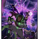
Conversations about how iconography would look started very early on in development. Did we want to go for a sketched-in style to fit the Craftbook's papery look or a more chalky outlined appearance? Jamal (a temporary 2D artist at the time) took a stab at drawing out and exploring the style, some of which can be seen below. They covered bold, thin, cute shapes, loose shapes, and even personified icons.


Our discussions for icon aesthetics went on for months. Eventually, the torch for icon design was passed back to Halston, the team's Graphic Designer. Concepts for icon styles were then drawn out on paper with the aim to explore how to capture the attention of the player while staying practical to its purpose.

We didn't want to make icons that were too intricate or detailed as this doesn't scale well at a UI size in-game. We also didn't want to overwhelm the player with too much information and negative space, so we made the icons bold with somewhat loose and playful edges... enough to make it feel clean but also fun!
With the concepts out of the way, the next step was to create them in Adobe Illustrator! Often times at the beginning of the icon design process, the designer would take a scan or photo of the drawn concepts to be imported into the program on its own layer. From there, a drawing tablet was used to brush in the icon over the faint concept image underneath it.
Below you can see the artboard layout for icons. When an icon is completed, it's placed here within the red squares. We then label the icons, create an artboard around them, and enter a wireframe view to double-check that all strokes are filled (this is fancy talk for turning everything into 100% solid form).

As time went on, the designer relied less on the drawing tablet to give a handmade impression, and more on a mouse and the combination of basic shapes which were then adjusted point-by-point and artificially loosened by warping the edges and applying several effects. Most recent icons were made without a drawing tablet at all!


It's not uncommon to work outside of the actual artboard/canvas space. This is especially true for our 'Icons Master Document'. The designer works more efficiently by keeping all finalized icons in their own, labeled zone. Newly-made icons, icons to be used as future templates, etc. are all located somewhere outside of the final icon zone. Consider it a void - but instead of things being easily lost, we use it to organize!

Our team has private access to a Restitched Documentation forum where we provide information such as how to import icons. This forum post (an extract of which is displayed below) details a step-by-step process on how to turn icons into usable data. We export icons as '.SVG' vector files. This is done en masse by selecting all artboards with icons in them. An artboard is an area that the software recognizes like a page. Anything outside of the artboards is not saved in an export.

We use a very handy external tool for our icons in order to organize, label, and encode them. This service/tool is called 'IcoMoon', and their website allows us to create our own font files from SVG graphics!

After IcoMoon does the heavy lifting, we make sure every icon is in the same place as it was in the previous font file. If icons are mixed up in order, then the game will start displaying incorrect icons. This has happened before, and we weren't particularly fond of a cake slice search icon! 🍰
Once the icon font file is in the engine, we use a tool to update and overwrite the outdated file. If all is well, then the new font will be in-game at runtime.

Below is an early snippet of the first time the icons were added to the game. Until this point, we had been using placeholders. This was a very exciting moment that really brought the game's vision to life even more!

Icons are essential to pulling Restitched's visual style together cohesively. We really hope our goal of creating a playfully bold style has been successful. The team's graphic designer is frequently touching up previous icons and refining the process for future ones!
So, what do you think about Restitched's icons? Did you imagine the process being similar to how we've done it? Are there any icons in this post that catch your eye? Let us know in the comments!
Fate
2022-09-27 22:35:44 +0000 UTCcutegirlclover
2022-09-25 15:46:47 +0000 UTC