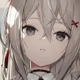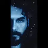
A few more little details probably. But the next time you see her it will be the scanned and color corrected image.
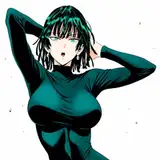
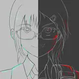
This was a wild color pallet for me.
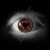
"Permanent Violet Dark" (Golden pigment numbers PR122 and PB60 if you wanna get real nerdy)
and "Turquoise Phthalo" (PG7, PB15:3)
with Burnt Sienna underneath.
The Turquoise and Violet are deep, transparent, high chroma colors. They are also very cool.
The Burnt Sienna (PBr7) is a very warm, earthy orange hue.
I layered the turquoise and violet colors over the warm Burnt Sienna underpainting. It creates a kind of tension between the warm and cool. It looks like there's something burning inside all the forms.
I chose the colors because the music is very brutal death metal but with passages of like moody, melodic electronic stuff going on too.
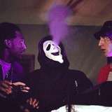
I've been watching this clip from curb your enthusiasm a few times a day. https://youtu.be/5ULYWaUZMLA?si=ERvRV7f2UVTdDRCI
Everything about it is funny to me. I watch it before I got to bed. Or when I need a little crumb of serotonin.
Have Fun
goodnight sweeties
JoanneCallaghan.Art
2024-03-27 02:56:23 +0000 UTC