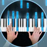
Hello all! I've been working on a new set-up. I hope you like it and I'd love your opinions. Here it is on one of the Patron vote winners :)
x
Comments
Like the new setup. Having the camera to the side gives makes it feel more conversational to me, which I liked.
2022-07-07 21:25:13 +0000 UTC
Thanks for the imput!
2022-07-06 23:21:29 +0000 UTC
The only think I don’t like is how the artists and songs are displayed. The black and white is a bit too bland and the font is too thin and small, meaning it will make it harder to see in the myriad of Youtube thumbnails and this will appear much smaller on peoples’s suggestions. I t might be even harder to read a small text and many ppl may simply not bother to. IMHO the the letters shoul be a bit bolder, or have kind of outline. Also the simple rectangle is sorry, boring. Maybe you could add just a bit of flair to help it stand out on youtube, maybe blue. Looking at the set up it reminds me of the attractions announcements on concert halls venues, so maybe that could add some inspiration as well. But I’m not lie: I liked the older one better.