NokiMo
SingularityGames
SingularityGames

patreon


Wormhole Suit

Hi All!

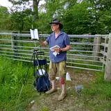
I wanted to show off the wormhole suit and get your feedback before I post it to drive thru cards and add the PnP files to the drive.

Let me know what you think.

-Matthew

Updated the image to be the latest version of the suit with the new tower card and some other minor tweaks. Overall I'm pretty happy with it, but of course, I'm always open to feedback.

Comments

Eric, When I reference the new suit on Drive Thru Cards and such are you okay with me including your name as the inspiration for the suit?

I updated the Wormhole suit image with the updated tower card and some other minor tweaks. Overall I'm pretty happy with everything, but of course, I'm open to feedback.

Great to hear!

Added a dark version of the suit. Ignore the Tower card and the 0 card as I'm still working on those. Let me know what you think.

Yeah, good idea. I'll play around with it and see how it looks.

Have you considered having the cards white on black with a white border to prevent them from being easily picked out from other cards in the deck? It would definitely fit the theme and make it visually distinct from the Spades suit.

Hi Sugoi Desu Yo Ne. All great points. I'll see if I can play around with the tower card a bit. For this suit, I did want the royalty cards to be a bit more distinct since it's supposed to stand outside the other ones a bit. Overall though, I do agree that over the 3 years I've been working on the deck the style is shifting a bit as I design each new suit. I think I'm at the point where I need to go back and look at everything as a whole and tweak things for a greater consistency. For the color similarity to spades I completely agree. For this suit, since it was supposed to represent a bridge between all of the suits (almost like a wild) I wanted it to be either colorless (hence the black, white, and grey) , or all of the colors. I knew the black and white look would look really similar to the spades suit though. I added a version of the king card I was kicking around that has all of the colors, but I worry it becomes even more distinct stylistically from the other suits. Let me know how you feel about it. Very long term, I'm collecting ideas for a 3rd edition of the deck that will build on everyone's suggestions.

Sorry for the late feedback. I like the design of the black hole/wormhole element, it looks very clean, and the omega card is clever. But I think the tower card could use more theming (maybe the tower slopes down to a small point, like it's being sucked into a singularity?), and the royalty cards are too visually distinct from the other equivalent cards in the Cosmos/Earth decks. I also fear that the coloring is too similar to the spades suit. Not that these aren't perfectly usable anyway, but it may be something to consider in a second design pass sometime in the future. Love your work. Good to see this project continuing.

Glad you like it.


Related Creators