

Hey guys,
Recently I've been working at some redesigns for our user interface, based on both feedback from you guys and from Crimson. The biggest problem to solve has been time, as the current layout, although quite functional, really works against what Unity's GUI system can do and as such has been a headache to get it working.
Dividing the screen into quarters instead of having central elements allows us a lot more flexibility, as well as nicely supporting Unity's simple vertical layout groups. Once I started moving things away from the middle of the screen, things began to work a lot more efficiently.
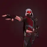
During battle, the text box doesn't need a great deal of space, and stacking everything on the left quarter means we have the whole right side to display the current enemy (art, in this case, by Booster!). The submenu for displaying moves can grow upwards, using all the space from bottom to title bar before it needs to enable scrolling, making things a lot easier to display with minimal player effort.
Overall, this works a lot closer to Unity's strengths and should require no extra effort to make it function, whereas the current layout in our alpha has been a bit of a nightmare to maintain. Now that we're more equipped with Unity's strengths, we can work to those. I also happen to like the look of this a lot more.
Here are some other mockups showing other elements:Start ViewExpanded Moves SubmenuNew Timed Continue Button
Meanwhile, Crimson has been working very hard on a rather huge optimisation pass, and has managed to dump out dozens of scripts. As previously mentioned, once complete this new system should make things much, much simpler for multiple programmers to work on it at the same time, and require far less effort to build and connect UI elements to the engine.
It is sometimes saddening to me that a lot of the work that has to be done at this stage isn't something that can be shown off. While the current alpha doesn't offer a lot to do, it has this stonking great back-end that continues to improve. If all we wanted to do was achieve our current alpha's appearance, that could probably be done in a few afternoons, but we're building something pretty big.
I'd equate it to electrical work - if all you want is an on/off switch, anyone could likely put that together in minutes with the right parts and it'll work fine. But if you want an on/off switch in your house, it means wiring the entire building, ensuring safety and reliability, proper insulation and grounding, working fuse boxes, properly designed circuits, and so on. You've still only got an on/off switch, but you've got a whole network behind the walls ready to plug in all your switches, devices, and appliances. That's what we're doing right now.
I hope that makes sense. Anyway, next I'll be putting together further mockups for Crimson and Vahn to work from, building on this design to make our map and scene views much simpler to put together and nicer to use. Once Vahn's new computer is up and running he wants to work on getting our weapon and move data hooked up and importing correctly, and at that stage Crimson should be working on the new UI to display it as well.
Until next time!


