Art Direction: Sleepaway And Uncanny
Added 2021-02-16 17:11:52 +0000 UTC(Uncanny: A Sleepaway Expansion releases on Itch.io and our website February 19th)
Hey gang! Grub here, Art Director/only other employee at Possum Creek Games. Last week my mom told me that she looked at our website and in her objective opinion it featured way too much of Jay and not enough of me, so we’re going to overcorrect by posting this long article on my exacting, inscrutable, unreasonable process for designing and art directing Sleepaway and Uncanny (which comes out in like … a week? god)
Sleepaway was Jay & my first big collaboration, which was honestly a great starting point because it's based on the summer camp where we met and where both of our souls sleep. (Shoutout to the Wayfinder Experience: I’d say I owe you everything but at this point we’re probably even.) To this day all Possum Creek projects start out as a side project for Jay to work on when I’m asleep and she doesn’t want to do boring administrative work--sometimes the first time I hear about a project is when she posts a preview of it here. This means that with Wanderhome, for example, there were a few weeks when I first officially joined the project where we had to go back and forth about the exact mood and style until I understood what to go for. But Sleepaway--easy. Instant understanding.
Technically for Sleepaway I was just hired to do book layout but--okay. Sometimes me and Jay joke about how we’re both “like this” because we got really into House of Leaves too young, like middle school too young. Also the reason there’s going to be marginalia and footnotes in everything Possum Creek publishes. So it was pretty much inevitable that she’d trust me--a book designer who’s also into critical theory--and implicitly understand my ideas and that’s why we’re business partners now. Anyway all I mean is that while I did “graphic design” for Sleepaway and “art direction” for Uncanny, it’s the same process.
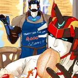
Jay's original itch.io release for Sleepway was based off of the...how shall we say...gay yearning version of summer camp. The "sitting around a bonfire and stargazing" vibes with classic tumblr font amatic--I just wouldn't have it. I mean she’s right--the stargazing and bonfire parts of camp are where you access the romantic sharp liminal space that Sleepaway is essentially about. But to people who aren’t Jay, “the teenage yearning RPG” simply isn’t as enticing as “haunted summer camp game.” So we went for more classic summer camp/campground vibes. We literally met up one day after working day camp to figure out fonts and artists, sweaty and tired and covered in grass stains.


Screenshots from the early release of Sleepaway--peep the Decemberists lyrics on the Lake playbook.


I’m pretty sure these are all fakey Urb*n O*tfitters gift shop trash reproductions of something that may not have ever existed, but the aesthetic is very solid and definitely communicates that something very well. I fell for it at least--I used the same style for the poster for my high school art show ten years ago.
We went through a few iterations of type but pretty quickly settled on our header font, Newcastle, which has beautiful highway sign/battered notebook vibes, and Chaparral (one of my all time favorite typefaces) which is a readable serif but with tons of character--also kind of blocky and could pass for something on a sign at a campground.


Oswald from my high school art show, Neutra from our college’s signage.


Some highway signage-inspired type--too literal.


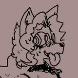
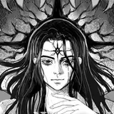
My angels!!
Oh--the House of Leaves-induced marginalia! Jay knew that she wanted weird footnotes and asides but didn’t know what to put in them. I thought of doing little drawings of bugs, flowers, and other summer camp objects with an accompanying poem or lyrical phrase. We brainstormed all the little objects that might go there, and Jay wrote the accompanying text, and we scattered them throughout the book wherever we needed to break up text with an image or wherever a page didn’t have enough text to fill it. With a nice thick divider line to mimic the header and footer text. The thing about blank page space is that with a novel, flowing text into pages is more straightforward--many paragraphs and then the chapter ends. With an RPG, there are so many sections and headers and tables and things to be referenced that the information hierarchy creates a much more jagged page layout and it’s good to have something to fill the space. I mean, these dumb little cicada poems are integral to the game, of course, but.


I don’t know what to say from here about Sleepaway. The rest of the process was very easy going, again because we both so effortlessly understood the vision we were working towards. I did drawings based on the many lands where we’ve run camp. Our other artist, Worsey--also a former attendee of the same summer camp--did character portraits from reference photos of the people who inspired the various playbooks. In a world where this wasn’t our first big release, we maybe would have hired artists who weren’t personal friends, but honestly it was a really great shortcut to only commission art from people who needed very little direction because they’d been there and felt these things.


A doodle I did while learning our new magic system (2012) vs “The Field” (2019).


Comparison between design notes, references of our friends, and Worsey’s final character designs.
Anyway then the book was finished and published and we won an Ennie. Moving on.
Uncanny is a year later and everyone involved in the project (still me, Jay, and Worsey) is smarter and a better artist.
The thesis is to explore the parts of camp on the edges of normal camp, introducing more Weirdness and venturing outside the bounds of the camp, which makes so much inherent sense to me and Jay because it explores the part that we only experience when we're in a fantasy world inside of camp (larping) or when we're with our community but not "at camp," as staff and role models and friends the rest of the year. Designing a Sleepaway expansion is a lot like character creation for a game of Sleepaway is a lot like how we talk about our camp. What are interesting archetypes we could put in Uncanny, what are the weirdest or most fraught parts of camp? Oh, the camper who’s popular and charismatic and that we put all of our hopes for the next generation of staff onto. Oh, remember that land contact who wanted to be Aragorn and taught us a blacksmithing workshop just for fun? And then he was on an episode of Naked and Afraid? Oh, that feeling when you run to the gas station to get coffee but you’re still in full demon makeup. Oh, remember that time we all ran away from the campfire songs and the campers to canoe in the dark, “as a joke” ?


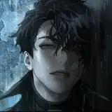
Worsey’s drawings of night canoeing and the camper we put all of our hopes and dreams onto.
We also specifically wanted the drawings in Uncanny to mimic the art from Sleepaway but, just like the text, weirder and darker. Jay and I flipped through one of our copies and decided how to visually match the new art with the old.


Setting elements chapter heading from Sleepaway vs Uncanny.
When we started thinking about visually referencing Sleepaway in the art for Uncanny we realized we absolutely had to get another set of buggy endpapers. The originals are by a camper of ours, and we wanted something similar but, obviously, weirder and visually distinct from ladybugs. Millipedes! Her art has also changed and improved in the year since we published Sleepaway so we got these incredible weird inky guys and love them so so much.


The original endpapers (I wanted them red!) with Emma’s new millipede drawings and the final endpapers after some photoshopping.
For my part, I modeled setting elements even more closely on the Weird parts of our real life at camp. A lot of my personal art references in this article are from 2012 because it was the year I turned 18 and moved away from home for the first time, and also the year that the place we’d run camp for years and years was designated as a floodplain for the nearby reservoir and we knew we could never return to our childhoods. It was all very fraught!


What the flood looked like in our imaginations vs what it was actually like.


Tearful goodbyes at the bunks back in day; I used these as reference for the Roaming Fen.

The painting that was my desktop wallpaper for most of high school vs the final Roaming Fen illustration.
Hmmm… having been through all of this I realize there’s much more feeling and auspice in here than art direction insight. Really it’s apt; that’s how making Sleepaway is, for us. It just flows and makes sense. This is how you know we’re going to be making Sleepaway expansions forever. Also, I refuse to be a writer, just look at all the screenshots again. You can get my ideas about margin size and paragraph spacing when I do this for Wanderhome.
xoxoox
Grub
Comments
I keep forgetting that y'all and I are both friends with Wes and every once in a while they'll pop up somewhere in something y'all post and I lose my mind just a tiny bit But in reaction to the great post, I love seeing the threads between all of the images that were swirling around to make this visual world feel alive!
C
2021-02-19 23:32:13 +0000 UTCThank you for gratuitous font samples. Excellent choices!
Dinah from Kabalor
2021-02-16 18:14:00 +0000 UTCThis is fascinating! Would love to keep seeing blogs like this!
Erika Belsaas
2021-02-16 17:40:51 +0000 UTCThis is lovely, and I especially enjoyed seeing some of the IRL inspirations for the art!
Becca Green
2021-02-16 17:18:12 +0000 UTC