![[Concept Art] New cover](https://img5.nokimo.com/storage/1/dv/ny/fb3178-019e84eb-543b-7729-bdfe-c2c4ffe2c83a.png)
![[Concept Art] New cover](https://img5.nokimo.com/storage/2/sj/od/fb3178-019e84eb-543c-719e-9194-9a5c48713809.png)
![[Concept Art] New cover](https://img5.nokimo.com/storage/5/db/ot/fb3178-019e84eb-543c-7339-9468-09152d8ff6b0.png)
![[Concept Art] New cover](https://img5.nokimo.com/storage/10/fp/du/fb3178-019e84eb-5440-7fa6-ac7c-f05c86083f0a.png)
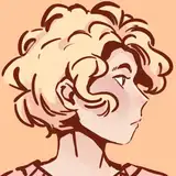
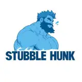
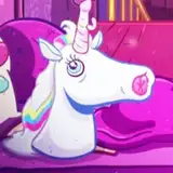
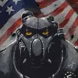
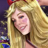
Made a new cover for Tapas (and print? Someday...) It's the first image in this post!
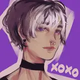
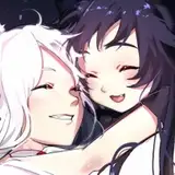
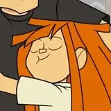
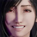
The second image was the one I originally planned to be the new cover. But right as I finished it I didn't like it anymore. It's a beautiful illustration, but it looks more like low stakes romance and it's also kinda hard to make out the characters. I feel like it lost the old cover's charm, idk.
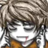
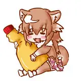
Last image is the old cover for comparison.
I'm going to talk about the new cover a bit.
So, Gilbert painting with blue paint is kind of the key visual (even though it barely happens after the first chapter lol)
Most readers, no matter whether on Tapas or Webtoons, clicked on this comic seeing a curly blonde + blue paint. I wanted to keep that theme, but also include more characters. This design just felt right. The paint stuff could be interpreted as Gilbert having an "impact" on everyone around him. Or like he's drawing a line around him that noone may cross. (Or maybe you have a completely different interpretation? Let me know!)
Anyway I think it gives off a drama/slice of life vibe and I like that better. I know people tend to click on faces but I really like covers that DON'T show faces, I don't know why, maybe that's just me haha.
And before anyone else points it out... yeah I know the shape around him is kinda...... so I tried extra hard to give it a lot of corners and edges, okay?? It is what it is hahahahhaa
Violeta
2023-12-17 00:42:54 +0000 UTCalissacolors
2023-12-01 08:07:22 +0000 UTCcaracal
2023-12-01 03:51:17 +0000 UTC