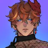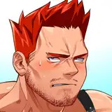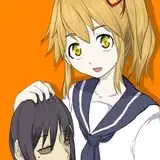
Can you believe I had to go back to drawing Andy with the hood up? I pulled it down in the story for a REASON and that was because it's easier to draw his head than a hoodie in perspective u_u
ANYWAYS, welcome to the long, labor-intensive process of designing a printed comic cover! That's right! This will be PRINTED atop the rest of the RR pages as a spiffy, full-color graphic novel. As I've mentioned, the Kickstarter is tentatively planned for January/February-ish in 2022. Not too far away!
I'm discussing this piece at the $5 tier instead of the SPICY tier, because the cover is relatively Safe For Work, as most printed comic covers should be for marketing and advertising purposes. I took pains to make all the boxes in the background "slightly suggestive" but not really indicative of any real-world objects. Slipshine, who publishes Robber/Robert, had equal say in the creation of this cover, so all the decisions made were a mix of what I wanted and what they wanted. Lots of back and forth!
They first sent me a few inspo examples from existing comics that had interesting covers, and then I sent back some thumbnail ideas:

They chose C!
Next, I had to redesign the logo. I made the original logo in maybe 10 minutes at the very beginning of the comic (2018 hahaHA), so it was always meant to be a placeholder. Let's take a moment to thank the old logo for its service and send it on it's way~~~~

And now for a new logo!

I LOVED THE LOOK OF B3 but it was a little too Schoolhouse Rock for everyone's tastes, so we went with my other fav, A2!
Now that I had a new logo and a basic idea, I did a quick and dirty pass to see how it all fit together:

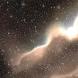
We all took a long, thorough look at this, and had some additional thoughts. What's up with that background? What's happening at the bottom behind the text? Is that the right pose for Rob? I came up with some options:

5 was my real favorite, but we decided it looked a little too scary! Despite the setup, RR is a goofy, fun story about some doofs who get busy. We didn't want to give anyone the wrong impression. With that in mind, I changed up Andy's face a little bit too, so he looked more nervous and less menacing. Slipshine wanted to keep the background in some form, so I did a little more tweaking:

As you can probably guess, everybody settled on the left option, and that's the one I took to completion!
Next, Slipshine gave me some ideas and input on what needed to be included on the back cover, and how the art should be handled. I came back with the final comp:

AND THEN EVERYTHING ELSE. I should also mention that all of the text on this cover was done totally by hand, which is a painstaking process of minute pixel edits that I wouldn't wish on my own worst enemy! I really need to make a font of my handwriting one of these days!

And thar ya have it! Hope this process was interesting to see! I just wanted a chance to show off all those extra unused ideas and art since it took a while to make it all lol.
Thanks for reading!
Tyler Mann
2022-03-01 17:18:48 +0000 UTCAzou
2021-09-08 19:27:23 +0000 UTC