In another part of my "what even is my specialization" random series of "how did I do"s, I thought you could find it interesting if I showed you the process of making a title for a book, or a graphic novel in this case.
I'm by no means an expert and it's always a lot of trial and error, so please, don't claim to replicate my ways to get anything resembling a success, but since I have a solid trove of steps in progress of this thing, I could as well give you something hopefully worth your coin.
Oh, and you can find the textless version of the original poster available for download in the attachments.
Here's the full title card for the book, including the simplified logo:

I generally prefer to have my logos illustrated rather than rely on typography. For one, font licenses can be a bit of an arse to deal with (and I have enough of those headaches from lettering alone), for two, finding a font that fits my specific needs is a bit of a hassle. It also felt slightly more fitting to the setting and time period, because hand-written text has imperfections and slight differences no typeset can replicate, making it less pristine and machine-perfect.
Not to mention, there's something very relaxing about calligraphy, especially when you're doing it wrong.
I went for a serif kind of letter, drawing inspiration from texts on old naval maps. I added some curvature to evoke waves or wind currents, and since the title is long as a boring day, cut down on the width of the letters somewhat. My sense of symmetry is a bit buggered by having to smash the "at the" part where it is, but any other option offered a worse result – the image going off center, entire thing being too long, words being obviously different length on each side, etc. Not to mention, none offered as clean and easy way to remove the icon for the purpose of using it with the large logo variant.

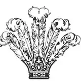
But the actual text came in last. First was the general iconography, which I always intended to be fully illustrated. I played with some ideas like ship silhouettes chased by wind, but I always came back to incorporating figureheads in lieu of a cheap metaphor instead.
My original plans were rather... circular. (Yes, I have a thing for circles.) Primarily inspired by Auryn (from Neverending Story), it gave an ideal opportunity for aforementioned cheap symbolism – the Kelpie in an endless loop, chased forever by the Solomon's golden lion.
So I sketched it out sometime in early 2019 and shelved it, since it wouldn't be needed for quite a long time back then (I didn't even have a finished script).

I was pretty comfortably resting on my laurels, poking around the script and doodling character concepts, when Guild Wars 2 completely unrelatedly dropped news of its next expansion and... um... I think you can see the problem.
So after faceplanting on a table and laughing it off for an hour or so, I scrapped the original and went to work before something else comes along and I have to start completely from scratch.
I started with the text this time, and worked around trying to fit the illustration into it. That pushed it into a vertical stance, since the title is long enough on its own. My brain derailed itself back to my love for traditional heraldry and immediately imagined a coat of arms, with heraldic animals rampant/salient.
And everything clicked together.
The 8-shape ties everything into a loop (8-shaped knots are very common element of heraldry). Horse and lion are very close to British royal heraldic symbols (lion and unicorn), hinting at the tie to the Royal navy. Animals back to back instead of facing/holding a shield suggests discord and noncooperation (yet they're still tied together at the tail and through the common element of the ship's wheel). Lion's stance is rampant (ready to strike), symbolizing fierceness, chase and fight, kelpie is salient (leaping), springing away and escaping. And the entire heraldic theme pushes it back into historic territory.
I only swapped the elements from the original circle, where lion was carried by the wind, ever at the wave's (and the Kelpie's) back, to instead have kelpie being the active element spurring the lion into action and dancing out of its reach.
All of which is a lot of word salad, but it looks something like this when translated into an image.

While working on the illustrated version, friend's feedback helped me return the ship's wheel into the picture as a tying element replacing the text (as the bottom was quite bare without it). There was generally a lot of back and forth and balancing around the color scheme, with the kelpie being too dark, too complicated, the lion too blue or too tan... But I was lucky to have good advisors and managed to settle on something I can consider half-decent.
In the actual book (used as division pages) and on the forepage (with the text), there will be another version, stylized in the form of vintage period illustration to match with the text.
This big one didn't exactly turn out the way I expected, but...
It looks pretty good on tan.

Now just wait for my manufacturer to be back online, and I can make myself into a nice little narcissist.
So, I hope that was at least a bit illuminating. Just don't go quoting it anywhere as a hard proven fact; as I've said above, it's just an attempt to show you my particular brand of trial and error.
That said, off to more comics. Until then, thank you for your kind patronage. Stay safe!