NokiMo
enyoeerie
enyoeerie

patreon


Dialogue box.

Hi, guys. I was thinking for a long time to improve dialogue box in the game. So I want to know your opinion about it. 

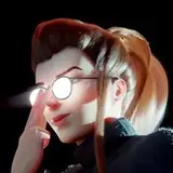
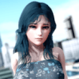
As you can see right now there is character images at the left corner of dialogue box and emotions differ according to situation(smile, anger etc.):

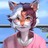
I want to change it. Now all emotions will be shown directly in the scene. Like this: 

Now before I will start to implement my ideas, I want to know your opinion about the variants I have in mind.  

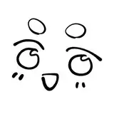
Please choose variant that you like more and which you'd like to see in the game:


Comments

2 & 5 looks pretty nice ;)

Katsuni

Wow, thank you for your detailed feedback, man! It is very useful.

Enyo Eerie

Its a good idea to identify the issues you are trying to address with the changes, since is often a trade off between how easy it is to read versus how much space it covers. I prefer the 3rd one but will elaborate a bit 1st one is very clear and readable, but covers a lot of unnecessary space, which is kind of a shame considering your image quality. 2nd one makes it hard to tell who's talking, which could be solved by using different colored text for characters, otherwise it would be too much of a guessing game Main issue of 3rd/4th option is that the character name is bundled in with the text. Making it separate with a different size/font above the text as it is in option 1 would make it much more readable. I personally feel that black outlines on texts are enough, but wouldnt really mind the background as long as its just behind the text I would however strongly advise against option 5. It may seem like a good way to skip the need to show names, but it will make it more tiring to read the text, which will manifests itself during longer conversations or when more people are involved ( and i am not even counting the increased workload with placement :) )


Related Creators