NokiMo
philtucker
philtucker

patreon


What do you guys think of this cover?

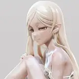
No computer/Internet yet, but I'm working things via phone. Hence my ability to post this sketch for a possible new cover based on everyone's feedback. What do you guys think?

(Things are getting better here daily, btw. Amazing sense of community.)

What do you guys think of this cover?

Comments

The monsters look like Lebensauger from Grimm 😂 awesome

Jason Bradford

Excellent points. I appreciate your taking the time to share them! 100% will strive to make these fantastical works reflect the diversity I see in the real world, and then go farther. Cheers!

Phil Tucker

Thanks! As a Black fantasy fan, I'm always grateful for main characters that are not just white, skinny, and straight. In so many fantastical worlds so far from our own, still the protagonists' all hew to the mold. Occasionally diversity is left to orcs, dwarves, elves, of varying builds and colors, but not the primary human protagonists. Of course there are many amazing POC fantasy authors I could wax poetic about for hours expanding the genre - another conversation. But when I see art like this, I can't help but gently ask - why in a world of fallen angels, scales, earth blood, rune magic, demons, is every human...white and slim and straight? Anyway, I'm a big fan of your work and think Bastion is one of the best LitRPGs currently out there (can't wait for the next one). Thanks for engaging with this feedback!

Zero__PD

You know, after tallying votes on Reddit, RR, and here, it broke down to about 60% C, 35% A, and 5% B. It was a tough call, because I think A spoke to some key elements of the story, but C seemed better geared to triggering the 'buy' reflex from progression fantasy readers, so.

Phil Tucker

Those are all excellent suggestions for future covers, though. I'll be releasing 3 books in relatively short order, so those different images can definitely be used!

Phil Tucker

Good points on Harald's physique. I'll share that with my artist - still time for exactly that kind of feedback. Also, excellent point about the main four characters being white - tbh, I dove into Thrones and wrote it in such a frenzy that I simply didn't stop to consider a better and more diverse cast. That's on me and defaulting to my own ethnicity, I guess. I've got to do better, and will.

Phil Tucker

I like it but, is every main character white, and if so, why? Of course we can't tell at this point in the drawing, but I wondered when you posted rough concept art of the characters in the past. Also, assuming the man in the middle is Harrow, he looks conventionally fit, but at this point isn't he still supposed to be carrying some fat on his frame (despite the burgeoning strength underneath)? I would expect him to be more of a big bruiser and less of "the consummate, ripped sword wielding action hero" look.

Zero__PD

I personally like it more than the previous ones you showed. Only thing I would add is it would be awesome if the dungeon portal was looming menacingly behind them

Hailhound

Just to throw one more random suggestion in the mix… the themes so far are the team fighting for their lives in the dungeon, which this captures; the embattled city of flutic; the demon’s string puppeteering of Harald; and the fallen angel making it all possible. When I think of this story, which I do too often, I see a cascade of images speaking to each of those themes - from foreground to back. All the images so far are great and capture moments in the story, but perhaps my idea is too all-encompassing for just the first book.

Sampson3927

It’s ok. I still think option A looked better and that seemed to be the vast majority of the opinions. If you have to go with C this is better than the Harald only option. Also, it’s better than the existing cover.

Jake Swartz

I like this! Would love to see how it looks in color before making a decision however. I think overall it looks good. With Harald in the center, it’s easy to see who the main protagonist is. It does look a little busy however. If the actual colorizing is clean, I think it could be a good cover! Heralds, character figure looks better in option C imo and I like the style more. I also love the polyhedron in option A as it adds a sense of mystery. Wish there was a way to cleanly mix all of that together.

Akshay Avala

I like that Sam and Vic are there. Overall the option C you presented in your previous post is better and very dynamic too. This is obviously a variant of that. Option C makes it clear who the central protagonist is because even though it is an ensemble, Harald is the main man. I'd like to see book 2 have a version of the previous option A, but with a more character accurate group in front of the polyhedron thingy - it was very eyecatching

ShivaMcTimber

It might just be me but I like the original. Not too busy and it gives a feel for the theme of corrupt power. I liked the dark vibe

Fleetpanda

It’s better, you can decrease the busy by shading the outside with darkness when it gets colored in. I would make the gate to that level in the background, sorta to highlight that aspect of the book. I do like the main players being there as a team

Paul1441

Yeah I agree with the other comment that it’s very busy. It’s a really cool picture and should definitely be included in the finished book as an illustration at some point. But something simpler like the crew in front of the gate would be better.

Taylor

Harald, Sam, Vic? Very cool edit: It just occurred to me that Vic is missing his signature grin!

IamTheCasualReader

I like it, this from Level 4?

John Cerefice

Pretty good, but a little busy

David Ford


Related Creators