Hi everyone, hope you're doing well.
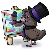
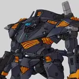
As the heading says, I'm trying out a new thumbnail format for the new year. Although the thumbnail for the upcoming video has been determined, I wanted to get your opinion on which one you think is better/find more aesthetically pleasing.
Please let me know your thoughts in the comments. The more honest, the better.
Thank you so much for reading, take care.
Likedbacchus142
2023-12-06 23:19:14 +0000 UTCPixel
2023-12-04 01:36:32 +0000 UTCMysterys
2023-12-03 22:48:26 +0000 UTCJzTuner2035
2023-12-03 21:57:44 +0000 UTCDeath1121
2023-12-03 21:57:30 +0000 UTCThe Merc
2023-12-03 21:56:11 +0000 UTCDean Winchester
2023-12-03 21:55:35 +0000 UTCShadow Wolf
2023-12-03 21:54:17 +0000 UTCdragon cosplay
2023-12-03 21:48:09 +0000 UTCMaddeusNimrod
2023-12-03 21:46:22 +0000 UTC