Commentary: Pages 44-45
Added 2025-03-27 23:31:33 +0000 UTCPage 044 - After Action
Not a lot to say this time– two pages in a row that are both pretty straightforward.
Peri pioneers:
Wait, wait! I want to go first this time.
Let’s start by embarrassing Lum a little. (It’s for a good reason, I promise.)
Behold! The first draft of this page!
It’s beautiful. It’s majestic. It’s 10/10 no notes… It's well and thoroughly what we in the business like to call a “shitty first draft”. (With apologies to Anne Lamott.)
Now, I’m guessing I’m preaching to the choir for a lot of you (webcomic readers on the whole are a very creatively inclined bunch), but I think it’s always useful to talk out loud about just how circuitous the writing process can be sometimes. We’ve got proverbs galore about it: “All good writing starts with bad writing”, “The secret to good writing is: revision, revision, revision”, etc.
It’s advice that is easy to give, but oh-so-hard to internalize. In our head, we often have an idealized version of the thing we want to make, and the first words or brushstrokes we put on paper are rarely up to snuff with what we imagine. It’s easy to let that discourage you from ever getting started. But the truth of the matter is that it is way easier to modify and improve an existing version of a work (even a really really bad one) than it is to start from scratch. Which is why I’m airing Lum’s dirty laundry here for you all to see.
A Foreach page has a lot of aspects to juggle. It needs to move the plot forward, convey exposition, match the tone of the art, flow naturally as dialogue, and stay in-voice for every character. That’s a lot to keep track of for a first draft! Instead, sometimes it is easier to start with just the bones. What fundamentally needs to happen on this page? What are the conversational beats that need to happen? This “shitty” first draft hits them all, essentially laying out a roadmap that we can then go back to flesh out with proper dialogue that pays attention to voice, tone, and flow. It also gives Lum a way to get feedback earlier in the process–they can send me a page that looks like this, and I can give them a second opinion on whether they’re hitting all the beats they need to before they put in the time to make all the words sound nice.
It can be hard to let go of perfectionism, even if it’s just for a first draft. But the more you practice it, the less you’ll find yourself getting stuck before you’ve even started.

Cliff shows Allen the stars in this page because, honestly, not much else of interest when you’re in space, but also because it felt prudent to show the viewer that his little pod has a cockpit considering that’s gonna come up in chapter 3. In any case Cliff is exactly the kind of nomp that’d tie the infinite expanse of space to some bullshit little anecdote about his perfect life back home cause that’s the guy he is. We talked a little to figure out what that anecdote should be.

Unfortunately narrative constraints left us unable to include the detail that cliff was “smokan weed” in the past. Kill your darlings, as they say.
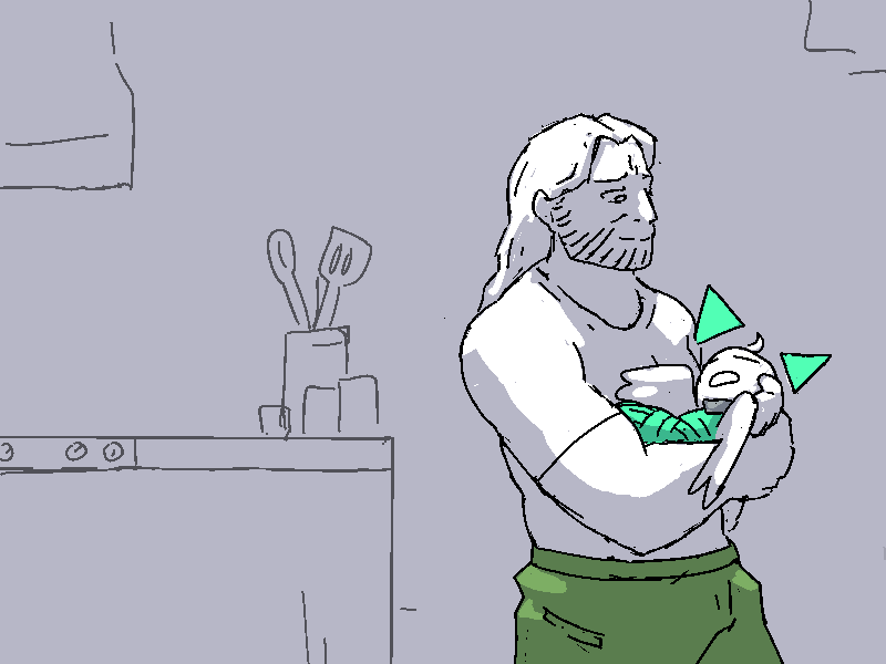
A lot of angels in this comic have halos. You can see here Allen’s got one, made of three triangles. Traditionally when an angel has a halo in fiction it’s usually the “ring-above-the-head” style classic, a physical object in the world, but traditionally they were more like an artistic flourish. Something symbolic, a circle drawn behind the head of a saint that represents their divinity. As I started designing more angels for hellfuck, it just made sense to reach into that more abstract idea of a halo to match the abstract nature of hellfuck’s world. Artistic halos, too, come in a variety of shapes depending on the nature of the being depicted, so I leant real hard in that for the various hellfuckian angels.
Allen’s halo has some odd properties to it as a result of being abstract. When depicting something that doesn’t really fit into the world as a physical object, I need to decide how it responds to the world around it on a case-by-case basis. For example: does the halo cast a shadow? Does it respond to lighting? How’s it look at an angle?
It felt appropriate in the case of Foreach to take inspiration from videogames. In this case, billboards. In videogame graphics, a “billboard” is a 2D graphic in a 3D game that always faces the camera, no matter what. The purpose of these is usually technical, a 2D object is a lot cheaper to render than a complex 3D one, especially for stuff like fire and smoke. But sometimes they’re also used for non-diegetic UI elements that are embedded in the world, to maximise clarity of design while also giving them a sense of “unreality” that reminds the player that that exclamation point above the guard’s head is not actually there. It’s that second use of billboards that I wanted to evoke with Allen’s halo; to imply it’s not quite a physical thing.
So, then, Allen’s halo always faces the viewer, Mickey mouse style. One presumes this is how it appears to all perspectives; when Cliff looks down at Allen in the above panel he probably perceives it as facing him, too. When I draw shadows in a panel I skip the halo, as though it’s just not included in the light rendering pass. And the halo is distinctly non physical: in the above panel, one of the triangles is essentially embedded inside Cliff’s chest where it’s hidden from view. Your hand could pass right through it, it’s not really there. (With that said, though, I avoid drawing panels where an object might be partially embedded in the halo, like I’d never have it where you could see one corner of the triangle sticking out of something; I think outright drawing attention to that aspect of it would be distracting in a bad way.

Yet despite having a bunch of properties of a non-diegetic object, Cliff can still see it. Hellfuck is the world that gives the least shielding to its gameplay contrivances, where the other settings create justifications for their mechanics, Hellfuck is uninterested in shielding its world against threats to suspension of disbelief. Cliff doesn’t quite understand what’s going on with Allen’s halo, here, because there’s no way he could, so he grasps for the most familiar analogy he has for it in his sci-fi setting.

Cliff and Mercy are meant to be “more realistic” than other characters in Foreach as part of the style blending conceit, but exactly how realistic is something I find I can be a bit indecisive on. Realism is tricky. For one, it’s hard! We’ve all heard of the uncanny valley, if you strive for realism then you’re setting yourself a target that everyone on earth is intimately familiar, and they will immediately notice if you fail. And true realism is just not compatible with Foreach’s relatively minimalist visual style. Characters in Foreach are composed of lines with consistent thickness, while the real world (as we perceive it) is composed of shapes and colour. Already we’ve departed from the realm of the real. There’s a lot of things on the face that one could define as “a line” and if I tried to represent all of them on Cliff here he’d quickly turn into an unreadable mess. So to depict him, I need to make decisions about what lines I’m gonna represent and where.
I say all that but let’s be real, it’s also a bit of cope. I’m also just not good enough for that. I do not have those skills! I do not have an intuitive enough comprehension of the human face to draw a nose the way it looks in reality and have a viewer look at it and go yyyup, that’s how a nose looks. Those things are complicated three dimensional objects! They have all sorts of weird jutty bits!!! So, okay, I’m gonna fall back on symbols to carry the load, I’m gonna simplify the nose down into a triangle and a line so that it matches up with the limits of my skillset better.
To finally get to the point, though, the amount of “realism” I draw Cliff with is not actually consistent within the comic itself. I mean, partly because the art in this comic is kinda broadly not consistent lmaooooo. But also because sometimes the scene has needs! I want Cliff to have a really big surprised expression in that above panel, and going a little cartoonier made helped me push that further.
Peri puts in:
Working on Cliff’s characterization through dialogue on this page was so fun. Cliff exists in an odd tension where he wants to be a casual fun guy, but he’s also enormously out of practice with people. And he’s also an extremely bad liar.
We get to see his sociable side on the first half of the page, while he chats to Allen about his past. Here he is relaxed and casual, perfectly comfortable when there’s nobody to actually talk back to him. But the minute Mercy calls, his demeanor changes entirely. I remember when we posted this page, we had a few readers ask if his dialogue line “Mercy! Good to. How's it going?” was a typo–it’s deliberate! He’s flustered and unpracticed at verbally thinking on his feet, leaving both grammar and good sense at the door. I also like how he retreats into formality with his “No ma’am.” when lying to Mercy about the comm towers, in stark contrast to his casual tone with her in previous conversations. He’s as see-through as cellophane! And I love that Mercy clearly isn’t buying his bullshit, either. It’s an uneasy peace they have, for now at least.
Page 045 - Graveyard Shift

It’s funny to think there was a time when we could post an image of Sunny and the readers wouldn’t go bananas over it. They’d see Sunny and go yeah, that’s just one of many characters in the webcomic Foreach. It’s natural that characters will distinguish themselves over time, and as an authour it’s wise to not get impatient about that. Don't panic if readers don't like a character right away! Give it a minute.
At some point this sequence was gonna start with Jasper at Alma’s shop, helping out, but like, you know the drill by now. Jasper gets a phone call from Sunny, big reveal! Ghost at the Woolies! End page! You know the fuckin drill by now.
There is really nothing to talk about on this page, huh. The possession effect, I guess?

It’s like, a regular dialogue box and a ghost dialogue box combined. The black of a regular character with streaks of the green ghost background intruding in. I’m not necessarily super satisfied by it, but like, couldn’t really think of anything better. Because I make these textboxes in straight HTML I was pretty constrained in what I could do with this effect. Like, I woulda liked to have the green effect be strongest at the edges and sorta working its way into the black in the middle, but I don’t think I can do that with CSS alone. Maybe? I’ve seen folk do some bonkers shit with CSS, but I haven’t the foggiest how they pull that shit off.
Peri weeps:
If we ever need to have an angel possessed by a ghost, I don’t know what we’ll do…
Kind of a theme here, really. The whole setup for Foreach pages is honestly pretty simple. I’m not one of those CSS wizards, I just know a few tricks here and there that I use when I get a chance. There’s not really anything dynamic going on here: it’s just html and image files. Like, let’s take a look at the page source:

It’s just fuckin tables. Which, to be clear, if you’re gonna attempt a project like this you should REALLY be using flexboxes or something, but I made a lot of decisions in Foreach from a position of limited information that I was unable to take back, so here we are.
But yeah, that stuff above is pretty much the whole of it. Table, table, image, table, all broken up with newlines. The textbox style is defined by classes, so that’s what applies the visual flourishes like borders, rounded edges, and so on and so forth. I don’t even use any special software for it, it’s all just done in a text editor -- it's not like there's any fancy features here that would meaningfully improve my efficiency. I just copy/paste textboxes from earlier pages when writing all the dialogue and put images in between. You’ll notice every image has its height in pixels defined: this is so that when the page loads, the text boxes don’t jump around as the images load in. The HTML has the image heights already embedded in it, so the web browser can reserve the correct amount of space for every image as they’re loaded. It is important to have absolute consistency in some elements, and for those I use simple scripts to insert elements onto every page. That’s what I use for stuff like the navigation bar, the banners, that kinda thing.
If I wanted to give you a takeaway here it’s that you can literally do whatever. There wasn’t an existing body of media that used this format, this is something I pretty much just invented because it worked with my skillset. The whole concept of a “medium” is made up!!! There was a time when I was really concerned about the “proper” way of doing things, right? I would make comics, and I would wonder, am I doing this right? Is there some hidden rule of comics I’m violating and I don’t realise it and I’m ruining the whole thing? It was really freeing to just invent a medium like this cause now I make the rules. And if I were to go back to more standard media I’m going to take that lesson with me, and just literally do whatever tells the story without concern for tradition. That’s the trick! You can use any arrangement of text and images and sound and music can be used to tell a story! You don’t have to stick to those arrangements that have been codified into larger bodies of work!
Peri retrospects:
You know… I think this was one of the first times we did batch scripting. Lum wrote up all of pages 45-48 (which is the entire rest of the chapter) and sent them to me in one go for editing. This is standard practice for us now, but at the time it was a bit revolutionary. Reviewing pages all in one go lets you visualize a scene in its entirety, which in turn makes it much easier to edit for pacing (including where page breaks should go.) This is particularly important in scenes that are particularly image-heavy or particularly complicated (or both!) This one falls more in the former category than the latter, but it is also arguably one of the most important scenes in the comic so far (the reveal that travel between the games is possible!) and so it was important to get right.
Hm. I guess there isn’t that much more to talk about on this page. Kinda just needed to get from point A to point B so we could set up the Headless Ed encounter. Some good expressions on this page though. I particularly like Cliff being a gamer dad and Jasper’s nervous entrance to the Woolies.