Commentary Pages 19-21
Added 2024-09-11 21:50:48 +0000 UTCPage 019 - Search and Destroy
The title of this page was going to be “Search Action”, after the game genre. But then I realised I don’t actually like the term “Search Action” (just call them metroidvanias! It’s fine!) and I didn’t want to lend the term any additional legitimacy. My motivations in writing this comic are, as you can see, very often highly political.
Figuring out the Aveans’ designs was a bit of a process. The tricky thing about aliens is that they really can look like anything. Cliff’s enemy had to be visibly alien, that was step one. It’s easy to imagine Cliff fighting, I dunno, generic blobby monsters, but ideally we could come up with something that had a design language that was consistent and memorable, that you could immediately associate with Last Gun and Foreach more broadly. I don’t want these 4 games to just be generic cheap slop, I want them to feel like games you actually kinda wanna play, and a unique aesthetic for all of them is a part of that!
Feathered dinosaurs was Rhys’ idea. For a few reasons! Feathered dinos just don’t get enough play in general (some kinds of jerks think they’re “uncool”), but also the feathers create an interesting resonance with the angels of Hellfuck. I was actually opposed to this approach at first, though, if you can believe it. No shade on the feathers or anything, but rather I was worried dinosaurs wouldn’t feel alien enough, or they’d come off as too cartoon-for-kids rather than the grungy stuff you saw in early FPS games. Not to mention, I was worried it would be too limiting an aesthetic when coming up with enemy designs. But Rhys won me over eventually, and I very much like what we came up with.
See some early explorations here, where I tried to decide exactly how feathered they should be:

And here’s an early version of the grunt specifically:

This was for sure a move in the right direction, but adjustments were still necessary, on a few fronts. For one this guy is a bit visually complicated to be drawing constantly. And for two… he doesn’t really feel weak enough to me? I wanted the grunts to feel genuinely pretty small, like you could imagine just mowing through them in a few hits. This guy seems like he could take you. In a fight, I mean.
The biggest wide-scale difference I went with for the design philosophy as a whole was to give them milky blank eyes instead of those slits. Making them too expressive, I found, made them fall into that cartoon-for-kids vibe. It just didn’t feel like they were FPS characters! In addition I made the grunts’ bodies a bit more animalistic and raptor-like, less humanoid:

The final adjustment to the grunts was to reintroduce a bit of that goofiness to them, make them less intimidating. I took a special inspiration there from a game that Peri showed me called Nanosaur, which had these ridiculous looking bug eyed raptor dudes who shoot lasers at you. How could I resist?
Peri pipes up:
NANOSAUR MENTION!!!
Sorry Lum, I’m not letting you get away with just a one line name drop here. You kidding me?
Okay, so I should start by disclaiming: the designs for the Aveans were largely set before I brought Nanosaur into the picture. You can see that from the sketches above. But I’m not here to be logical and restrained. No, I’m here because you’re my captive audience and I’ve decided I want to tell you about a game that was basically my CHILDHOOD.
Nanosaur and Nanosaur II are fucking awesome. You play as a pterodactyl equipped with a combo jetpack/fusion blaster and you fly around and rescue dinosaur eggs from maps full of hostile dinosaurs and environmental hazards and then you drop the eggs into wormholes to send them to the future. Why are you doing this? I have no idea. There are floating landmines and robots with laser guns for some reason, and huge brachiosaurus who rear back when you shoot them and then you have to dodge around their necks as they flail around. The scariest ones are the raptors, who are wicked fast and in the later levels have jetpacks to they can boost up and shoot you out of the sky. There’s a desert level with these giant cyclones that fling you around and when I was eight years old it was SO HARD.
What I’m trying to say is this: Nansoaur is FUCKING AWESOME. I mean, just look at this!
Gosh. Look at that early 2000s UI. Look at those goofy raptors with their little claw arms. Incredible.
…and yes, this IS actually relevant to Foreach. Design is more than just how a character looks, it’s also about how they move, act, and comport themselves within the narrative. The look of the Aveans was settled on fairly early, but their larger portrayal in the narrative is something that has undergone some several transformations as we’ve plotted out more of the comic. I can’t get too specific, because the comic is just now getting to the point of showing us more of Avean society (keep your eyes peeled for next week’s update!) But a major point that was (and still is!) under discussion is how to balance out the Aveans as goofy, comical FPS cannon fodder with the Aveans as a fleshed out society that can carry more serious narrative beats.
When we’re working these things out in the outline and script, Nanosaur is sitting in the back of my head as a guiding inspiration. To me, Nanosaur perfectly encompasses the balance of “that’s fucking awesome” and “that’s just silly” that we are are seeking in the aesthetics of Last Gun. After all, the game needs to be able portray both the badass power fantasy that Nix is seeking and the absurdist, endless string of missions that Cliff can only survive via dad jokes. It needs to be cool, and it needs to be silly, and then later we need to be able to peel back that silliness to find earnest characters underneath. It needs raptors with jetpacks!


In any case, let’s talk about the page itself!
This one actually went through some pretty significant revisions. At first, it didn’t have the map screens, it was just a montage of Cliff shooting Aveans broken up by tall blank spaces. That was really bad for clarity though, and to communicate what I was trying to do with illustrations alone would have demanded wayy more panels than I could put out in a weekend, or some clumsy expositional dialogue. Fortunately, the medium of videogames gives us a clean and easy-to draw alternative here, and it comes with the added bonus of cramming in an extra gag:

Including map screens in the comic were an idea I first had for Hellfuck in order to communicate the geography of Nix’s journey and just how much progress she had lost there, which I deemed unnecessary for that sequence. Nix’s map would have been a game-wide world chart, like you might see on the lower screen of New Super Mario Bros:

I felt Nix’s sequence communicated well enough without it, so I kept it in the back pocket. And lo, it came in very much handy here to sell the tedium of what Cliff was doing here. His map was a single level restricted one, based on the Doom automap, with a little joke in there about how labyrinthine the levels in those early shooters could get.

I’m quite fond of this last gag on this page. Haha, isn’t it funny how when you find corpses in a video game and you don’t react the way one may expect! It’s fun, because it really is vital exposition for Cliff’s mental state while also being a stock standard gamer webcomic joke. Here at Foreach, we can do both.
That last panel was going to be a lot tamer, just 2-3 few corpses at first. But it occurred to me that the punchline just wouldn't hit unless the scale of violence was significantly greater than what we'd seen before. I tried to compensate at first by removing any violence and corpses from the rest of this page, but that didn't really work on multiple levels. It's not like I can make the audience forget the scale of violence on the previous page. So ultimately I just ramped up the scale and the number of bodies, and threw a few megabeasts in there for good measure. It was hard on my arm, but it really does sell the punchline a lot better -- the audience needs to have a very different reaction to that last panel than Cliff if we want the joke to land.
Page 020 - Trigger on Pickup
The title here (and the page proper) is a reference to how in doom and its ilk you’d have enemies that would spawn in when you grab a keycard. In a map editor this’d be an event which triggers on pickup. And you can imagine this even being an in universe conceit, like maybe the Aveans deliberately set up a trap for Cliff here.

I recall the lanyard was my friend Alexi’s idea. It’s a good way to centre the keycard in frame without it, like, floating off the floor while slowly rotating. As much as each of these worlds conforms to the genre constraints of each videogame, I would take pains so that everything in them is still explicable from an in-universe perspective.

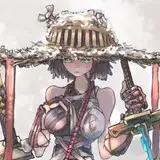
And here’s the captain! Or rather, one captain. Aveans are classed into categories, or enemy types, each with distinct designs and roles in combat. It’s one of those things that helps it feel like it could be a real game with real combat design! We’ve already seen the scrawny, raptorish Grunts and the beefy, t-rex-like Heavies, and now we have the Captains, who I imagine are agile, elite-type enemies. I wanted them to appear more luxuriant than their peers, so they have a fuller plumage on their heads and a big feathery tail. Their bearing is a little more aristocratic, perhaps? And then the little half-cape completes the design. I’m very fond of these guys, I imagine they’re really tricky fighters. Although they seem to get killed off ignobly a lot for the sake of the story. Sorry guys…
Peri parenthesizes:
One of the best parts of making a webcomic is getting to see it through new eyes–those of your audience–once it’s posted. This page came with a wonderful surprise: People LOVED the design of the Avean Captains. This was actually the first page that got posted after we made the Foreach discord server public, and the first message in the entire channel is my sister saying: “Let's talk about who's your favorite Foreach character, and why it's THIS GUY”. And she wasn’t the only one either! (Shout out to Benedict! Who I think has a very reasonable claim on the title of Avean Captain #1 Fan–sorry we keep killing them off immediately. 😅)
But what’s this? Tall panel alert!

The big field of black there was something I definitely wanted, but the idea of having it fade into the scene of Cliff surrounded by corpses was Peri’s idea. I was reluctant at first! I wasn’t sure if an outright gradient would look right in Foreach’s style because of how heavily I lean on that digital flat colours style for the art. I was worried that fade might jar with the existing art! It looks fine though, and I’ve used this sort of technique (in much subtler variations) a number of times since then.
Peri explains:
The idea for the fade came from the fact that gradients are often used to show the passage of time in comics and even in film (think of the phrase “fade to black!”)
The second piece to making the fade work was having it fade into the picture. The original draft of this page looked like this:
Which… didn’t work nearly as well, because it was easy to read as a glitch in the web design rather than a deliberate part of page design. The culprit here is the fact that the black space goes the full length of the page background. In Foreach, we establish a visual language in which the backgrounds serve as a representation of the world. Panels and dialogue boxes take place in the world, and this is reflected visually by the fact that they are fully contained within the background. Things that break the background therefore break out of the confines of the world–and it’s incredibly important to stick to that rule because ARE things in the comic that break out of the in-world structure, namely the inter-world glitches. If we want those “game breaking” moments to land properly, we can’t muddy the watters by invoking that visual language anywhere else.
Therefore, the black fade needed to be restricted to the same canvas width as the dialogue boxes and panels. Doing so indicates to the reader that the time skip is fully diegetic to Last Gun, and that we are still in the realm of normal narrative flow.
The funny thing is, I don’t think I could have explained this whole thing about the visual language of the worlds to you back when we made the page. At that point, we hadn’t scripted or done design tests of any pages with glitches or crossover events. But on an instinctual level, I could tell that the first way didn’t work and the second way did.


This page was another case where cutting corners really enhanced the overall end result. In panel 3, I just Did Not want to draw a billion dudes, so I made all the goons behind the Captain into silhouettes with gleaming teeth and eyes. This was, as a side effect, just compositionally much more interesting, and it helped enhance the feeling of the aliens as a jeering mob.
That last panel is a much more salient example though. I simply could not be fucked to draw more corpses. I have drawn so many corpses this chapter. If I had to try and make drawing another dead guy interesting, I was gonna shit. So instead, I drew the silhouettes of some corpses. Ultimately, this ended up really enhancing the mood of the scene. The bodies of the aliens have become anonymised by the violence. Their life and colour in the previous panels have been robbed from them, and they have been reduced to distorted black shapes -- with Cliff coming off as all the more alone in the centre of the frame.
Peri adds:
Another great thing about the final composition of this panel: the circle of clear floor around Cliff implies that, for all their bravado, none of the Aveans even got close to touching him. Oof.
Plus, I think on some level, the readers are gonna be as done with corpses as I am. After the punchline to page 19, there's no more weight to be wrung out of dead bodies. We've hit the dead body motherlode. So to keep things interesting, for myself and the readers, I had to change things up. Depicting the violence differently this time helps decontextualise it from all the other murder we've seen in this sequence, and helps keep the impact high.
Page 021 - Switch Off
At long last! My least favourite page in chapter 1.
At this point in Foreach I didn’t have much in the way of a buffer and I was still drawing all pages over a single weekend each. So if I ran out of time, or I wasn’t quite feeling it on a Sunday… we had to improvise with what we had. So speaks the story of this page.
The original plan was that it would end on this panel of Cliff removing his helmet from page 22, but I ended up not getting all those panels done in time. We basically ended up with illustrations for half a page, and we had to figure out a way to make it feel substantive as an update on its own.
Peri professes:
Lemme tell ya, the pre-buffer era was rough. Lum was scripting week by week, usually sending me the page text at some point between Monday and Wednesday, and then drawing all the panels across two days on the weekend and posting the pages Monday morning before work. If Lum couldn’t finish all the panels on Saturday and Sunday, sometimes they’d be up early on Monday trying to squeeze in the last one or two before posting. Meanwhile, I’d usually have a few last suggestions as the art got put in (e.g. about panel spacing or order), meaning it was not uncommon for us to be implementing tweaks right up to the minute Lum uploaded the page. And then they’d have to turn around and start scripting again right away!
Needless to say, it made for some scrambles early on in the comic. There wasn’t a lot of time built for extra iterations on the script or art, and we were often working against our time zone difference as well. Lum, that maniac, has my undying respect for pulling that shit off with so much consistency and quality under the time constraints. These days: All hail the buffer.
The first version of the page was intended to be pretty light on dialogue, mostly told through images. With only four illustrations and the mission success screen, a little extra dialogue was needed to fill things out a little more. What we added was this conversation:

It works well enough, but… well, when you think about it, it’s kind of redundant with later conversations Cliff has with Mercy. You absolutely could cut this whole conversation and the story would still hold together fine. And unlike the rest of chapter one, which manages to be fairly self contained, this conversation is introducing ideas that will not fully get resolved until much later (you may disagree on whether or not this is true).
For these reasons, I kind of consider this one page to be the sole blemish on chapter one of Foreach. Without it, I think it would be a kind of perfect object, a perfectly circular work of art that achieves exactly what it set out to achieve. It doesn’t exactly keep me up at night that it isn’t, or anything like that. I don’t regret it or anything. But it is a bit of a shame, Maybe it’s for the better that it didn’t end up perfect, though. It keeps me humble!
Peri points out:
Lum has a point about the exposition on this page, but I don’t think it’s wholly redundant. There’s two things I like about including Cliff’s minor spat with Mercy on this page.
First, Cliff’s ennui comes through more strongly when he expresses it immediately after the mission ends, as opposed to pages later after he’s gone home, showered, had some food, and unwound. It conveys the immediacy of his dissatisfaction, the sense that his frustration with his purposeless missions is always at the forefront of his mind.
Second, it establishes the normal dynamic between Cliff and Mercy so we can break it later. Here Mercy is curt and professional, sticking to military language and formal addresses. In contrast, Cliff is more colloquial and unbuttoned despite the fact that he’s speaking to his commanding officer, which we gather is more from his exhaustion with his situation than from a lack of respect. With this dynamic defined, it hits harder in the conversation two pages later when we see Mercy drop her formal language and speak to Cliff with real emotion about the people she left behind on Earth.
So is this conversational tangent strictly necessary? Probably not. The chapter would still read fine without it, and may even be a bit tighter on the whole. (Which is saying something, because these 24 pages are already tight.) But we needed words to fill out the page, and I think we managed to squeeze plenty of mileage out of them.